
Thank you! Your submission has been received!
Oops! Something went wrong while submitting the form.
Get SaaSFrame Pro
Monthly
$18
Quarterly
$48
Yearly
$180
Upgrade to access this feature
Browse all screens & flows
Filter and search screens & flows
Access Figma files
Access mobile versions
Bookmark screens & flows
Join now
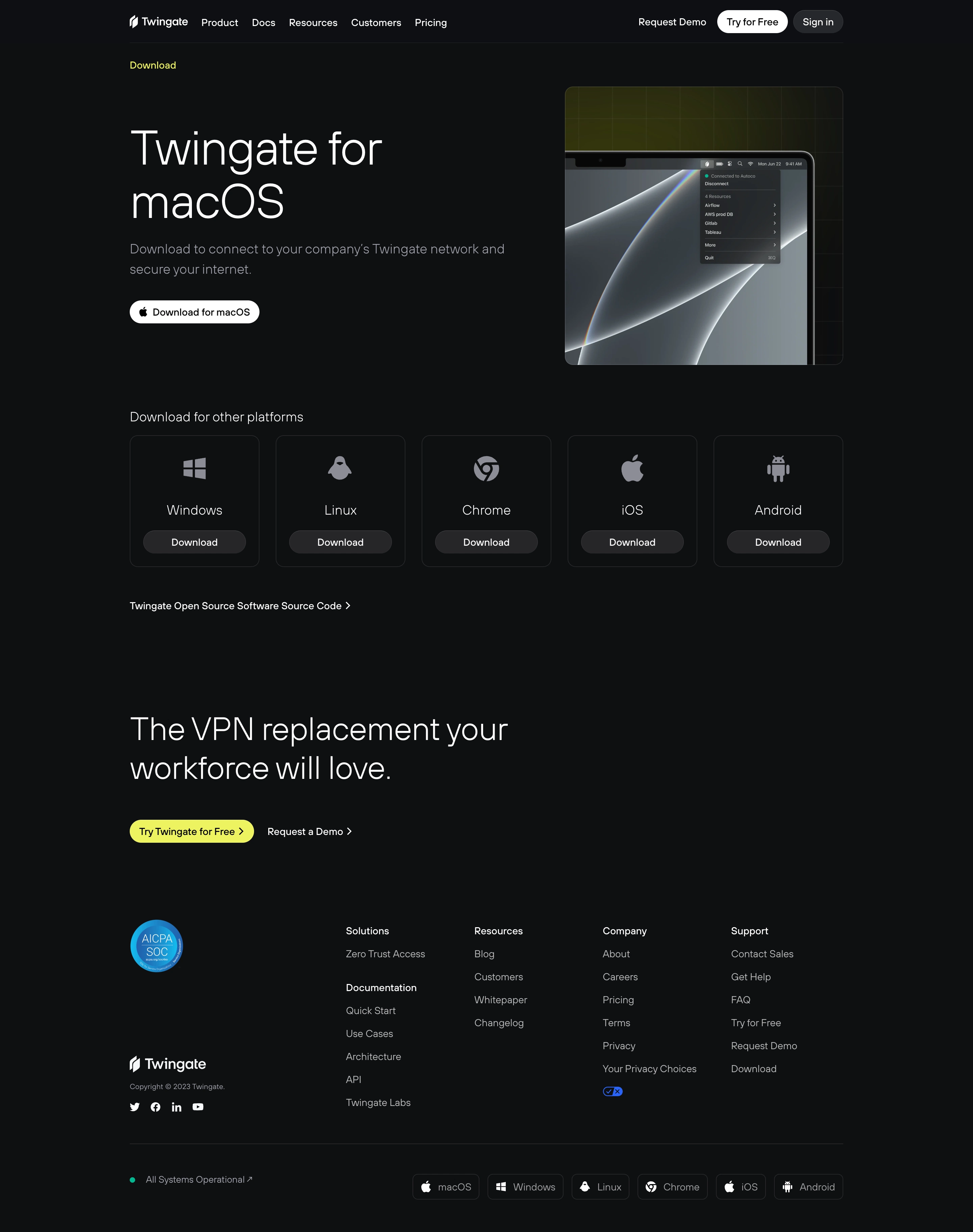

Twingate Download Page

Twingate
It's time to ditch your VPN
Designed by
No items found.

Bookmark
Bookmark

Design with AI
Thank you! Your submission has been received!
Oops! Something went wrong while submitting the form.
# Design from Reference: Twingate Download Page
Create an original, high-fidelity visual design inspired by the reference. Prioritize composition, typography, colors, spacing, and component styling over technical implementation.
## Reference
- **Product:** Twingate
- **Category:** Download Page
- **Screenshot:** https://cdn.prod.website-files.com/5e9dc792e1210c5325f7ebbc/6acb6ae9bf2e69a0c03b6bf7_6acb6a10c8e486b211792033_cms-7ec9199e28931a48d4324822.webp
Analyze the screenshot first. If inaccessible, request it rather than guessing.
## Content
{{content.instructions}}
{{content.data}}
Preserve essential messaging and factual accuracy. Adapt structure and copy length for visual balance; never invent product claims.
## Visual Design
### Overall aesthetic
- **Character:** A restrained download page uses near-black surfaces, thin gray outlines, light typography, white primary download pills, and sparse acid-yellow accents.
- **Evidence:** The source is 2880 × 3646 px, inspected across two readable crops at 1400 px width. Dimensions below estimate a 1440 px CSS layout at 2× capture; ratio is unverified.
- **Tone:** The product is presented through one device image and a quiet platform catalog rather than dense marketing cards.
### Page composition
- **Header:** Branding and product links sit left, with demo, white trial pill, and dark sign-in pill right.
- **Hero:** A small yellow Download label precedes a split layout: large two-line macOS heading, muted explanation, and download action left; a square laptop/menu preview right.
- **Other platforms:** Five equal outlined cards form one row for alternative platforms.
- **Source link:** An open-source software link appears below the cards.
- **Close:** A large two-line conversion message and yellow trial action precede a multi-column footer.
- **Footer:** Certification/brand/social material sits left, four link groups right, then status and compact platform pills beneath a divider.
### Information hierarchy
- **Primary platform:** The large macOS heading and white download action establish the main route.
- **Alternatives:** Large platform icons and labels provide quick scanning before repeated dark Download pills.
- **Secondary route:** The source-code link is plain text with a chevron.
- **Conversion:** Yellow is reserved for the section label and lower trial action, drawing attention within the monochrome page.
### Typography
- **Family:** A light modern sans serif is used; exact identity is unverified.
- **Hero:** Approximately 68–72 CSS px, light weight, with 78 px leading.
- **Supporting copy:** Around 20 px with 30 px line-height, muted gray.
- **Platform labels:** Approximately 20 px, regular/light.
- **Closing headline:** Around 46–48 px with 58 px leading.
- **Navigation/footer:** Approximately 14–15 px; buttons use similar medium-weight labels.
### Colors & surfaces
- **Measured palette:** Source samples include near-black #0E0F11, related #0E0F13, dark gray #262629, white #FFFFFF, acid yellow #EDF337, and black #070707.
- **Semantic use:** Near-black grounds the entire page; white marks primary text and macOS/trial-header actions.
- **Muted UI:** Gray icons, descriptions, and footer links reduce secondary emphasis.
- **Image treatment:** A faint yellow-green grid glow sits behind the laptop preview; the rest of the page remains flat.
### Components
- **Hero image:** A roughly 412 px square rounded panel contains a cropped laptop display and menu-bar interface.
- **Primary download:** Compact white pill with Apple symbol and dark label, around 36 px high.
- **Platform cards:** Approximately 192 × 195 px, 12 px radii, thin dark-gray outline, centered icon/name, and lower dark pill action.
- **Trial action:** Small acid-yellow pill with dark text and chevron.
- **Footer platform pills:** Outlined compact rectangles pair platform icons with muted labels.
- **Status:** Small teal dot precedes operational-status text.
### Visual rhythm
- **Container:** Roughly 1060 CSS px centered with broad side gutters.
- **Spacing:** Large gaps separate hero, platform cards, conversion, and footer.
- **Card cadence:** Equal widths/heights normalize platform identities with consistent action placement.
- **Alignment:** Hero text, platform heading, source link, and closing copy share the same left edge.
### Responsive
- **Observed limit:** Only desktop is visible; mobile and download behavior are unverified.
- **Recommended layout:** Stack hero text/image and reduce platform grid to two columns and then one.
- **Recommended type:** Scale large light headings fluidly without shrinking body text.
- **Recommended footer:** Wrap link groups and platform pills with readable spacing and clear focus.
### Adaptation guidance
- **Preserve:** Keep the primary-platform emphasis, consistent alternative cards, sparse yellow accent, and dark visual restraint.
- **Implement:** Use descriptive download links, authentic platform marks, and accessible status text.
- **Assets:** Treat the laptop menu as illustrative product evidence rather than live page UI.
- **Validate:** Confirm fonts, CSS scale, platform destinations, narrow layouts, and focus states. The screenshot does not verify current software availability.
Use this context to reproduce the reference's visual language: layout, typography, colors, spacing, borders, radii, and distinctive elements. The screenshot takes priority if descriptions conflict.
## Direction
{{preferences.fidelityInstructions}}
## Output
{{output.instructions}}
Deliver a polished, cohesive design with precise alignment, hierarchy, and spacing. Produce the requested visual artifact, not just a description. If unsupported, explain the limitation.


Category
Patterns
No items found.


Added on
April 7, 2023
Similar screens




Upgrade to SaaSFrame Pro now to see similar examples.
Monthly
$18 /month
Billed $18 monthly
Browse all screens & flows
Filter and search screens & flows
Search text in screenshots
Access Figma files
Access mobile versions
Join now
Quarterly
$16 /month
Billed $48 quarterly
Browse all screens & flows
Filter and search screens & flows
Search text in screenshots
Access Figma files
Access mobile versions
Join now
Yearly
$15 /month
Billed $180 yearly
Browse all screens & flows
Filter and search screens & flows
Search text in screenshots
Access Figma files
Access mobile versions
Join now