Design with AI
Generate a new design based on this screen using your own content.
# Design from Reference: Twingate Account Setup
Create an original, high-fidelity visual design inspired by the reference. Prioritize composition, typography, colors, spacing, and component styling over technical implementation.
## Reference
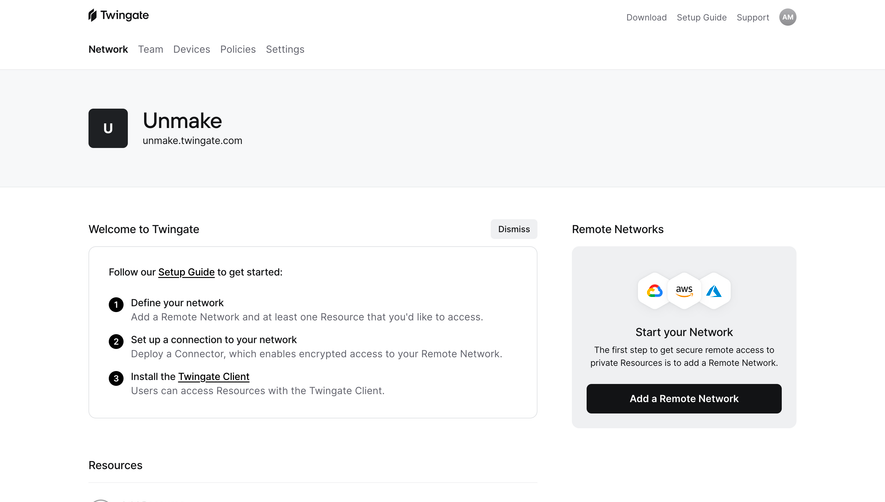
- **Product:** Twingate
- **Category:** Account Setup
- **Screenshot:** https://cdn.prod.website-files.com/5e9dc792e1210c5325f7ebbc/6acb6c105391d62536b67180_6acb6a12ac21a1e4ab66b8eb_cms-82987c36198914f81845e9d0.webp
Analyze the screenshot first. If inaccessible, request it rather than guessing.
## Content
{{content.instructions}}
{{content.data}}
Preserve essential messaging and factual accuracy. Adapt structure and copy length for visual balance; never invent product claims.
## Visual Design
### Overall aesthetic
- **Character:** Minimal developer-oriented onboarding with a restrained monochrome form and a product demonstration.
### Page composition
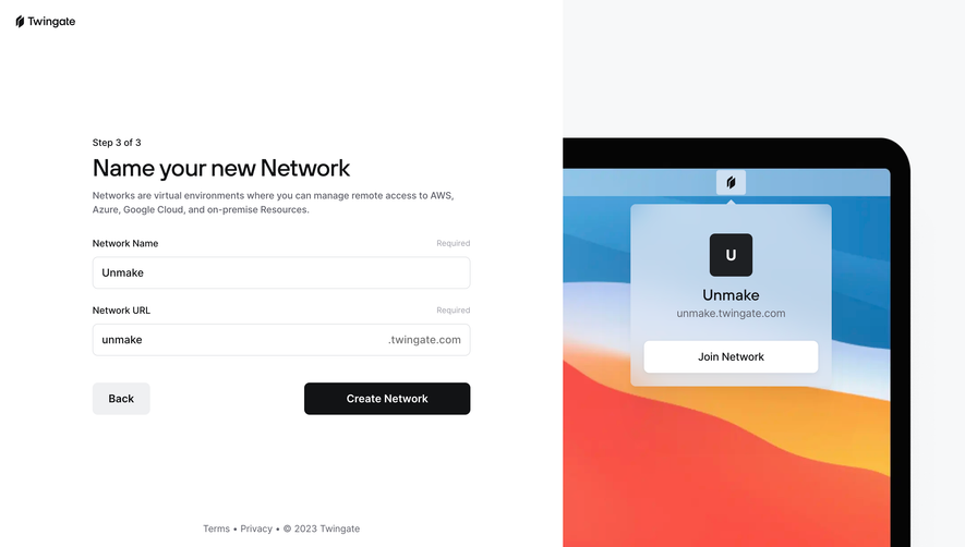
- **Canvas:** 2880 × 1642 screenshot pixels; a white left panel occupies approximately 58%, with a pale laptop illustration panel on the right.
- **Layout:** Brand at the upper left, centered form area, and legal copy near the bottom. Estimated CSS form width 564 px at an assumed 2× capture scale.
### Information hierarchy
- **Sequence:** Step 3 of 3 precedes the network naming headline, helper text, two required fields, then navigation actions.
### Typography
- **Scale:** Estimated CSS headline 36 px, body 14–16 px, and labels 14 px; clean sans serif with medium-weight headings. Font family is unverified.
### Colors & surfaces
- **Palette:** Sampled sRGB white #FFFFFF, right surface #F7F8F9, primary black #050505, and illustration dark #121315. Coral #FA5346 belongs to the laptop artwork.
### Components
- **Fields:** Approximately 48 px high with thin neutral borders and 8 px corners; the URL field appends a fixed .twingate.com suffix.
- **Actions:** Neutral Back button and black Create Network button, approximately 48 px high. Laptop mockup contains a compact network-join card.
### Visual rhythm
- **Spacing:** Large outer margins and approximately 24 px vertical form intervals keep the final setup step calm and focused.
### Responsive
- **Adaptation:** Mobile behavior is not shown. Stack the panels, prioritize the form, and reduce or move the laptop artwork below completion actions.
### Adaptation guidance
- **Transfer:** Preserve the two-field hierarchy, suffix treatment, paired navigation, and quiet product preview. Adapt network terminology and legal copy to the actual product.
Use this context to reproduce the reference's visual language: layout, typography, colors, spacing, borders, radii, and distinctive elements. The screenshot takes priority if descriptions conflict.
## Direction
{{preferences.fidelityInstructions}}
## Output
{{output.instructions}}
Deliver a polished, cohesive design with precise alignment, hierarchy, and spacing. Produce the requested visual artifact, not just a description. If unsupported, explain the limitation.