Design with AI
Generate a new design based on this screen using your own content.
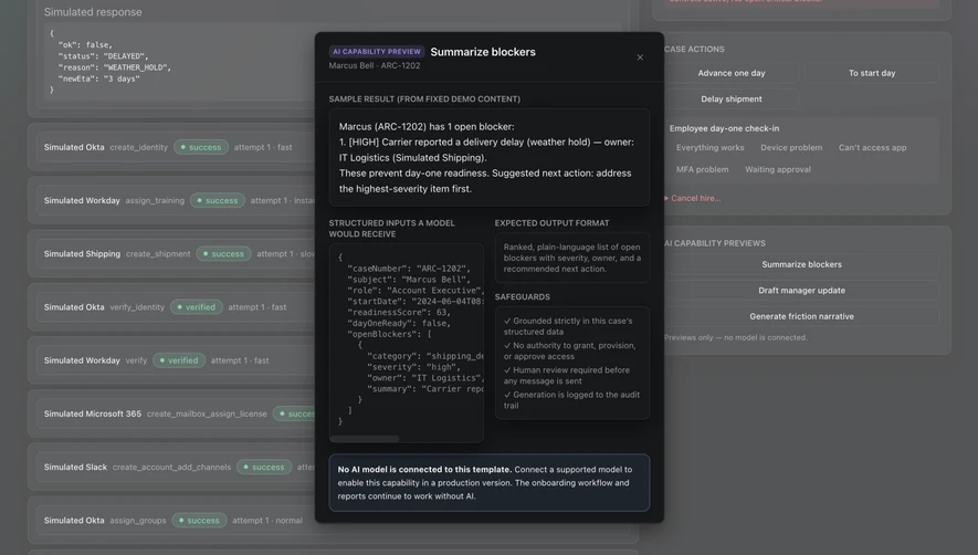
# Design from Reference: Tines Onboarding Blocker Summary
Create an original, high-fidelity visual design inspired by the reference. Prioritize composition, typography, colors, spacing, and component styling over technical implementation.
## Reference
- **Product:** Tines
- **Category:** Details
- **Screenshot:** https://cdn.prod.website-files.com/5e9dc792e1210c5325f7ebbc/6aca2632fe95dabb920562cb_6aca230273348a8d07465d54_cms-95a1b1d2e72a173233cc57a7.webp
Analyze the screenshot first. If inaccessible, request it rather than guessing.
## Content
{{content.instructions}}
{{content.data}}
Preserve essential messaging and factual accuracy. Adapt structure and copy length for visual balance; never invent product claims.
## Visual Design
### Overall aesthetic
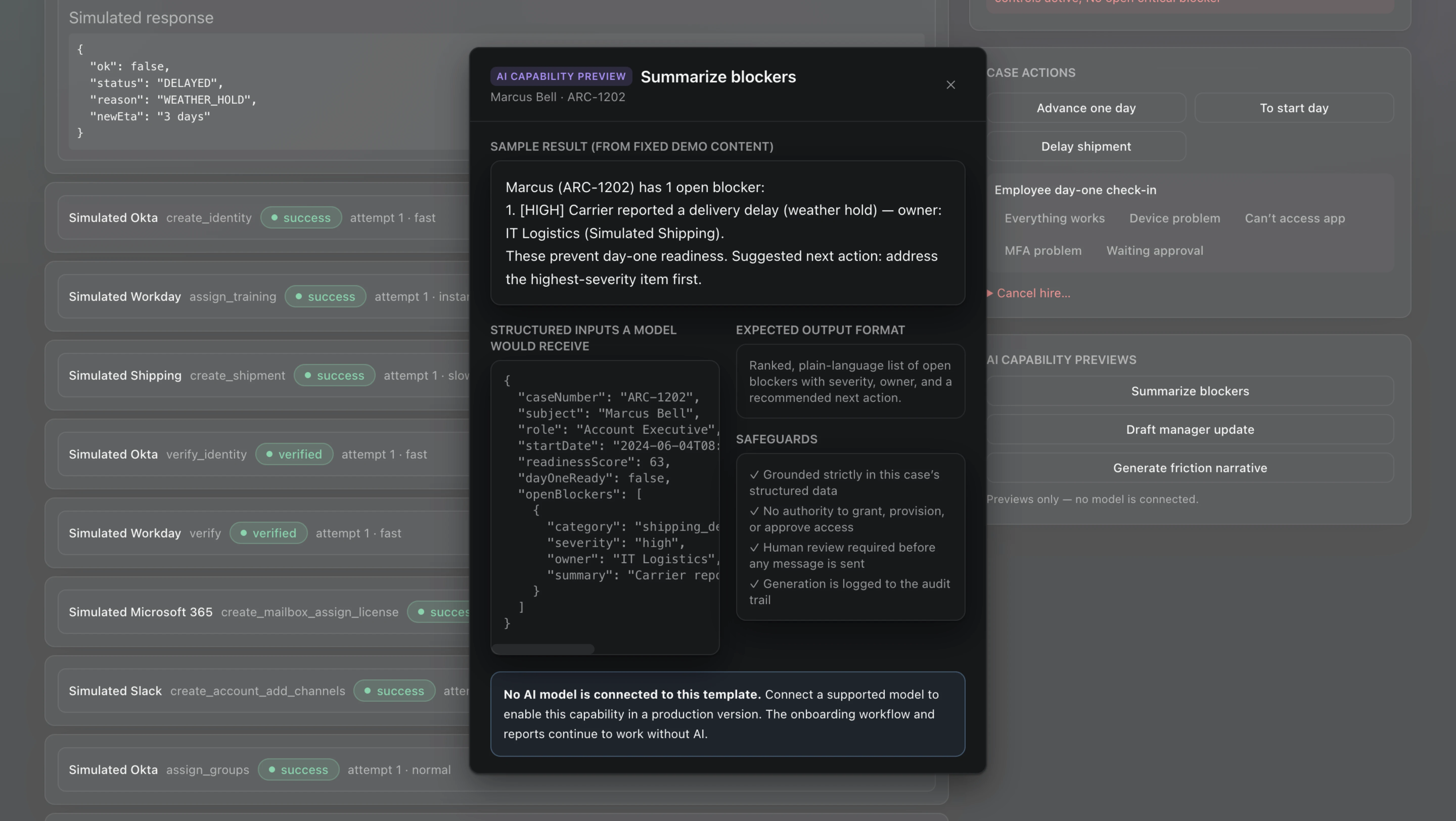
- **Character:** Dark technical blocker-summary preview, with a compact modal emphasizing structured data and explicit model limitations.
### Page composition
- **Canvas:** 5760 × 3248 screenshot px; CSS estimates assume 4× capture.
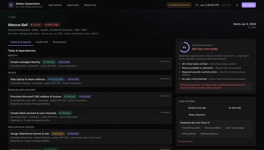
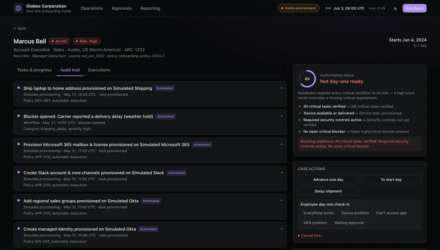
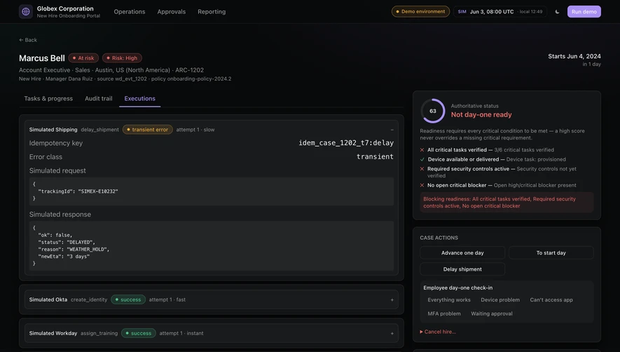
- **Structure:** Centered tall modal over dimmed workflow dashboard; badge/title/case label; sample summary; lower two-column input/output/safeguard area; bottom connection-status notice.
### Information hierarchy
- **Priority:** Sample result appears before raw structured inputs. Output-format and safeguard panels explain interpretation beside the code.
### Typography
- **Family:** Neutral interface sans serif with monospace JSON; exact fonts unverified.
- **Scale:** Estimated CSS modal title 16 px bold, body 14 px, uppercase section labels 12 px and code 12 px.
### Colors & surfaces
- **Sampled palette:** Modal near-black #17181B/#16171A, secondary panel #1F242C and dimmed background grays #545556/#5C5D5F/#606163.
- **Accents:** Muted violet preview badge, pale green status pills behind scrim and blue-gray outline on connection notice.
### Components
- **Panels:** Thin outlined rounded dark rectangles; scrollable code input with horizontal scrollbar; checkmarked safeguard list.
- **Header/footer:** Small close icon, compact capability badge and bottom notice explaining no model is connected.
- **Geometry:** Estimated CSS modal width 510 px, 10 px corners and 20 px padding; nested panels approximately 8 px corners.
### Visual rhythm
- **Spacing:** Dense 12–20 CSS px gaps, strong label grouping and narrow columns support a technical inspection task.
### Responsive
- **Observed:** Desktop only.
- **Adaptation:** Stack input/output columns, keep code scrollable and modal body internally scrollable; retain the model-connection notice.
### Adaptation guidance
- **Preserve:** Clear sample/input/output distinction and restrained dark inspection panels.
- **Replace:** Use actual case data and model status; do not imply the sample generated a live result or performed actions.
Use this context to reproduce the reference's visual language: layout, typography, colors, spacing, borders, radii, and distinctive elements. The screenshot takes priority if descriptions conflict.
## Direction
{{preferences.fidelityInstructions}}
## Output
{{output.instructions}}
Deliver a polished, cohesive design with precise alignment, hierarchy, and spacing. Produce the requested visual artifact, not just a description. If unsupported, explain the limitation.