Design with AI
Generate a new design based on this screen using your own content.
# Design from Reference: Tines Connector Library
Create an original, high-fidelity visual design inspired by the reference. Prioritize composition, typography, colors, spacing, and component styling over technical implementation.
## Reference
- **Product:** Tines
- **Category:** Integrations
- **Screenshot:** https://cdn.prod.website-files.com/5e9dc792e1210c5325f7ebbc/6aca2632fe95dabb920562c5_6aca2301e379045e1b71c6f7_cms-dcdc4b978ae35511351c1d5c.webp
Analyze the screenshot first. If inaccessible, request it rather than guessing.
## Content
{{content.instructions}}
{{content.data}}
Preserve essential messaging and factual accuracy. Adapt structure and copy length for visual balance; never invent product claims.
## Visual Design
### Overall aesthetic
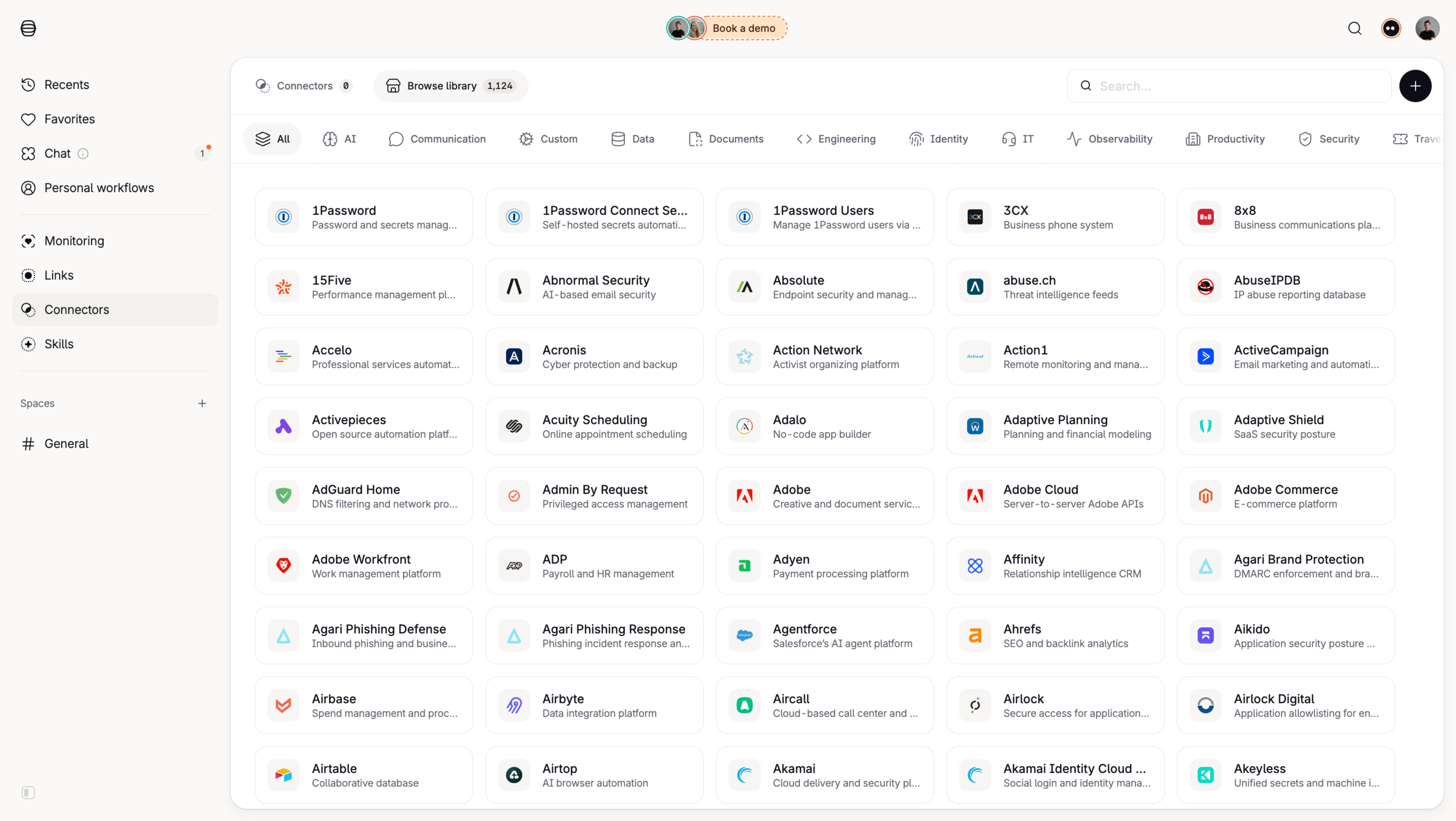
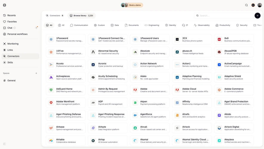
- **Style:** A compact connector catalog with a warm off-white application shell, white rounded content frame, and dense logo-led integration tiles.
- **Character:** Quiet and utilitarian, prioritizing breadth, search, and category scanning.
### Page composition
- **Capture and scale:** The image measures 5760 × 3248 pixels, consistent with an estimated 4× capture of 1440 × 812 CSS pixels. Following sizes are estimated CSS pixels under that assumption.
- **Shell:** A roughly 225 px left rail contains navigation, a selected Connectors row, and spaces. A shallow top region includes a small demo prompt and utility/avatar controls.
- **Catalog:** A large rounded white panel fills the remaining area. Its top row contains Connectors/Browse library tabs with counts, search at right, and a dark circular plus action.
- **Browsing:** A horizontal category strip sits above a five-column grid of connector tiles. Nine rows are visible, with the collection extending beyond the capture.
### Information hierarchy
- **Collection focus:** Browse library is visibly emphasized and displays a large count. Search and categories precede connector results.
- **Tile hierarchy:** Each tile places a small product logo left, connector name above a one-line muted description.
- **Navigation:** The selected sidebar row and selected All category use pale filled backgrounds rather than saturated color.
### Typography
- **Family:** A compact neutral sans serif is visible; exact identity is unverified.
- **Sizing:** Connector names are approximately 13–14 px CSS semibold; descriptions 11–12 px. Sidebar and tabs are around 14 px.
- **Overflow:** Long names and descriptions are visibly ellipsized, maintaining consistent tile widths and heights.
### Colors & surfaces
- **Foundation:** Sampled sRGB #FFFFFF defines panel/tiles, while #FAF9F7, #F8F7F5, #F9F8F6, #F3F1ED, and #F7F6F4 support warm shell/selected surfaces.
- **Boundaries:** Sampled #ECECED supplies fine tile and panel borders. #F9F9F9 appears in logo wells.
- **Color use:** Most interface ink is dark gray; product logos supply varied brand colors. A small orange demo prompt is localized near the top.
### Components
- **Tiles:** Approximately 215 px wide and 56 px high, with 12–14 px radii, thin light-gray borders, and around 12 px padding. No strong shadows.
- **Logo wells:** Small pale rounded squares contain product marks, aligned consistently with the two-line text stack.
- **Categories:** Compact icon/text controls run horizontally, with All shown as a pale pill. The rightmost category is clipped at the edge.
- **Search and plus:** A long rounded search field aligns with a black circular plus button. Tabs/count badges occupy the opposite side of the same row.
- **Sidebar:** Small line icons precede labels; thin rules separate navigation groups and spaces.
### Visual rhythm
- **Density:** Use approximately 12 px grid gutters and 12 px vertical row gaps, with a larger 24 px panel inset.
- **Alignment:** Keep logo wells, names, and description baselines consistent across all five columns.
- **Restraint:** Let product marks identify connectors; avoid adding decorative color fields to every tile.
### Responsive
- **Observed state:** Only desktop is shown.
- **Recommended reflow:** Collapse sidebar navigation, make categories horizontally scrollable, and reduce the grid to three, two, then one column.
- **Discovery:** Keep search prominent and provide access to full connector names when truncation occurs.
### Adaptation guidance
- **Preserve:** Retain the search/category/grid hierarchy, compact logo-led tiles, warm neutral shell, and restrained selected states.
- **Adapt:** Populate with actual supported connectors and meaningful descriptions/counts.
- **Avoid:** Do not invent available integrations or unseen connector-detail behavior.
Use this context to reproduce the reference's visual language: layout, typography, colors, spacing, borders, radii, and distinctive elements. The screenshot takes priority if descriptions conflict.
## Direction
{{preferences.fidelityInstructions}}
## Output
{{output.instructions}}
Deliver a polished, cohesive design with precise alignment, hierarchy, and spacing. Produce the requested visual artifact, not just a description. If unsupported, explain the limitation.