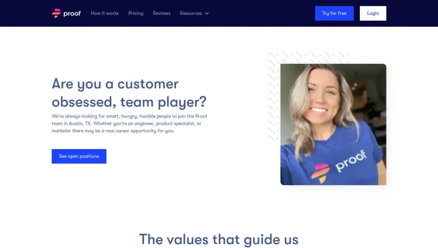
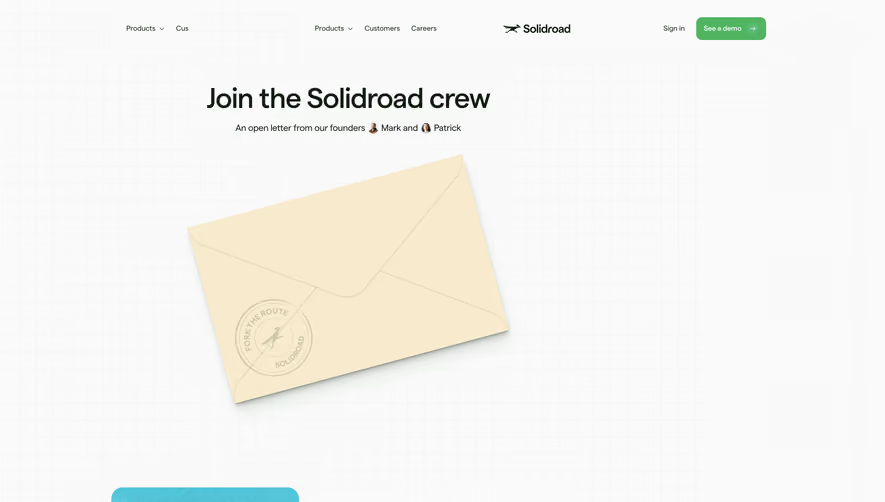
Generate a new design based on this screen using your own content.
Thank you! Your submission has been received!
Oops! Something went wrong while submitting the form.
# Design from Reference: Teta Careers Page
Create an original, high-fidelity visual design inspired by the reference. Prioritize composition, typography, colors, spacing, and component styling over technical implementation.
## Reference
- **Product:** Teta
- **Category:** Careers Page
- **Screenshot:** https://cdn.prod.website-files.com/5e9dc792e1210c5325f7ebbc/62ee97d5dd39ff70a2f148c2_1659802902304-screenshot-device-03f191aedd37d6ef4c81d05e83ad2943-1659802854417.webp
Analyze the screenshot first. If inaccessible, request it rather than guessing.
## Content
{{content.instructions}}
{{content.data}}
Preserve essential messaging and factual accuracy. Adapt structure and copy length for visual balance; never invent product claims.
## Visual Design
Use this context to reproduce the reference's visual language: layout, typography, colors, spacing, borders, radii, and distinctive elements. The screenshot takes priority if descriptions conflict.
## Direction
{{preferences.fidelityInstructions}}
## Output
{{output.instructions}}
Deliver a polished, cohesive design with precise alignment, hierarchy, and spacing. Produce the requested visual artifact, not just a description. If unsupported, explain the limitation.
Teta’s careers page embodies a distinctly modern and minimalist aesthetic, merging plenty of breathing space with playful, animated flourishes. The design feels approachable yet professional, balancing clean lines with energetic accents that reinforce a sense of innovation and creativity—perfect for a tech-forward SaaS brand hiring top talent.
Layout and Structure
The page structure flows from a bold hero section—featuring an inviting headline and dynamic, floating illustrations—into well-defined sections: open positions, company perks, and a subtle call-to-action. Each segment is given ample room, reducing cognitive load and making navigation effortless. The footer is lean and discreet, focusing attention on the main content.
Visual Elements
Custom vector illustrations and fluid, on-scroll animations breathe personality into the experience. Stylized avatars and quirky icons echo the playful brand tone without jeopardizing clarity. Visual cues guide the user smoothly down the page, while micro-interactions add a layer of polish.
Color Palette and Typography
A bold purple anchors the palette, accented by soft gradations of blue and white. These hues contrast against pops of color in illustrations. The typography is clean and tech-savvy—likely using a modern sans-serif with varied weight for hierarchy—giving the text clarity and punch. Headings are prominent, while body text remains friendly and readable.
User Experience Patterns & Unique Choices
Sticky navigation, concise CTAs, and animated section transitions promote both clarity and engagement. The custom illustrated storytelling in the hero section sets the tone, while transparent job listings foster trust. Notable is the use of playful motion to avoid rigidity, making the experience lively yet focused—striking a delicate balance between fun and professional, ideal for SaaS inspiration.