Design with AI
Generate a new design based on this screen using your own content.
# Design from Reference: Testimonial.to Product Tour
Create an original, high-fidelity visual design inspired by the reference. Prioritize composition, typography, colors, spacing, and component styling over technical implementation.
## Reference
- **Product:** Testimonial.to
- **Category:** Product Tour
- **Screenshot:** https://cdn.prod.website-files.com/5e9dc792e1210c5325f7ebbc/6acbbb6c151c40fa40746283_6acbba71d6be908889c41305_cms-6fbadc46159f99a00626a45d.webp
Analyze the screenshot first. If inaccessible, request it rather than guessing.
## Content
{{content.instructions}}
{{content.data}}
Preserve essential messaging and factual accuracy. Adapt structure and copy length for visual balance; never invent product claims.
## Visual Design
### Overall aesthetic
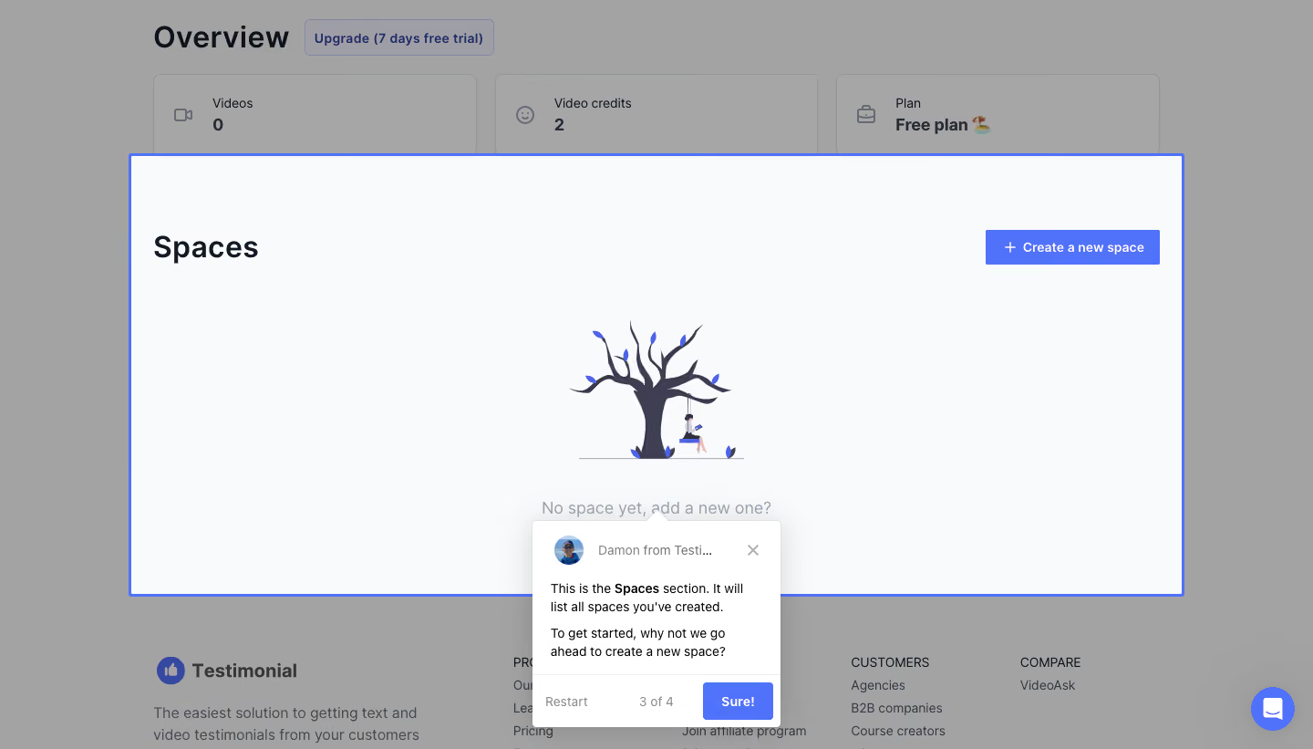
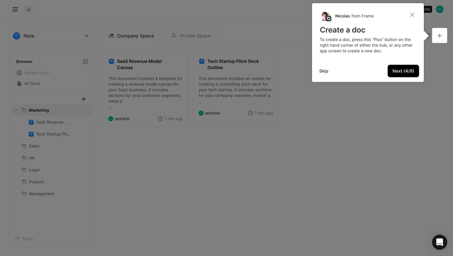
- **Style:** Spotlight product-tour step highlighting a large empty Spaces section.
### Page composition
- **Canvas:** 1440 × 821 screenshot px.
- **Focus:** Broad pale section outlined blue, with heading, create action, tree illustration, and empty message.
- **Tour:** Small white card anchored below; backdrop dimmed.
### Information hierarchy
- **Primary:** Highlighted Spaces area.
- **Instruction:** Short explanation in tour card.
- **Progress:** 3 of 4 with Sure action, Restart, and close.
### Typography
- **Family:** Sans serif; exact identity unverified.
- **Section title:** Approximately 32px.
- **Tour body:** 14px; metadata 12px.
- **Precision:** Screenshot estimates.
### Colors & surfaces
- **Focus surface:** #F9FAFB.
- **Backdrop:** #A2A3A3/#A6A6A6.
- **Tour:** #FFFFFF.
- **Blue:** #5071F9.
- **Precision:** Backdrop includes overlay.
### Components
- **Focus border:** Bright thin blue rectangle.
- **Tour card:** Avatar/sender row, body, footer progress/actions.
- **Empty art:** Small tree/person illustration.
- **Create:** Blue rectangular button.
### Visual rhythm
- **Whitespace:** Large empty focus panel.
- **Anchoring:** Tour card overlaps lower edge.
- **Hierarchy:** Dimming isolates highlighted region.
### Responsive
- **Observed:** Desktop only.
- **Recommendation:** Reposition tooltip and constrain focus region on small screens.
### Adaptation guidance
- **Preserve:** Section-level spotlight and concise instruction.
- **Content:** Use actual step count and target.
- **Behavior:** Tour progression unverified.
Use this context to reproduce the reference's visual language: layout, typography, colors, spacing, borders, radii, and distinctive elements. The screenshot takes priority if descriptions conflict.
## Direction
{{preferences.fidelityInstructions}}
## Output
{{output.instructions}}
Deliver a polished, cohesive design with precise alignment, hierarchy, and spacing. Produce the requested visual artifact, not just a description. If unsupported, explain the limitation.