Design with AI
Generate a new design based on this screen using your own content.
# Design from Reference: Teachable Signup Page
Create an original, high-fidelity visual design inspired by the reference. Prioritize composition, typography, colors, spacing, and component styling over technical implementation.
## Reference
- **Product:** Teachable
- **Category:** Signup
- **Screenshot:** https://cdn.prod.website-files.com/5e9dc792e1210c5325f7ebbc/6acbcd6833302e716eaa43c2_6acbcb240f0c77113b5b970e_cms-d326932f7fda6595d9fc8a74.webp
Analyze the screenshot first. If inaccessible, request it rather than guessing.
## Content
{{content.instructions}}
{{content.data}}
Preserve essential messaging and factual accuracy. Adapt structure and copy length for visual balance; never invent product claims.
## Visual Design
### Overall aesthetic
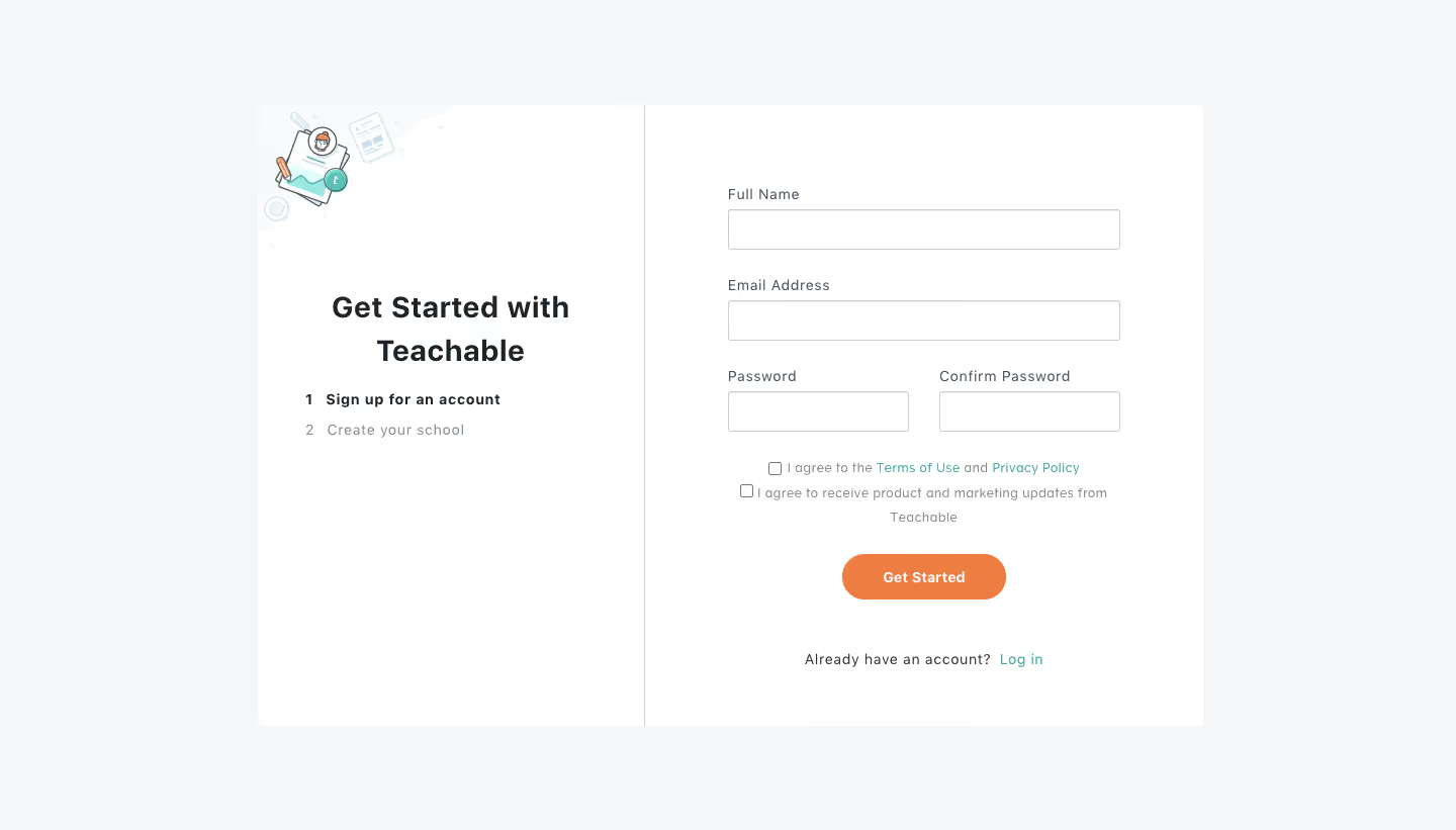
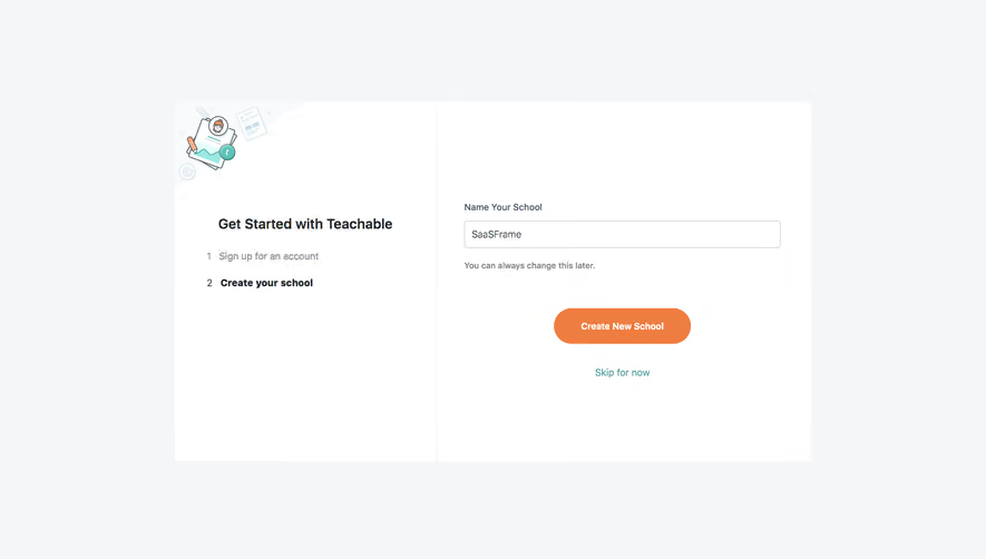
- **Character:** Traditional split-panel signup with a small onboarding illustration, numbered steps and a compact form.
### Page composition
- **Capture:** 1440 × 821 screenshot pixels; estimated CSS scale approximately 1×.
- **Structure:** Centered white panel on gray; left introduction and two-step list, right name/email/password confirmation fields, agreement checkboxes, orange action and login.
### Information hierarchy
- **Priority:** Get Started heading and active signup step explain the flow; form fields lead to required agreement and primary action.
### Typography
- **Family:** Sans serif with slightly tracked labels; exact family unverified.
- **Estimated CSS sizes:** Heading 28px, labels/body 14px, checkbox copy 13px and button 14px bold.
### Colors & surfaces
- **Measured palette:** Canvas #F5F6F7, white #FFFFFF, action orange #EE7D41, illustration pale #F8FBFB, borders #CECECE and dark #1E2327.
- **Accents:** Teal legal/login links.
### Components
- **Elements:** Small education-themed illustration, numbered step list, full-width name/email, paired passwords, two checkboxes and orange pill button.
- **Estimated geometry:** Panel approximately 936×614px, form width 388px, 40px fields, 4px panel radius and 46px action.
### Visual rhythm
- **Spacing:** Generous panel padding contrasts with compact field groups; vertical divider separates orientation from input.
### Responsive
- **Suggested adaptation:** Move step summary above the form and stack password fields. Mobile behavior is not shown.
### Adaptation guidance
- **Transfer:** Preserve required agreement versus optional marketing preference and clear step progression.
Use this context to reproduce the reference's visual language: layout, typography, colors, spacing, borders, radii, and distinctive elements. The screenshot takes priority if descriptions conflict.
## Direction
{{preferences.fidelityInstructions}}
## Output
{{output.instructions}}
Deliver a polished, cohesive design with precise alignment, hierarchy, and spacing. Produce the requested visual artifact, not just a description. If unsupported, explain the limitation.