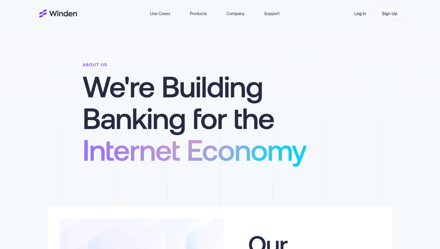
Generate a new design based on this screen using your own content.
Thank you! Your submission has been received!
Oops! Something went wrong while submitting the form.
# Design from Reference: Swell About Page
Create an original, high-fidelity visual design inspired by the reference. Prioritize composition, typography, colors, spacing, and component styling over technical implementation.
## Reference
- **Product:** Swell
- **Category:** About Page
- **Screenshot:** https://cdn.prod.website-files.com/5e9dc792e1210c5325f7ebbc/6acbca84f1e28b554221d05f_6acbc8f163666a5f0005a242_cms-d84bdbf776cf4836f5b4990a.webp
Analyze the screenshot first. If inaccessible, request it rather than guessing.
## Content
{{content.instructions}}
{{content.data}}
Preserve essential messaging and factual accuracy. Adapt structure and copy length for visual balance; never invent product claims.
## Visual Design
Use this context to reproduce the reference's visual language: layout, typography, colors, spacing, borders, radii, and distinctive elements. The screenshot takes priority if descriptions conflict.
## Direction
{{preferences.fidelityInstructions}}
## Output
{{output.instructions}}
Deliver a polished, cohesive design with precise alignment, hierarchy, and spacing. Produce the requested visual artifact, not just a description. If unsupported, explain the limitation.
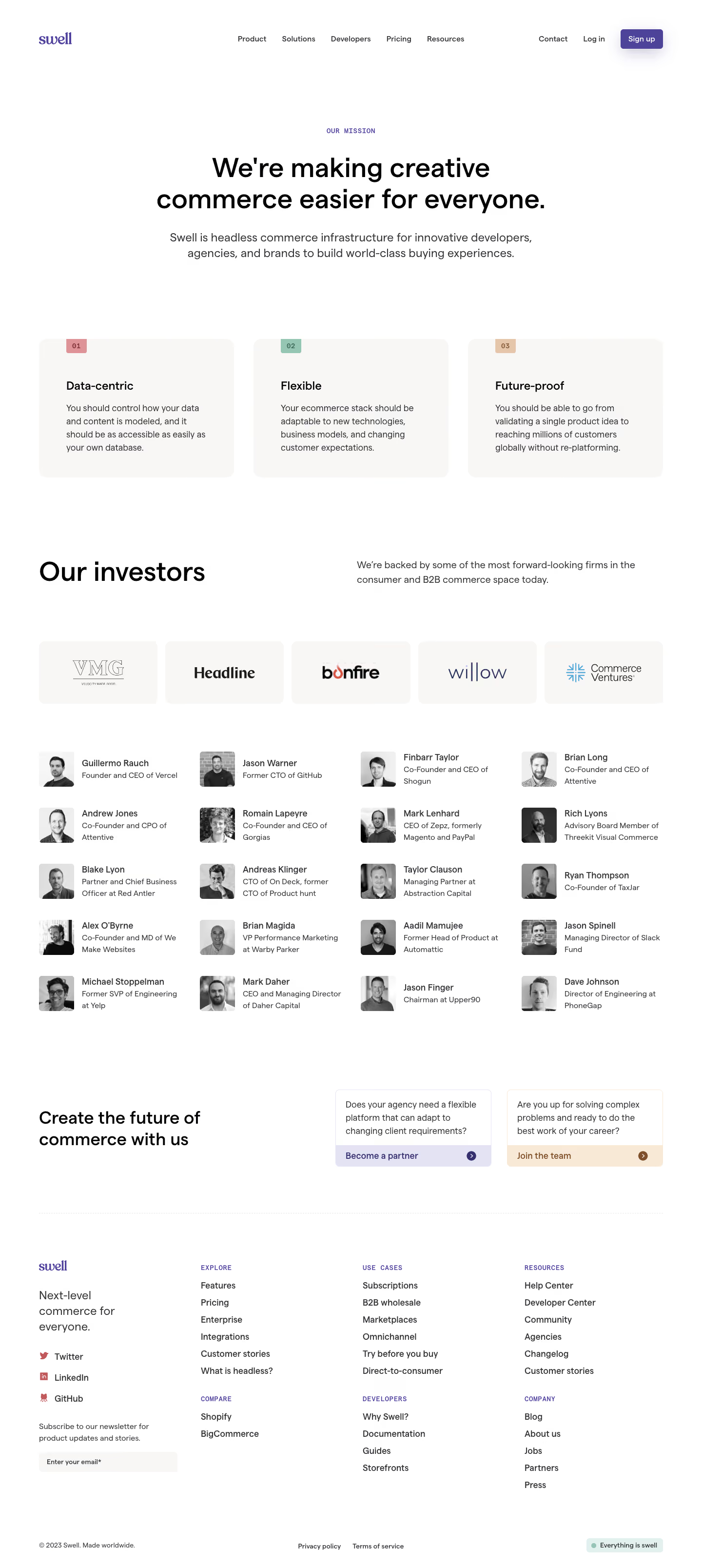
Swell’s About page epitomizes a modern minimalist aesthetic, blending clean geometry with generous whitespace and subtle color gradients. The site feels simultaneously professional and approachable, inviting users to explore while presenting an air of quiet confidence and innovation.
Layout and Structure
The layout is intuitive, starting with a bold hero section combining a concise mission statement with dynamic shapes and a playful swirl animation. Scrolling reveals a clear storyline: from team values and company mission to founder profiles and open positions, the content flows in digestible, well-spaced segments without overwhelming the user. There’s no clutter—each section gets room to breathe, reinforcing clarity.
Visual Elements
Custom illustrations and subtle animated accents bolster Swell’s narrative without distracting from key messages. Portraits are stylized and colorful, establishing a consistent brand mood. Abstract vector shapes accompany text, and understated microinteractions delight users as they scroll.
Color Palette and Typography
A muted palette—soft blues, teal, and cream—sets a calm yet sophisticated mood, with occasional bursts of accent color for highlights and calls to action. The sans-serif typeface is crisp and elegant, using size, weight, and spacing to establish hierarchy and guide the eye through headings, subheads, and body copy.
User Experience Patterns & Notable Design Choices
Navigation is sticky and clear, encouraging exploration with minimal friction. CTAs are prominent but never pushy, seamlessly integrated into the overall design. The page makes effective use of scrolling animations and visual continuity, presenting Swell as an innovative, quietly energetic platform—perfect for SaaS founders seeking inspiration for a refined, future-forward web presence.