Design with AI
Generate a new design based on this screen using your own content.
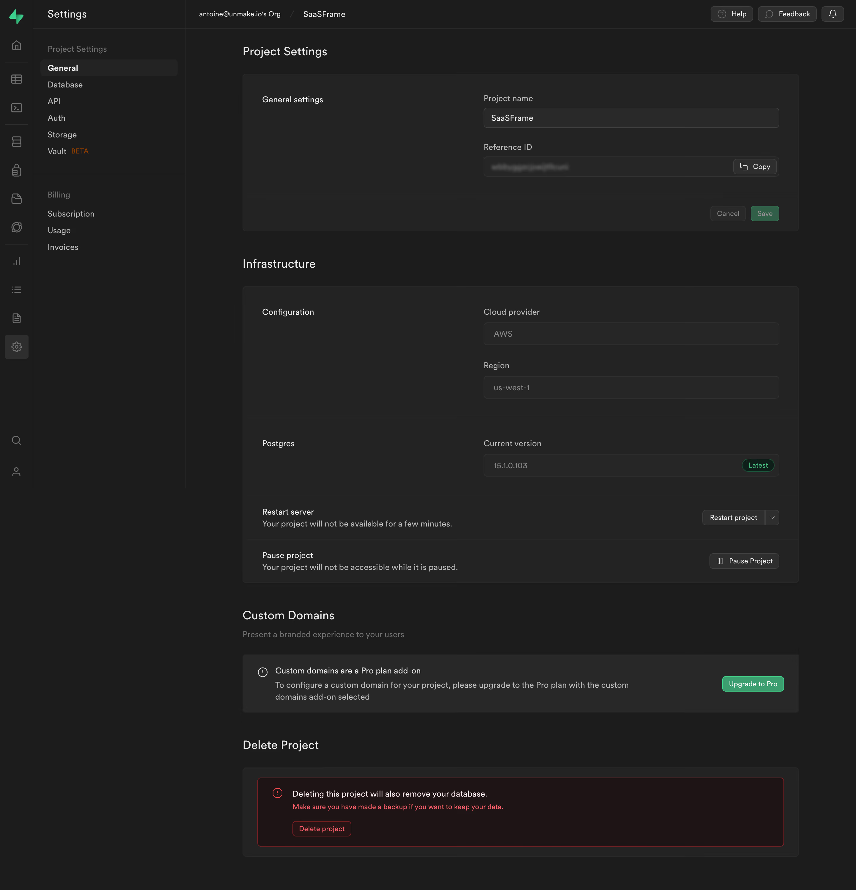
# Design from Reference: Supabase General Settings
Create an original, high-fidelity visual design inspired by the reference. Prioritize composition, typography, colors, spacing, and component styling over technical implementation.
## Reference
- **Product:** Supabase
- **Category:** Settings
- **Screenshot:** https://cdn.prod.website-files.com/5e9dc792e1210c5325f7ebbc/6acadcb98c9a73ab05f13284_6acadc1a83d98bb981885689_cms-edc37ade6523c403d0b73426.webp
Analyze the screenshot first. If inaccessible, request it rather than guessing.
## Content
{{content.instructions}}
{{content.data}}
Preserve essential messaging and factual accuracy. Adapt structure and copy length for visual balance; never invent product claims.
## Visual Design
### Overall aesthetic
- **Character:** Dense dark developer settings interface with layered charcoal panels, subdued borders and selective green actions.
### Page composition
- **Capture:** 2880 × 2992 screenshot pixels; estimated 2× CSS scale.
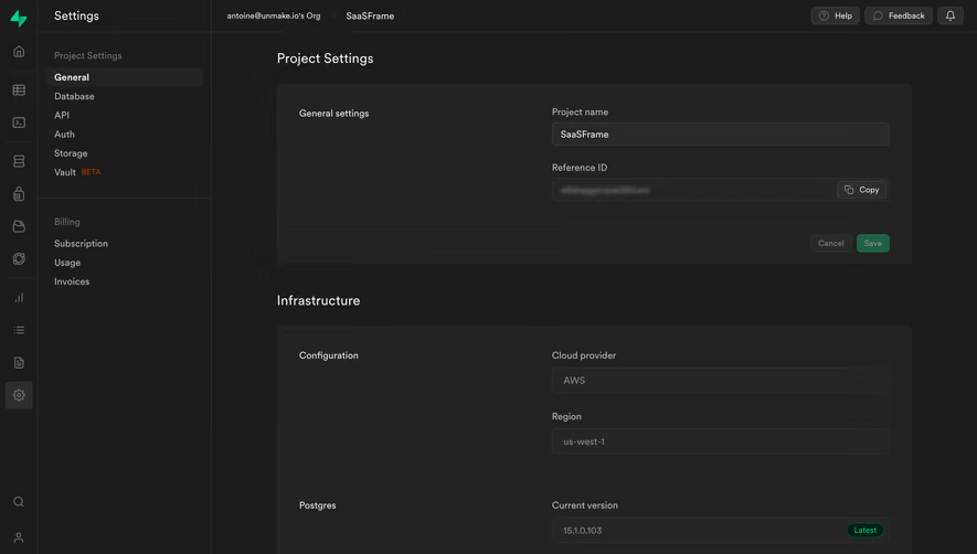
- **Structure:** Icon rail, settings sidebar, breadcrumb utility bar and centered content column. Project settings, infrastructure, custom domains and deletion form a vertical sequence.
### Information hierarchy
- **Priority:** Section headings divide configuration groups; left labels align with right fields. Destructive action is isolated at the bottom in a red-tinted warning panel.
### Typography
- **Family:** Sans serif; exact font unverified.
- **Estimated CSS sizes:** Section headings 20px, form labels/body 14px, metadata 12px and controls 13–14px.
### Colors & surfaces
- **Measured palette:** Canvas #1C1C1C, panels #232323, controls #282828/#262626 and minor surface #292929.
- **Danger surface:** Dark red #211315 with bright red border/text; green marks save, upgrade and current-version status.
### Components
- **Elements:** Project-name input, blurred reference ID with Copy, Save/Cancel footer, disabled cloud/region fields, version badge, restart dropdown, pause control and upgrade notice.
- **Estimated geometry:** Main width approximately 936px, input height 36px, panel radii 6px, 32px padding and fine charcoal rules.
### Visual rhythm
- **Spacing:** Regular panel padding and label/input alignment impose order; larger gaps separate infrastructure, domains and destructive settings.
### Responsive
- **Suggested adaptation:** Collapse navigation, stack labels above controls and let warning copy wrap before the action. Mobile layout is unverified.
### Adaptation guidance
- **Transfer:** Preserve quiet dark layers and distinguish read-only, editable and destructive controls. Keep sensitive IDs obscured in presentation examples.
Use this context to reproduce the reference's visual language: layout, typography, colors, spacing, borders, radii, and distinctive elements. The screenshot takes priority if descriptions conflict.
## Direction
{{preferences.fidelityInstructions}}
## Output
{{output.instructions}}
Deliver a polished, cohesive design with precise alignment, hierarchy, and spacing. Produce the requested visual artifact, not just a description. If unsupported, explain the limitation.