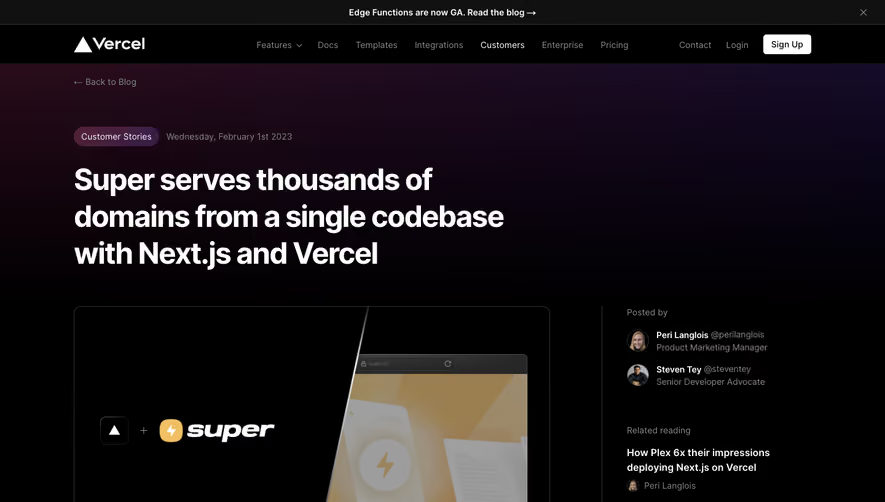
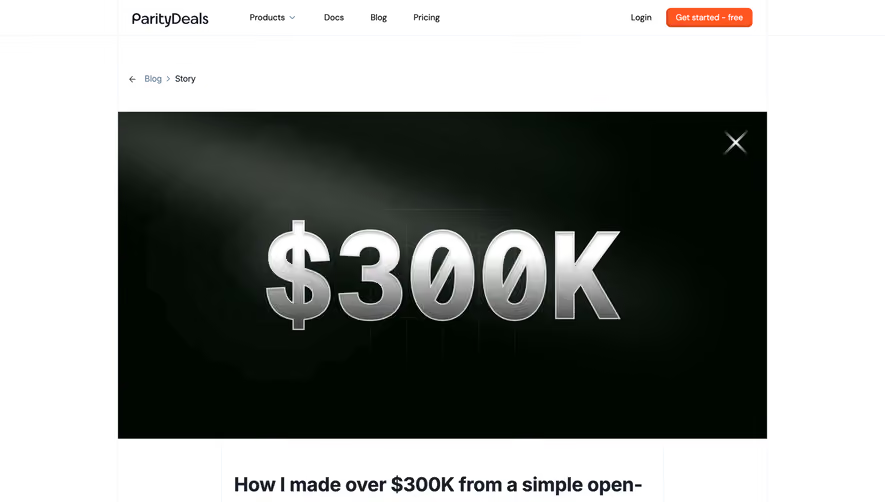
Generate a new design based on this screen using your own content.
Thank you! Your submission has been received!
Oops! Something went wrong while submitting the form.
# Design from Reference: Supabase Blog Post
Create an original, high-fidelity visual design inspired by the reference. Prioritize composition, typography, colors, spacing, and component styling over technical implementation.
## Reference
- **Product:** Supabase
- **Category:** Blog Post
- **Screenshot:** https://cdn.prod.website-files.com/5e9dc792e1210c5325f7ebbc/6acadcb18c9a73ab05f13150_6acadc0bd05a3f53c0a86872_cms-f4ba6685a63cd69eae76f619.webp
Analyze the screenshot first. If inaccessible, request it rather than guessing.
## Content
{{content.instructions}}
{{content.data}}
Preserve essential messaging and factual accuracy. Adapt structure and copy length for visual balance; never invent product claims.
## Visual Design
Use this context to reproduce the reference's visual language: layout, typography, colors, spacing, borders, radii, and distinctive elements. The screenshot takes priority if descriptions conflict.
## Direction
{{preferences.fidelityInstructions}}
## Output
{{output.instructions}}
Deliver a polished, cohesive design with precise alignment, hierarchy, and spacing. Produce the requested visual artifact, not just a description. If unsupported, explain the limitation.
Supabase’s blog page embodies a clean, modern, and highly professional aesthetic with minimalist leanings. Generous negative space, rounded cards, and subtle gradients lend a sense of calm and sophistication, while bold accent elements and functional visual hierarchy keep the eye moving naturally down the page.
Layout and Structure
The structure is intuitive and purposeful: a strong hero section sets the stage with eye-catching visuals and a succinct headline. The body content flows linearly, splitting information into digestible sections with clear demarcation—no cluttered sidebars or superfluous widgets. The footer is streamlined, providing essential navigation and branding without distraction.
Visual Elements
Illustrations take center stage over photography, aligning with the technical theme and adding custom personality. Animated SVG icons and diagrams enliven feature explanations, while embedded code snippets and interactive components reinforce the hands-on topic. The overall animation is subtle, serving to direct focus rather than steal it.
Color Palette and Typography
A sleek blend of deep charcoal backgrounds, crisp whites, and energetic greens (Supabase’s signature) dominate, with pastel gradients for highlights. Typography is modern and readable: bold, geometric sans-serifs for headings paired with understated, slightly rounded body text, ensuring great legibility and contrast throughout.
User Experience Patterns
Sticky navigation ensures persistent access to site-wide resources. Clear, well-placed primary CTAs (“Try the template,” “See it in action”) are repeated to drive engagement. Generous clickable areas, accessible font sizes, and smooth scroll interactions put usability first.
Unique or Notable Design Choices
Noteworthy is the integration of interactive elements and expandable code previews directly within the blog, merging documentation and inspiration seamlessly. The tone projects innovation and approachability—ideal for developers seeking both substance and effortless discovery.