Design with AI
Generate a new design based on this screen using your own content.
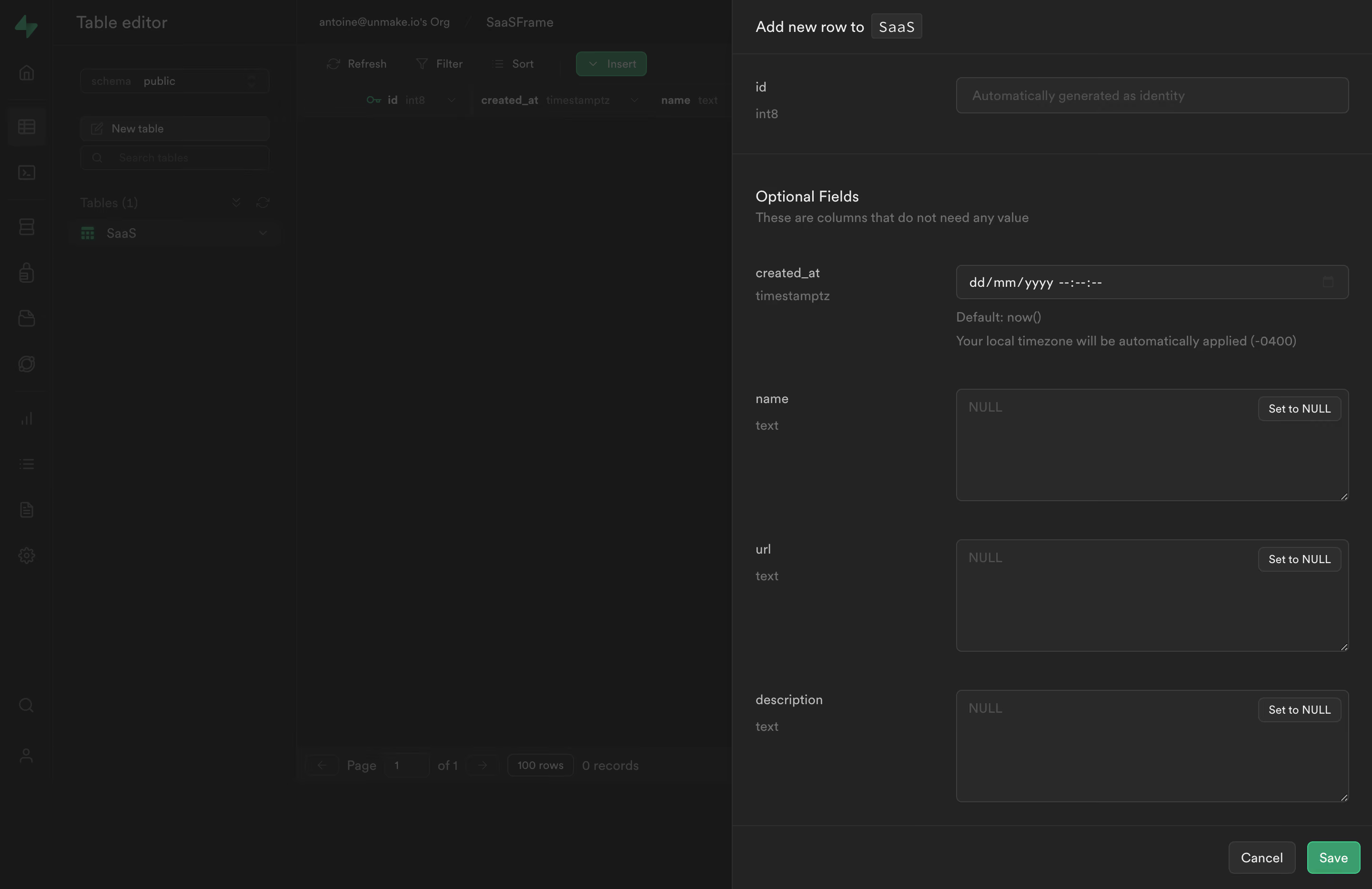
# Design from Reference: Supabase Add New Row
Create an original, high-fidelity visual design inspired by the reference. Prioritize composition, typography, colors, spacing, and component styling over technical implementation.
## Reference
- **Product:** Supabase
- **Category:** Add & Edit
- **Screenshot:** https://cdn.prod.website-files.com/5e9dc792e1210c5325f7ebbc/6acadcb78c9a73ab05f1323c_6acadc16f4cee3729f630260_cms-da368d23ab6a42a8f62c3128.webp
Analyze the screenshot first. If inaccessible, request it rather than guessing.
## Content
{{content.instructions}}
{{content.data}}
Preserve essential messaging and factual accuracy. Adapt structure and copy length for visual balance; never invent product claims.
## Visual Design
### Overall aesthetic
- **Character:** Dense, restrained dark developer interface with an administrative slideout over a subdued table editor.
### Page composition
- **Canvas:** 2880 × 1866 screenshot pixels; dimensional CSS estimates assume approximately 2× capture scale.
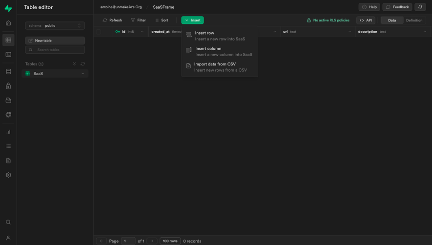
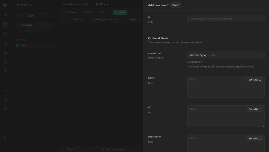
- **Structure:** A full-height right drawer occupies roughly 47% of the width. The underlying application retains a narrow icon rail, table navigation and empty data grid.
### Information hierarchy
- **Priority:** Drawer title, required identity field, Optional Fields divider, timestamp control, then three larger text fields.
- **Action:** Cancel and green Save sit together in a bottom footer, visually separate from the form.
### Typography
- **Family:** Compact neutral sans-serif; exact font is unverified. Data types use a quieter technical treatment.
- **Scale:** Estimated CSS title 16–18px, labels and inputs 13–14px, helper text 12px; labels use medium weight.
### Colors & surfaces
- **Sampled palette:** Dark background #181818; panel #232323; input surfaces #292929; dividers and subdued regions #2E2E2E.
- **Contrast:** Off-white labels contrast with gray metadata and helper copy. A saturated green Save button supplies the principal accent.
### Components
- **Fields:** Horizontal label/control arrangement; disabled identity input, timestamp input with helper line, and large multiline text areas.
- **Details:** Small Set to NULL actions align with field headers. Estimated 6px control radii, 1px borders and 12–16px internal padding.
### Visual rhythm
- **Spacing:** Approximately 24px drawer padding and 24–32px between field groups. Long text areas create repeated broad dark rectangles.
- **Alignment:** Consistent control left edges and muted rules make the technical form easy to scan.
### Responsive
- **Guidance:** Mobile behavior is not shown. Use a full-width drawer, stack labels above controls and keep the footer actions reachable.
### Adaptation guidance
- **Transfer:** Retain the compact typed-field hierarchy, understated dark surfaces and isolated primary action. Adapt field names and types to the target data model.
Use this context to reproduce the reference's visual language: layout, typography, colors, spacing, borders, radii, and distinctive elements. The screenshot takes priority if descriptions conflict.
## Direction
{{preferences.fidelityInstructions}}
## Output
{{output.instructions}}
Deliver a polished, cohesive design with precise alignment, hierarchy, and spacing. Produce the requested visual artifact, not just a description. If unsupported, explain the limitation.