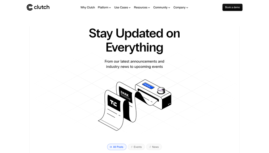
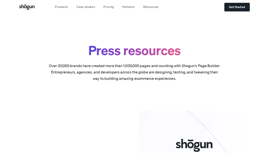
Design with AI
Generate a new design based on this screen using your own content.
# Design from Reference: Stripe Newsroom
Create an original, high-fidelity visual design inspired by the reference. Prioritize composition, typography, colors, spacing, and component styling over technical implementation.
## Reference
- **Product:** Stripe
- **Category:** Press Page
- **Screenshot:** https://cdn.prod.website-files.com/5e9dc792e1210c5325f7ebbc/62ec9c743da29e527cf53aeb_1659622265226-screenshot-device-3eebf3ea942b677a38f9deb28ff17677-1659602523752.webp
Analyze the screenshot first. If inaccessible, request it rather than guessing.
## Content
{{content.instructions}}
{{content.data}}
Preserve essential messaging and factual accuracy. Adapt structure and copy length for visual balance; never invent product claims.
## Visual Design
### Overall aesthetic
- **Character:** Polished editorial newsroom combining a precise column grid, navy typography, pale blue surfaces and vivid branded story imagery.
### Page composition
- **Canvas:** 1440 × 5211 screenshot pixels; estimated CSS sizes are near screenshot scale, with capture scale unverified.
- **Sequence:** Main navigation and newsroom subnavigation; split featured story; three directory links plus contact card; dated news rows; featured and secondary story cards; slanted dark publishing band; multi-column footer.
- **Grid:** Approximately 1080px-wide content area with visible fine vertical guides and a four-column rhythm.
### Information hierarchy
- **Priority:** Featured headline and large image lead. News uses date/category/headline/thumbnail rows; Stories gives greater prominence to visual cards.
- **Supporting content:** Press contact and social links occupy a compact raised card; the publishing promotion provides a distinct closing feature.
### Typography
- **Family:** Clean sans-serif with bold editorial headings; exact font is unverified.
- **Scale:** Estimated CSS feature title 38–40px, section titles 36px, card headings 24px, body 17–18px and metadata/navigation 14–15px.
### Colors & surfaces
- **Sampled palette:** Pale blue #F5F9FC, white #FFFFFF and deep navy #0A2641.
- **Accents:** Violet links and cyan publishing accents contrast with navy. Story imagery introduces saturated red #E50420 and green #266F56.
### Components
- **Story cards:** Rounded image panels with color overlays, white headings/logos and soft lower shadows; estimated 6–8px radii.
- **News list:** Wide horizontal rows align dates, text and small right thumbnails without enclosing card boxes.
- **Details:** Short colored vertical markers precede metadata; small chevron links, gradient progress line and angled section boundaries add controlled motion.
### Visual rhythm
- **Spacing:** Large 100–140px CSS section intervals balance dense lists. Story cards use generous 24–32px gutters.
- **Continuity:** Fine vertical grid lines continue across differently colored sections and the footer.
### Responsive
- **Guidance:** Mobile is not shown. Stack feature text/image, reduce story cards to one column, bring dates above titles and preserve useful section navigation.
### Adaptation guidance
- **Transfer:** Keep the editorial distinction between news and customer stories, consistent grid and restrained link color. Use original imagery and verified press details.
Use this context to reproduce the reference's visual language: layout, typography, colors, spacing, borders, radii, and distinctive elements. The screenshot takes priority if descriptions conflict.
## Direction
{{preferences.fidelityInstructions}}
## Output
{{output.instructions}}
Deliver a polished, cohesive design with precise alignment, hierarchy, and spacing. Produce the requested visual artifact, not just a description. If unsupported, explain the limitation.