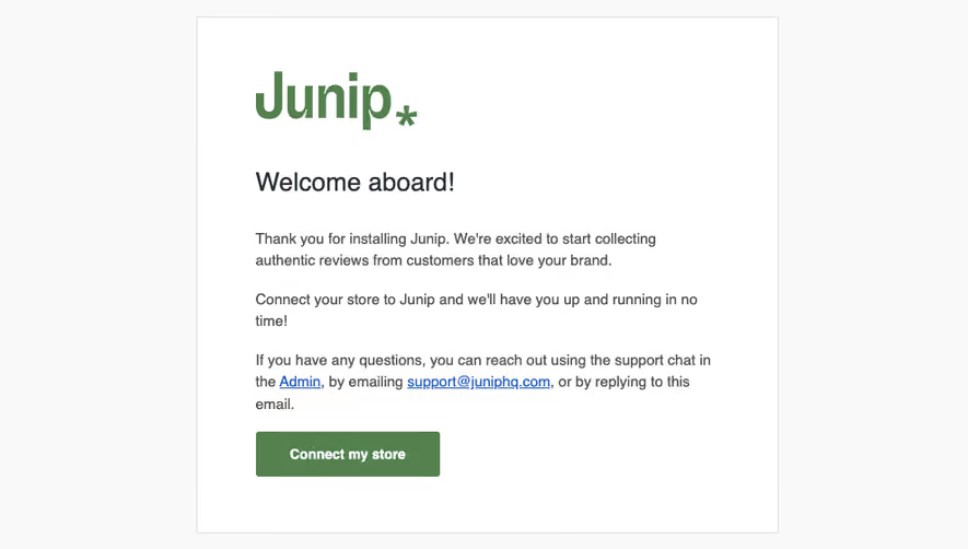
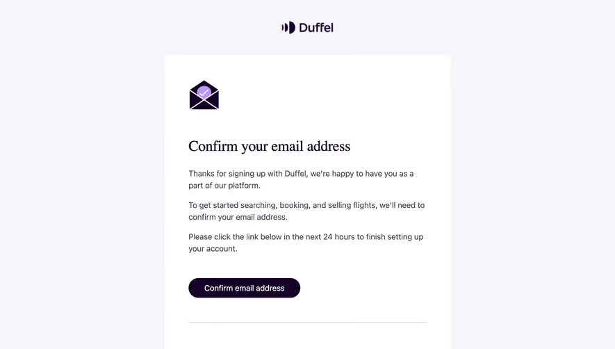
Design with AI
Generate a new design based on this screen using your own content.
# Design from Reference: Squeaky Welcome Email
Create an original, high-fidelity visual design inspired by the reference. Prioritize composition, typography, colors, spacing, and component styling over technical implementation.
## Reference
- **Product:** Squeaky
- **Category:** Welcome Email
- **Screenshot:** https://cdn.prod.website-files.com/5e9dc792e1210c5325f7ebbc/6acbc54a2488d2f8f7d367ac_6acbbd72b340c5df51511b66_cms-bbdba37d1d3ad361d067cfc2.webp
Analyze the screenshot first. If inaccessible, request it rather than guessing.
## Content
{{content.instructions}}
{{content.data}}
Preserve essential messaging and factual accuracy. Adapt structure and copy length for visual balance; never invent product claims.
## Visual Design
### Overall aesthetic
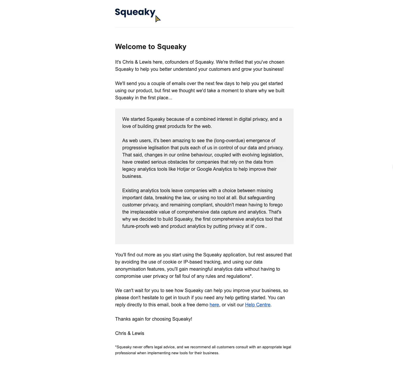
- **Character:** A founder-led welcome email uses plain black text, white space and one large light-gray narrative inset, with minimal branding and standard blue links.
- **Evidence:** The raster is 1321 × 1254 pixels. Measurements refer to observed image pixels; email CSS scale is unverified.
### Page composition
- **Column:** A roughly 600-pixel text column begins near x387, topped by the Squeaky wordmark and a fine horizontal rule.
- **Message:** A bold welcome heading and two introductory paragraphs precede a large gray story block.
- **Closing:** Further explanation, support/demo links, thanks and founder signoff follow, ending with a small footnote.
### Information hierarchy
- **Welcome:** A single bold heading establishes the purpose without a hero image or button.
- **Founder story:** The shaded inset distinguishes the long origin narrative from surrounding onboarding text.
- **Support:** Inline demo and Help Centre links appear late in the message; the footnote is smallest.
### Typography
- **Heading:** Approximately 24 pixels bold with compact leading.
- **Body:** Roughly 16 pixels with 24-pixel line-height; paragraphs are separated by about 24 pixels.
- **Footnote:** Approximately 13 pixels with 20-pixel leading. A neutral sans-serif resembling Arial is visible, but exact identity is unverified.
### Colors & surfaces
- **Measured palette:** ICC-to-sRGB sampling identifies #FFFFFF as canvas, #F2F2F2 as the inset and #222222 as principal text.
- **Text variations:** #2D2D2D and #505050 occur in dark/antialiased text regions.
- **Link treatment:** Conventional blue underlined links supply the only prominent interactive accent.
- **Surfaces:** Flat rectangles and a thin header rule replace shadows or rounded cards.
### Components
- **Brand lockup:** A dark wordmark with a tiny cursor-like colored symbol anchors the top.
- **Story inset:** Approximately 600 × 457 pixels with roughly 24-pixel padding and square corners.
- **Support links:** Demo and help destinations appear within prose rather than as filled buttons.
- **Signoff:** A short thanks line and founder names occupy separate lines above the smaller disclosure.
### Visual rhythm
- **Alignment:** Header, main copy, inset and footnote share the same column edges.
- **Paragraph cadence:** Consistent line-height and blank intervals structure a text-heavy email.
- **Whitespace:** Wide outer margins keep the narrow narrative readable.
### Responsive
- **Observed scope:** One email rendering is visible; mobile behavior is not established.
- **Recommended layout:** Use a fluid max-width column, reduce inset padding on phones and preserve readable body text.
- **Recommended links:** Allow inline destinations to wrap naturally and retain underlining for recognition.
### Adaptation guidance
- **Welcome pattern:** Introduce the founders, explain product motivation in a distinct inset and end with direct support routes.
- **Content treatment:** Keep legal/privacy statements as product-provided copy rather than turning them into new claims.
- **Implementation:** Confirm font and scale, preserve semantic paragraphs and avoid adding unsupported promotional components.
Use this context to reproduce the reference's visual language: layout, typography, colors, spacing, borders, radii, and distinctive elements. The screenshot takes priority if descriptions conflict.
## Direction
{{preferences.fidelityInstructions}}
## Output
{{output.instructions}}
Deliver a polished, cohesive design with precise alignment, hierarchy, and spacing. Produce the requested visual artifact, not just a description. If unsupported, explain the limitation.