Design with AI
Generate a new design based on this screen using your own content.
# Design from Reference: Squeaky Activity Summary Email
Create an original, high-fidelity visual design inspired by the reference. Prioritize composition, typography, colors, spacing, and component styling over technical implementation.
## Reference
- **Product:** Squeaky
- **Category:** Activity Summary Email
- **Screenshot:** https://cdn.prod.website-files.com/5e9dc792e1210c5325f7ebbc/6acbbe34476aea3982e3f9b3_6acbbd5a0d09bebe8a8e17e0_cms-d326dbff1c4c4cf9656ebfd9.webp
Analyze the screenshot first. If inaccessible, request it rather than guessing.
## Content
{{content.instructions}}
{{content.data}}
Preserve essential messaging and factual accuracy. Adapt structure and copy length for visual balance; never invent product claims.
## Visual Design
### Overall aesthetic
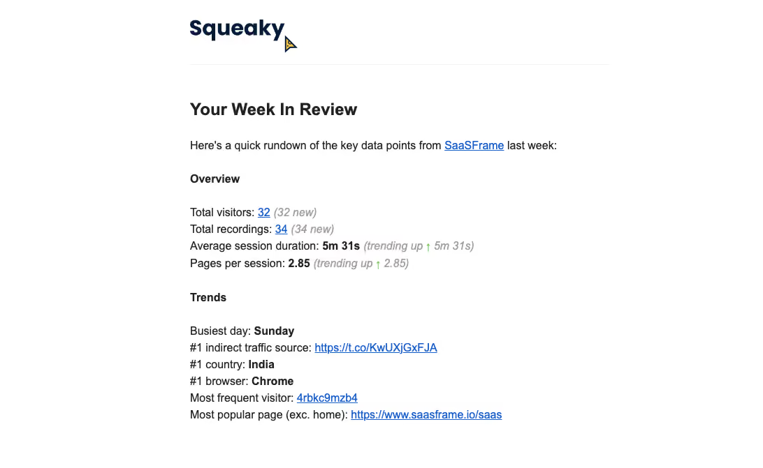
- **Character:** A plain weekly analytics email uses black text, blue underlined links and a small branded header on white.
- **Capture evidence:** The screenshot measures 1092 × 671 pixels and shows the complete visible message. Dimensions are image-pixel estimates; email CSS scale is unverified.
- **Tone:** Dense text metrics and minimal styling favor quick reading over visual dashboard presentation.
### Page composition
- **Reading column:** A roughly 600px-wide left-aligned column begins around 272px from the screenshot edge.
- **Header:** A dark Squeaky wordmark and small cursor graphic sit above a thin pale rule.
- **Introduction:** A bold weekly-review heading precedes one explanatory sentence.
- **Overview:** Four compact metric lines summarize visitors, recordings, duration and pages per session.
- **Trends:** A second bold label introduces six short ranked/contextual lines.
- **Closing boundary:** The capture ends after the last linked page line, with no visible action button or footer.
### Information hierarchy
- **Heading:** Your Week In Review is the largest text below the brand.
- **Sections:** Overview and Trends use bold labels separated by clear vertical gaps.
- **Values:** Selected metrics are bold; linked counts and destinations are blue and underlined.
- **Changes:** New/trending annotations are muted italic gray, with small green up arrows.
- **Data scope:** Displayed figures and trends are captured email content, not independently verified analytics.
### Typography
- **Family:** A familiar sans-serif is visible; exact identity is unverified.
- **Review heading:** Approximately 24px bold.
- **Section labels:** Approximately 16px bold.
- **Body:** Approximately 16px with 24px line-height.
- **Annotations:** Same approximate size as body, italic and gray.
- **Brand:** A custom heavy dark wordmark is larger than the body heading.
### Colors & surfaces
- **Canvas:** Sampled #FFFFFF supplies the full message background.
- **Text:** Sampled #222222 supplies primary copy.
- **Brand ink:** Sampled #051C38 supplies the dark navy wordmark.
- **Links:** Sampled #0F61C9 supplies blue among the linked text pixels.
- **Secondary text:** Sampled #A0A0A0 supplies muted annotations.
- **Divider:** Sampled #F2F2F2 supplies the pale header rule; small green arrows mark upward trends.
### Components
- **Header rule:** A fine horizontal separator spans the reading column.
- **Metric rows:** Plain text labels and values share each line without cards or table borders.
- **Inline links:** Underlined blue counts, visitor identifier and destination links sit within prose-like rows.
- **Trend annotations:** Italic gray parentheses and small up arrows distinguish changes from values.
- **Surface treatment:** No outer card, shadow, large image or CTA button is visible.
### Visual rhythm
- **Header gap:** Around 50px separates the divider from the review heading.
- **Section spacing:** Overview and Trends are separated by roughly 30px.
- **Row cadence:** Compact 24px line spacing makes each metric group scannable.
- **Alignment:** All main content shares a stable left edge.
- **Whitespace:** Broad outer margins contrast with the dense metric text.
### Responsive
- **Evidence limit:** Only one email width is observed; client rendering is unverified.
- **Container recommendation:** Use a fluid reading column with comfortable mobile gutters.
- **Link recommendation:** Allow long URLs to wrap safely without horizontal overflow.
- **Metric recommendation:** Preserve readable label/value relationships when lines wrap.
### Adaptation guidance
- **Digest template:** Keep two clear metric groups and emphasize only key values.
- **Data accuracy:** Populate values and trend annotations from the same reporting period.
- **Privacy:** Use representative visitor identifiers and destination links in demonstrations.
- **Accessibility:** Use descriptive links and text equivalents for trend arrows.
- **Email resilience:** Keep the digest useful as live text when branding or styling is unavailable.
Use this context to reproduce the reference's visual language: layout, typography, colors, spacing, borders, radii, and distinctive elements. The screenshot takes priority if descriptions conflict.
## Direction
{{preferences.fidelityInstructions}}
## Output
{{output.instructions}}
Deliver a polished, cohesive design with precise alignment, hierarchy, and spacing. Produce the requested visual artifact, not just a description. If unsupported, explain the limitation.