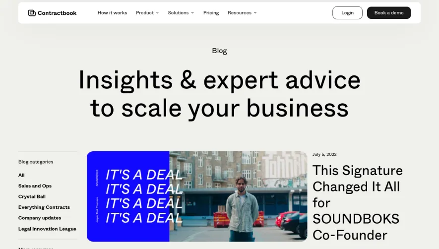
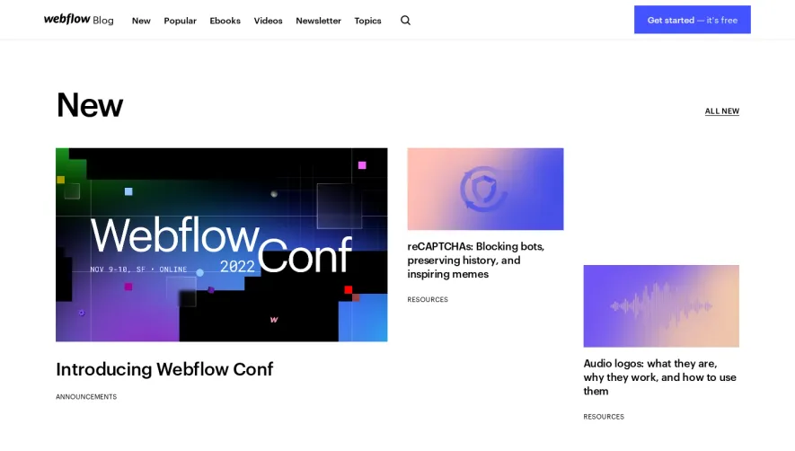
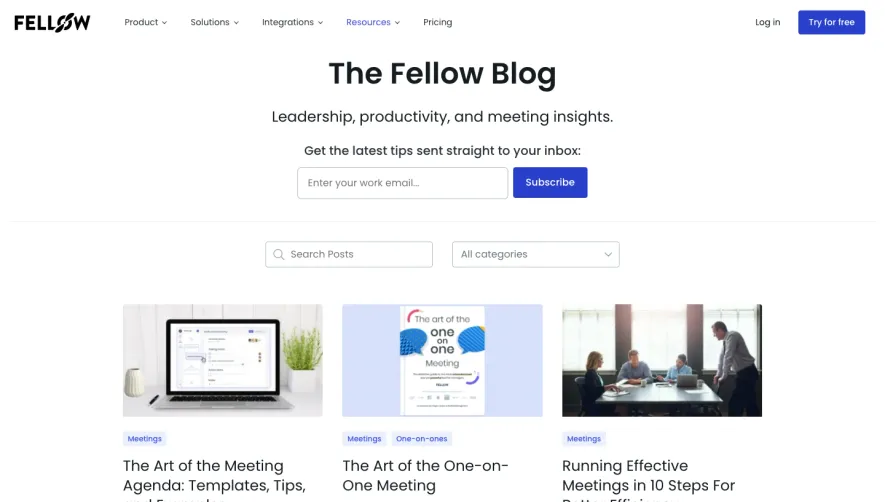
Overall Style and Aesthetic
Spendesk's blog exudes a clean, contemporary aesthetic that cleverly balances professionalism with a hint of playfulness. The interface embraces generous white space, giving content room to breathe and keeping user attention on the articles. Rounded edges, subtle shadows, and lively accent colors inject energy without overwhelming the primary function: content consumption. Layout and Structure
The page structure is both intuitive and engaging. A prominent hero section introduces featured stories, drawing users in immediately with bold headlines and compelling visuals. Below, content is organized into tidy, card-style grids and curated categories, making navigation effortless. There are no distractions—each section has a clear function, culminating in a comprehensive yet elegantly simple footer with further links and resources. Visual Elements
Original illustrations are a standout, blending geometric shapes, friendly characters, and crisp iconography. These, together with strategically placed photographs, create an approachable atmosphere. Featured posts often boast custom imagery, adding continuity and visual interest as users scroll. Color Palette and Typography
Spendesk opts for a sleek palette of deep blues, rich teals, and vibrant yellows—colors that project credibility and innovation. Typography is clear and sophisticated: headers use a bold sans-serif for impact, while body text is highly legible, supporting a smooth reading experience. Density and hierarchy are meticulously tuned through font weight and ample spacing. User Experience Patterns
Navigation is straightforward, with a sticky top menu and smart filtering on desktop and mobile. CTAs—such as newsletter signups—are boldly styled, yet never intrusive. Scroll interactions are smooth, with subtle hover effects and elegant transitions that guide attention organically. Unique or Notable Design Choices
Distinctive illustrations, personalized author avatars, and highlighted topic tags create a uniquely inviting, editorial feel uncommonly found in SaaS blogs. The overall vibe is credible yet inviting—conveying thought leadership while remaining welcoming to readers.