Design with AI
Generate a new design based on this screen using your own content.
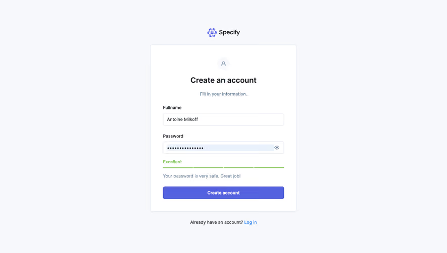
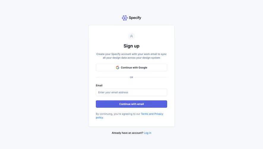
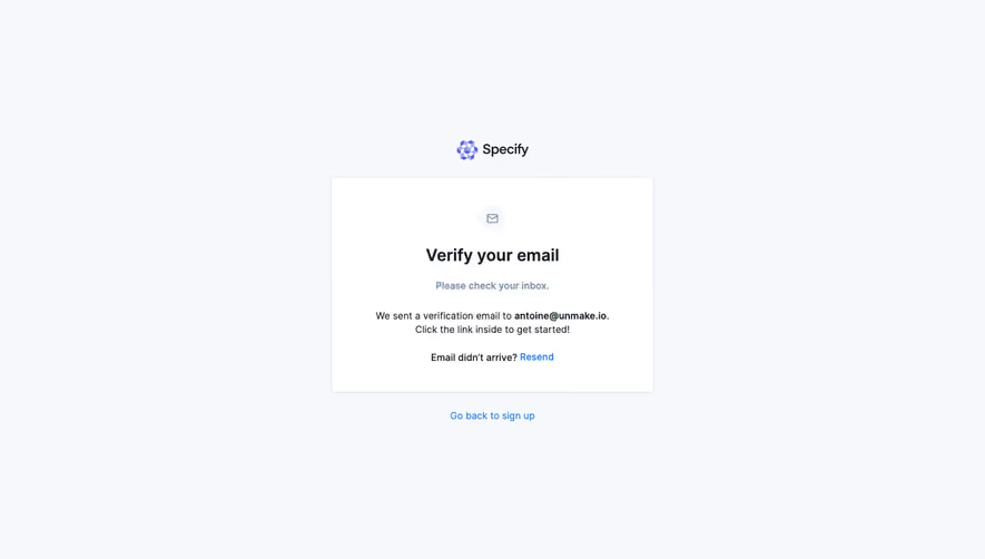
# Design from Reference: Specify Account Setup
Create an original, high-fidelity visual design inspired by the reference. Prioritize composition, typography, colors, spacing, and component styling over technical implementation.
## Reference
- **Product:** Specify
- **Category:** Account Setup
- **Screenshot:** https://cdn.prod.website-files.com/5e9dc792e1210c5325f7ebbc/6acbba04d37e66e942ffbd1e_6acb70be3044374e8e657450_cms-0bbc21b9ead8bb63c20bc2a2.webp
Analyze the screenshot first. If inaccessible, request it rather than guessing.
## Content
{{content.instructions}}
{{content.data}}
Preserve essential messaging and factual accuracy. Adapt structure and copy length for visual balance; never invent product claims.
## Visual Design
### Overall aesthetic
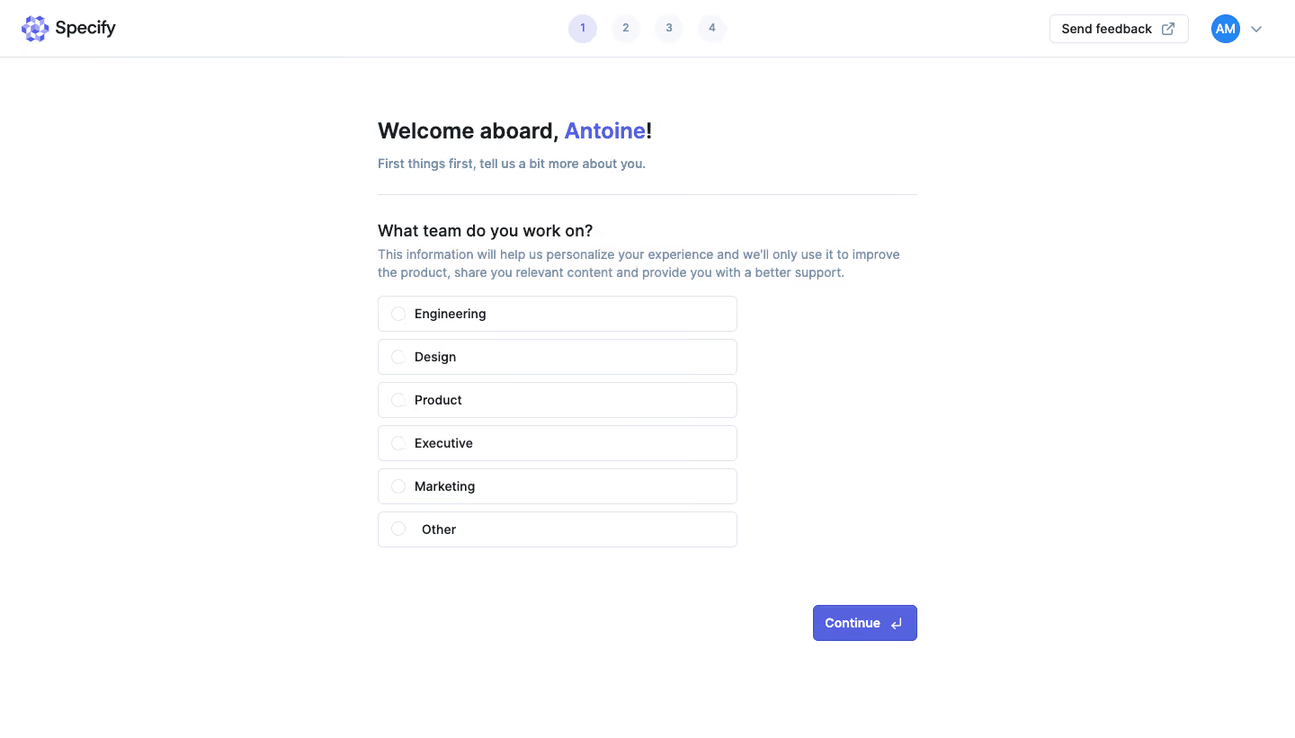
- **Character:** A minimal white onboarding questionnaire with purple progress/action accents and quiet blue-gray explanatory text.
- **Focus:** A single team-selection question occupies a narrow column without marketing imagery or an enclosing card.
### Page composition
- **Capture:** The source is 1440 × 821 image pixels. A 1× CSS scale is plausible but unverified.
- **Header:** Specify branding sits left, four progress circles center, and feedback/avatar controls right above a thin divider.
- **Main column:** A roughly 600-pixel-wide area begins near x=420, with a welcome heading, short introduction and horizontal rule.
- **Question:** A section heading and two-line explanation precede six vertically stacked radio-like choices, each about 400 pixels wide.
- **Action:** Continue sits at the lower right of the wider content column, leaving substantial whitespace below/left.
### Information hierarchy
- **Welcome:** The user's first name is highlighted in purple within the bold greeting; the personal name need not be reproduced.
- **Question:** “What team do you work on?” is the main form prompt.
- **Options:** Six equal rows cover Engineering, Design, Product, Executive, Marketing and Other. No radio appears selected.
- **Progression:** The first of four header steps is active; Continue is the only filled form action.
### Typography
- **Family:** A clean sans serif is visible; exact font identity is unverified.
- **Heading:** Approximately 24 image pixels, bold, with 30-pixel line height.
- **Question:** Around 18 pixels, semibold; supporting copy is about 14 pixels with 20-pixel line height.
- **Options/actions:** Approximately 14 pixels, medium to semibold.
### Colors & surfaces
- **Measured palette:** ICC-aware sRGB sampling yields white #FFFFFF, pale outline #DFE4ED, purple-blue #5562E0, dark text #191E25 and muted blue-gray #7B8CA4.
- **Progress surfaces:** Pale #F6F8FB and lavender #E6E6FA distinguish inactive/current step backgrounds.
- **Treatment:** Choices have thin pale borders and small radii around 5 pixels; the overall page remains flat and shadow-free.
### Components
- **Progress tracker:** Four numbered circles use a purple-tinted current state and faint future states.
- **Selection rows:** Six roughly 400 × 40-pixel outlined rectangles combine an empty circular indicator and left-aligned label.
- **Continue:** A roughly 116 × 40-pixel purple button includes a return-key symbol after its label.
- **Header utilities:** A compact outlined Send feedback control includes an external-link icon, followed by avatar and dropdown chevron.
### Visual rhythm
- **Spacing:** Approximately 8-pixel vertical gaps separate choices; larger 24–32-pixel intervals distinguish introductory and question blocks.
- **Alignment:** Greeting, rule, question and choices share one left edge, while Continue aligns with the column's right edge.
- **Whitespace:** The narrow form leaves broad side margins and a calm empty lower area.
### Responsive
- **Recommendation:** Keep the questionnaire within viewport width minus 32–40 CSS pixels and let explanatory text wrap.
- **Recommendation:** Preserve full-width option tap targets and simplify header utilities on phones. No mobile state is captured.
### Adaptation guidance
- **Preserve:** Retain one focused question, equal option rows and visible step progress.
- **Implement:** Use an accessible radio group with a distinct selected state and clear keyboard focus; interaction behavior is unverified.
- **Personalization:** Highlight a generic first name in examples rather than copying the captured identity.
Use this context to reproduce the reference's visual language: layout, typography, colors, spacing, borders, radii, and distinctive elements. The screenshot takes priority if descriptions conflict.
## Direction
{{preferences.fidelityInstructions}}
## Output
{{output.instructions}}
Deliver a polished, cohesive design with precise alignment, hierarchy, and spacing. Produce the requested visual artifact, not just a description. If unsupported, explain the limitation.