Design with AI
Generate a new design based on this screen using your own content.
# Design from Reference: Slite Onboarding Email Flow
Create an original, high-fidelity visual design inspired by the reference. Prioritize composition, typography, colors, spacing, and component styling over technical implementation.
## Reference
- **Product:** Slite
- **Category:** Onboarding Email
- **Screenshot:** https://cdn.prod.website-files.com/5e9dc792e1210c5325f7ebbc/6acbbbe4f023ce865170e061_6acbbb24d37e66e942004701_cms-d818610522ccd005060037bd.webp
Analyze the screenshot first. If inaccessible, request it rather than guessing.
## Content
{{content.instructions}}
{{content.data}}
Preserve essential messaging and factual accuracy. Adapt structure and copy length for visual balance; never invent product claims.
## Visual Design
### Overall aesthetic
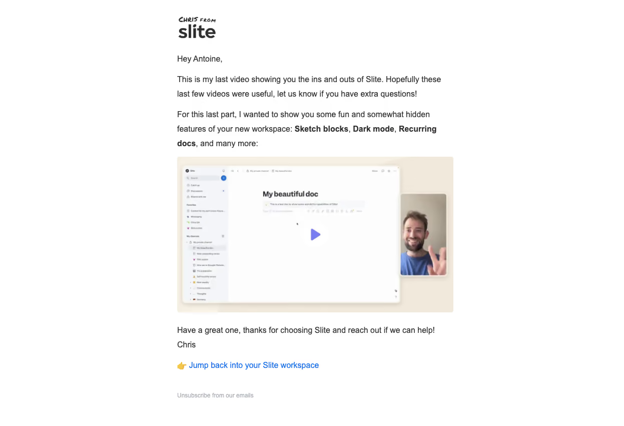
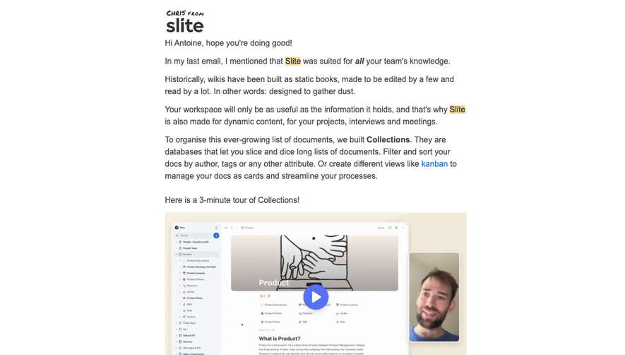
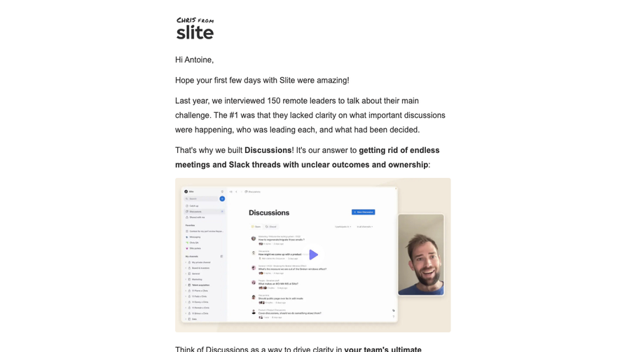
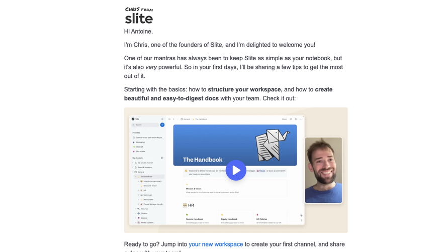
- **Character:** A personal, plain white onboarding email with a small informal brand lockup, conversational paragraphs and a large tutorial-video thumbnail.
- **Evidence scale:** Original 1247 × 851 pixels. Dimensions below are observed image-pixel estimates; email-client zoom and CSS scale are unverified.
### Page composition
- **Column:** An approximately 552 px content column begins around x354 and runs from a small top logo to a muted unsubscribe line near the bottom.
- **Opening:** A handwritten sender note over the Slite wordmark precedes a greeting and two short explanatory paragraphs.
- **Media:** A roughly 552 × 312 px video thumbnail spans the column beneath the introduction.
- **Closing:** A short sign-off and sender name precede a blue workspace-return link with a pointing-hand emoji, then a separated unsubscribe link.
### Information hierarchy
- **Personal framing:** The sender/brand lockup and greeting make the message feel individually written.
- **Feature emphasis:** Three feature names within the second paragraph are bold, breaking up otherwise regular copy.
- **Tutorial:** The broad thumbnail is the strongest visual object and contains a purple play symbol.
- **Actions:** A bright blue text link below the sign-off is the main explicit navigation link; unsubscribe is smaller and muted.
### Typography
- **Body:** Unverified sans-serif, approximately 16 px regular with 28–29 px line height.
- **Emphasis:** Bold feature phrases use roughly 700 weight at the same body size.
- **Brand:** Large bold Slite wordmark paired with a small handwritten uppercase sender phrase.
- **Footer:** Approximately 12 px muted unsubscribe text; main link remains at body size.
- **Tracking:** Neutral body spacing with no decorative paragraph styling.
### Colors & surfaces
- **Base:** White #FFFFFF canvas with neighboring near-white #FDFDFD pixels.
- **Text:** Measured dark #302F2F supplies the body and brand.
- **Media surround:** Warm beige #F1E9DB and #F6EFE3 frame the tutorial composition.
- **Embedded UI:** Pale #F4F5F9 surfaces and white document area appear inside the thumbnail.
- **Accents:** Purple play icon, bright blue return link and muted blue-gray unsubscribe text provide limited color.
### Components
- **Video thumbnail:** Small approximately 4 px corner radius, warm background and soft shadows behind an embedded document-app screenshot.
- **Thumbnail anatomy:** A miniature navigation sidebar and white document canvas fill most of the image; a portrait video inset overlaps its right side.
- **Play treatment:** Centered purple triangle appears over the document image; playback behavior is not verified.
- **Text link:** Unboxed blue return-to-workspace phrase with a leading emoji.
- **Unsubscribe:** Small muted text link with substantial space above, aligned with the content column.
### Visual rhythm
- **Paragraph spacing:** Roughly 16–20 px separates text blocks; generous line height supports a casual reading pace.
- **Media spacing:** The thumbnail follows the introduction closely, while the closing paragraph has about 24 px separation beneath it.
- **Footer spacing:** Approximately 44–48 px separates the main return link and unsubscribe.
- **Alignment:** Logo, greeting, paragraphs, thumbnail and footer all share one clean left edge.
### Responsive
- **Observed limit:** Only this email rendering is visible; no client-specific or mobile layout is established.
- **Recommendation:** Use a fluid single column capped near the observed width, with at least 20 px mobile gutters.
- **Media handling:** Scale the thumbnail proportionally and retain readable body text instead of scaling the entire email.
### Adaptation guidance
- **Retain:** Combine a named sender, brief feature-led explanation and one clear tutorial preview.
- **Implement:** Prefer plain paragraphs, selective bold emphasis and a simple text action over multiple competing buttons.
- **Verify:** Confirm font rendering, image accessibility text and link targets separately; the screenshot does not establish a live video or workspace action.
Use this context to reproduce the reference's visual language: layout, typography, colors, spacing, borders, radii, and distinctive elements. The screenshot takes priority if descriptions conflict.
## Direction
{{preferences.fidelityInstructions}}
## Output
{{output.instructions}}
Deliver a polished, cohesive design with precise alignment, hierarchy, and spacing. Produce the requested visual artifact, not just a description. If unsupported, explain the limitation.