Generate a new design based on this screen using your own content.
Thank you! Your submission has been received!
Oops! Something went wrong while submitting the form.
# Design from Reference: Slite Company Insights
Create an original, high-fidelity visual design inspired by the reference. Prioritize composition, typography, colors, spacing, and component styling over technical implementation.
## Reference
- **Product:** Slite
- **Category:** Company Insights
- **Screenshot:**
Analyze the screenshot first. If inaccessible, request it rather than guessing.
## Content
{{content.instructions}}
{{content.data}}
Preserve essential messaging and factual accuracy. Adapt structure and copy length for visual balance; never invent product claims.
## Visual Design
Use this context to reproduce the reference's visual language: layout, typography, colors, spacing, borders, radii, and distinctive elements. The screenshot takes priority if descriptions conflict.
## Direction
{{preferences.fidelityInstructions}}
## Output
{{output.instructions}}
Deliver a polished, cohesive design with precise alignment, hierarchy, and spacing. Produce the requested visual artifact, not just a description. If unsupported, explain the limitation.
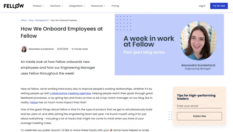
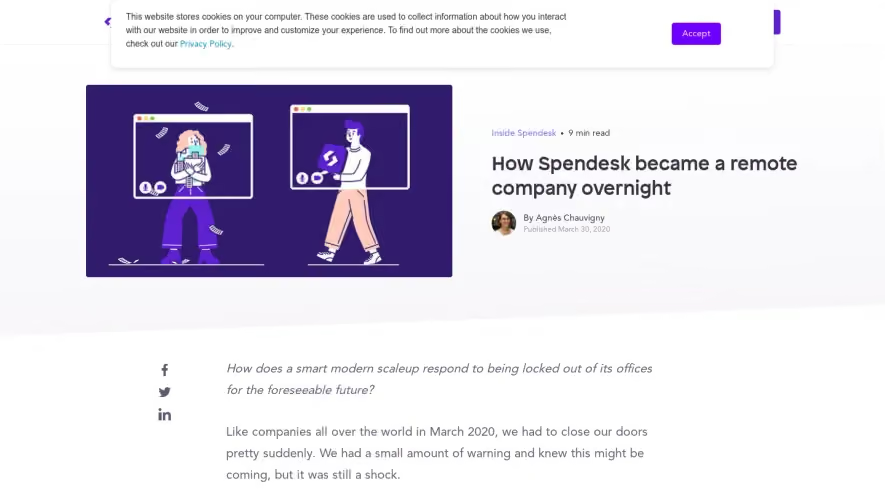
Slite’s blog page exemplifies a sophisticated, minimalist aesthetic, balancing ample white space with energetic accents. The design is visually calm and professional, yet approachable—reflecting a modern SaaS personality that feels both creative and credible.
Layout and Structure
Content takes center stage in a focused, single-column layout. The hero section is understated: concise text, lightly decorated with abstract line art, rather than heavy visuals. There are no disruptive banners or sidebar clutter; instead, the structure guides users seamlessly from the article’s title down through clearly defined content blocks and in-article callouts, ending in a modular and inviting footer.
Visual Elements
Illustrative touches—like line drawings and subtle graphic badges—add visual interest without overwhelming. Featured images and author avatars break up text, while in-text highlights and pull quotes employ color for emphasis. There are no complex animations or videos; instead, simplicity supports scannability and focus.
Color Palette and Typography
The palette is crisp and restrained: pure whites, deep blacks, and signature Slite blues, with judicious use of muted pastels for hierarchy. Typography is clean and geometric (likely Inter or a similar sans-serif), with bold weighting for headings and excellent text legibility, promoting effortless readability.
User Experience Patterns
Navigation is understated—a sticky top bar remains accessible but never intrusive. Sticky share CTAs and subtle in-article links encourage quiet interaction. CTAs blend environment cues rather than shouting for attention, supporting considered engagement.
Unique or Notable Design Choices
This page stands out through its editorial coherence: storytelling is visually prioritized, with decorative UI reduced to supporting roles. The site’s quiet confidence—and near-invisible interface—creates an inviting, user-first impression that mirrors aspirational SaaS product design.