Design with AI
Generate a new design based on this screen using your own content.
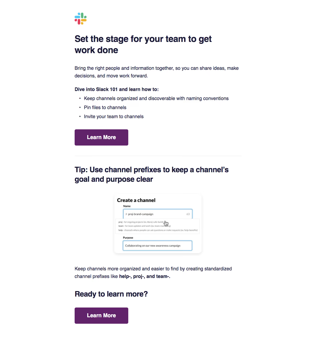
# Design from Reference: Slack Onboarding Email Flow
Create an original, high-fidelity visual design inspired by the reference. Prioritize composition, typography, colors, spacing, and component styling over technical implementation.
## Reference
- **Product:** Slack
- **Category:** Onboarding Email
- **Screenshot:** https://cdn.prod.website-files.com/5e9dc792e1210c5325f7ebbc/6acbbf624d71070f5fd41224_6acbbe83151c40fa4075f33d_cms-cf924c456804022820343075.webp
Analyze the screenshot first. If inaccessible, request it rather than guessing.
## Content
{{content.instructions}}
{{content.data}}
Preserve essential messaging and factual accuracy. Adapt structure and copy length for visual balance; never invent product claims.
## Visual Design
### Overall aesthetic
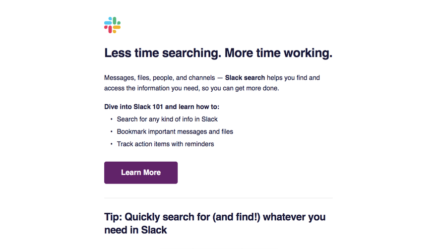
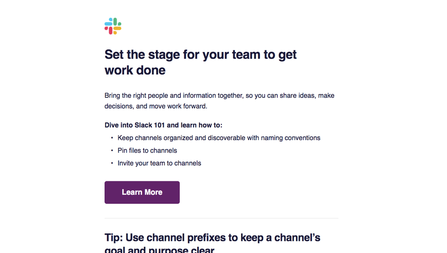
- **Character:** Clear educational onboarding email with bold navy headings, purple actions and a practical interface example.
### Page composition
- **Canvas:** 1338 × 1419 screenshot pixels; rendered CSS scale is unverified.
- **Structure:** Narrow centered column; small brand icon; large opening heading; introduction and three bullets; Learn More; divider; tip heading/image/explanation; repeated action.
### Information hierarchy
- **Priority:** Team-work headline and capability list lead to education. The lower tip provides a concrete channel-naming example.
### Typography
- **Family:** Neutral sans-serif with strong bold headings; exact font is unverified.
- **Scale:** Estimated rendered main heading 38–40px, section headings 30–32px, body 20px and action 22px bold.
### Colors & surfaces
- **Sampled palette:** White #FFFFFF; purple #612369; dark navy #1A1938.
- **Accents:** Multicolor brand icon and pale blue form focus outlines inside the demonstration image.
### Components
- **Actions:** Left-aligned purple rectangles with approximately 5px radius and 64–68px screenshot-pixel height.
- **Example:** Small centered white channel-creation screenshot with soft shadow, surrounded by explanatory text.
- **Divider:** Thin pale horizontal rule separates introduction from tip.
### Visual rhythm
- **Spacing:** Approximately 40–48 screenshot-pixel gaps between major blocks; left-aligned copy shares a consistent reading edge.
### Responsive
- **Guidance:** Mobile is not shown. Use fluid images and comfortable body size, keeping the tip/action sequence intact.
### Adaptation guidance
- **Transfer:** Preserve education plus concrete example and repeated next step. Adapt terminology and screenshot to the target collaboration workflow.
Use this context to reproduce the reference's visual language: layout, typography, colors, spacing, borders, radii, and distinctive elements. The screenshot takes priority if descriptions conflict.
## Direction
{{preferences.fidelityInstructions}}
## Output
{{output.instructions}}
Deliver a polished, cohesive design with precise alignment, hierarchy, and spacing. Produce the requested visual artifact, not just a description. If unsupported, explain the limitation.