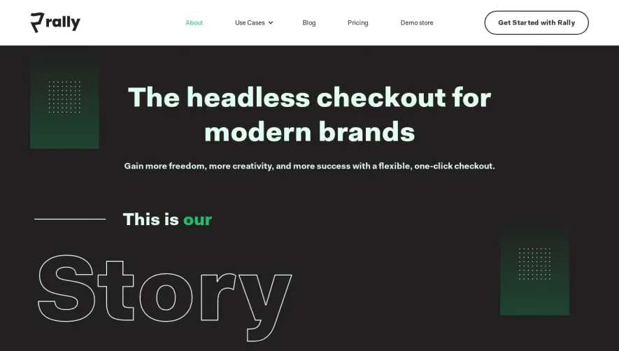
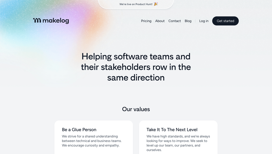
Generate a new design based on this screen using your own content.
Thank you! Your submission has been received!
Oops! Something went wrong while submitting the form.
# Design from Reference: Slack About Page
Create an original, high-fidelity visual design inspired by the reference. Prioritize composition, typography, colors, spacing, and component styling over technical implementation.
## Reference
- **Product:** Slack
- **Category:** About Page
- **Screenshot:** https://cdn.prod.website-files.com/5e9dc792e1210c5325f7ebbc/62eca43a08e2d808d329ea36_1659674826526-62ec9c9cd6406557d699bad1_screenshot-device-dcf656d10cdcb2aef61e10406997407b-1659616678056.webp
Analyze the screenshot first. If inaccessible, request it rather than guessing.
## Content
{{content.instructions}}
{{content.data}}
Preserve essential messaging and factual accuracy. Adapt structure and copy length for visual balance; never invent product claims.
## Visual Design
Use this context to reproduce the reference's visual language: layout, typography, colors, spacing, borders, radii, and distinctive elements. The screenshot takes priority if descriptions conflict.
## Direction
{{preferences.fidelityInstructions}}
## Output
{{output.instructions}}
Deliver a polished, cohesive design with precise alignment, hierarchy, and spacing. Produce the requested visual artifact, not just a description. If unsupported, explain the limitation.
The hero hits hard. That deep plum background with white serif type feels confident without trying too hard. "Make work life simpler, more pleasant and more productive." Clean value prop, no fluff. The three big stats below (169k+, 65, 150+) give instant credibility with minimal visual noise.
Trust logos done right
The logo bar featuring Uber, Netflix, Intuit, and others sits on white space and breathes. No cramped grid. It's proof without being pushy.
Illustration as personality
The custom illustrations throughout, especially the globe scene in the "Who we are" section, inject warmth into what could easily feel like another generic SaaS page. The color palette stays tight: purples, greens, warm yellows, and that signature Slack plum.
Structure that scales gracefully
The office locations section uses a clean card grid that handles six cities without feeling cluttered. The news section at the bottom mirrors this pattern. Typography stays consistent with a mix of serif headings and clean sans-serif body copy. That final purple CTA banner is impossible to scroll past.