Design with AI
Generate a new design based on this screen using your own content.
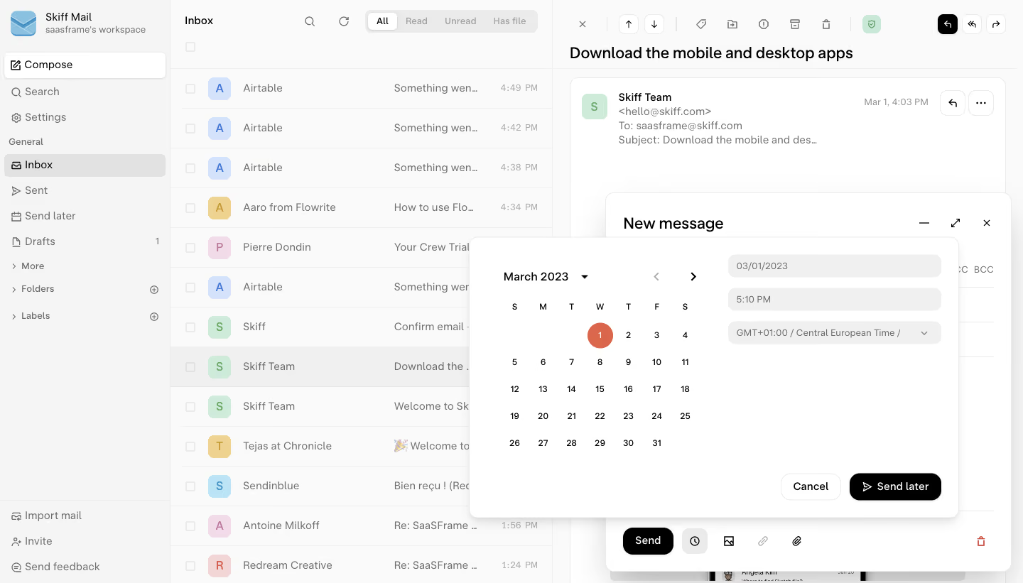
# Design from Reference: Skiff Schedule Message
Create an original, high-fidelity visual design inspired by the reference. Prioritize composition, typography, colors, spacing, and component styling over technical implementation.
## Reference
- **Product:** Skiff
- **Category:** Add & Edit
- **Screenshot:** https://cdn.prod.website-files.com/5e9dc792e1210c5325f7ebbc/6acbbaa3d01e364847659bfd_6acb7107b10d21a746c3e807_cms-26252972d08c21a488e3cb61.webp
Analyze the screenshot first. If inaccessible, request it rather than guessing.
## Content
{{content.instructions}}
{{content.data}}
Preserve essential messaging and factual accuracy. Adapt structure and copy length for visual balance; never invent product claims.
## Visual Design
### Overall aesthetic
- **Style:** Neutral email client with layered scheduling popover and black confirmation action.
### Page composition
- **Canvas:** 1440 × 821 screenshot px.
- **Structure:** Sidebar, inbox list, message reader; composer lower-right; scheduling panel overlays composer.
- **Panel:** Calendar left, date/time/timezone fields right, Cancel/Send later below.
### Information hierarchy
- **Primary:** Calendar/date scheduling choice.
- **Action:** Black Send later.
- **Context:** Composer and inbox visible behind.
### Typography
- **Family:** Neutral sans serif; exact identity unverified.
- **Panel labels:** Approximately 14px.
- **Calendar:** 12px; message titles 20–22px.
- **Precision:** Screenshot estimates.
### Colors & surfaces
- **Surfaces:** #FFFFFF/#FAFAFA.
- **Controls:** #F5F5F5/#F0F0F0.
- **Selected navigation:** #EBEBEB.
- **Action:** Black; selected date coral.
- **Precision:** Neutral samples.
### Components
- **Calendar:** Month navigation, weekday grid, filled selected date.
- **Inputs:** Rounded pale fields.
- **Popover:** White rounded rectangle with diffuse shadow.
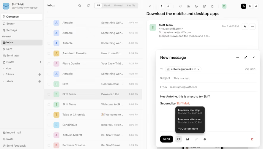
- **Composer:** Floating card with toolbar and send controls.
### Visual rhythm
- **Density:** Compact calendar and fields above broad empty panel space.
- **Layering:** Shadows distinguish popover from composer and reader.
### Responsive
- **Observed:** Desktop only.
- **Recommendation:** Stack calendar/fields and use full-screen composer on narrow screens.
### Adaptation guidance
- **Preserve:** Clear date/time/timezone confirmation.
- **Privacy:** Replace recipients/messages.
- **Behavior:** Scheduling/delivery unverified.
Use this context to reproduce the reference's visual language: layout, typography, colors, spacing, borders, radii, and distinctive elements. The screenshot takes priority if descriptions conflict.
## Direction
{{preferences.fidelityInstructions}}
## Output
{{output.instructions}}
Deliver a polished, cohesive design with precise alignment, hierarchy, and spacing. Produce the requested visual artifact, not just a description. If unsupported, explain the limitation.