Overall Style and Aesthetic
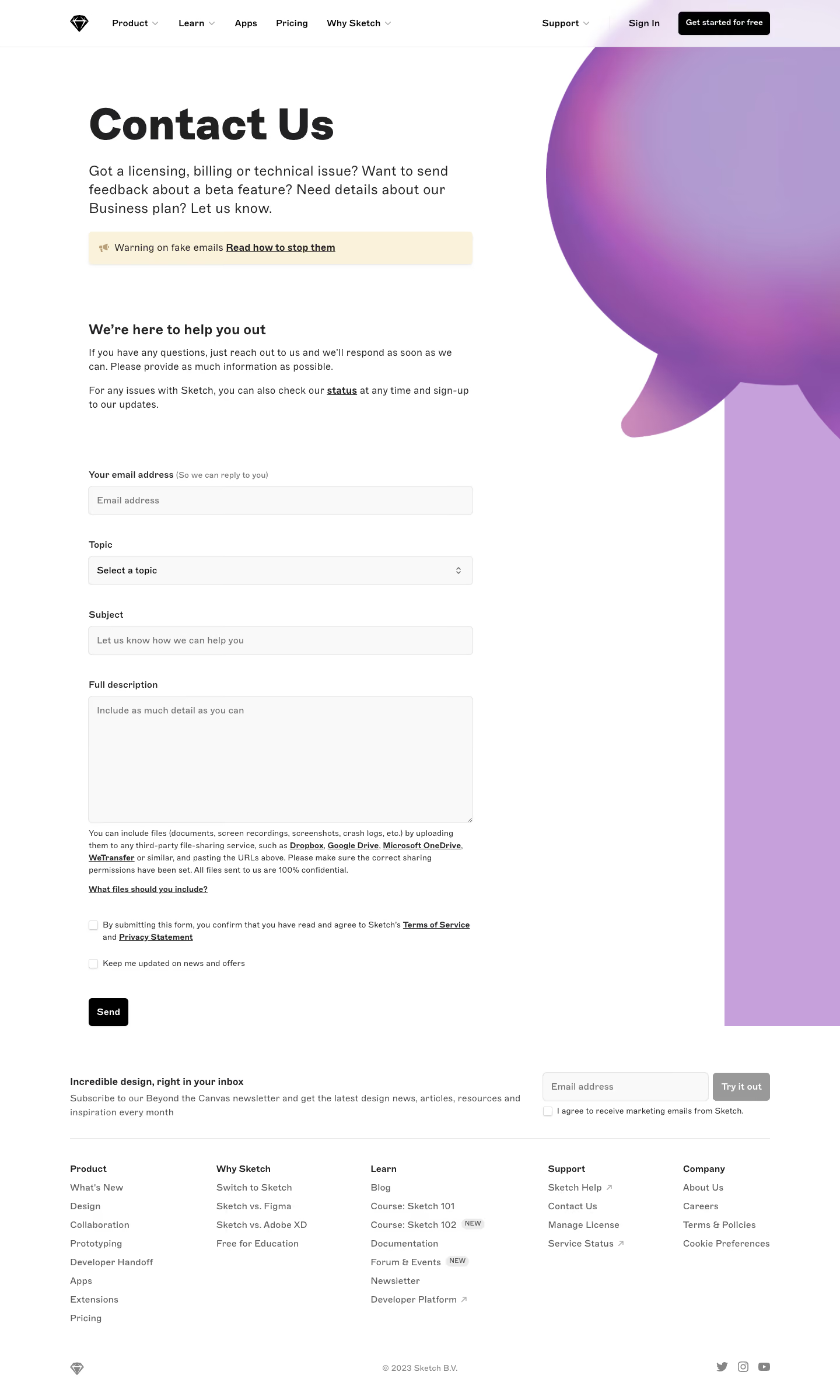
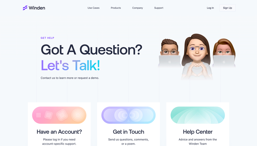
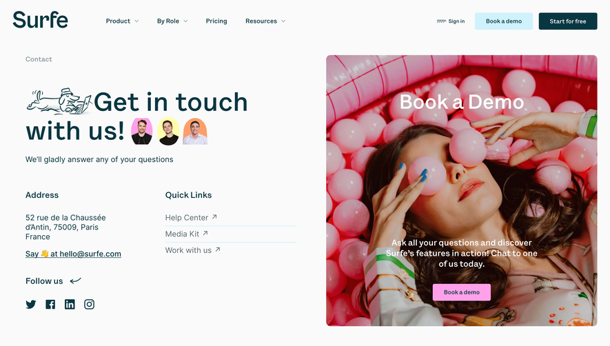
Sketch’s contact page epitomizes a crisp, modern minimalism that balances professionalism with approachability. The design leans on generous white space, clean lines, and subtle bursts of color, projecting a calming, trustworthy, and inviting atmosphere that feels both friendly and refined. Layout and Structure
The layout is straightforward and user-centered, beginning with a concise hero section that immediately clarifies the page’s purpose. Below, content is organized into distinct, easily scannable sections by topic—the result is a seamless support journey, allowing users to quickly find the help they need without cognitive overload. The structured hierarchy, from clear headings to the methodical arrangement of contact options, minimizes friction at every step. Visual Elements
Rather than relying on heavy imagery, Sketch employs custom icons and gentle color accents, using them to draw attention to key CTAs and information areas. The interface feels light and uncluttered, while playful illustrated icons inject a hint of personality, softening the formality of the support process. Color Palette and Typography
A restrained palette—mostly white and soft grays, punctuated by Sketch’s signature golden yellow—offers vibrancy without overwhelming the senses. The modern sans-serif typography is both readable and elegant, with clear typographic hierarchy making navigation effortless and instructions unmistakable. User Experience Patterns & Unique Design Choices
Thoughtfully placed CTAs, sticky navigation, and smart input forms streamline the user journey. Notably, the tone throughout is empathetic and supportive, echoed visually by rounded buttons and approachable microcopy. The absence of distraction (no testimonials or upsell banners) puts all focus on customer needs—an uncommon but effective choice that builds trust and sets a reassuring tone.