Design with AI
Generate a new design based on this screen using your own content.
# Design from Reference: Sidebird User Onboarding
Create an original, high-fidelity visual design inspired by the reference. Prioritize composition, typography, colors, spacing, and component styling over technical implementation.
## Reference
- **Product:** Sidebird
- **Category:** User Onboarding
- **Screenshot:** https://cdn.prod.website-files.com/5e9dc792e1210c5325f7ebbc/6acbbb66151c40fa40746184_6acbba67ca6f3d51a64e5655_cms-385970591808a215f4184e57.webp
Analyze the screenshot first. If inaccessible, request it rather than guessing.
## Content
{{content.instructions}}
{{content.data}}
Preserve essential messaging and factual accuracy. Adapt structure and copy length for visual balance; never invent product claims.
## Visual Design
### Overall aesthetic
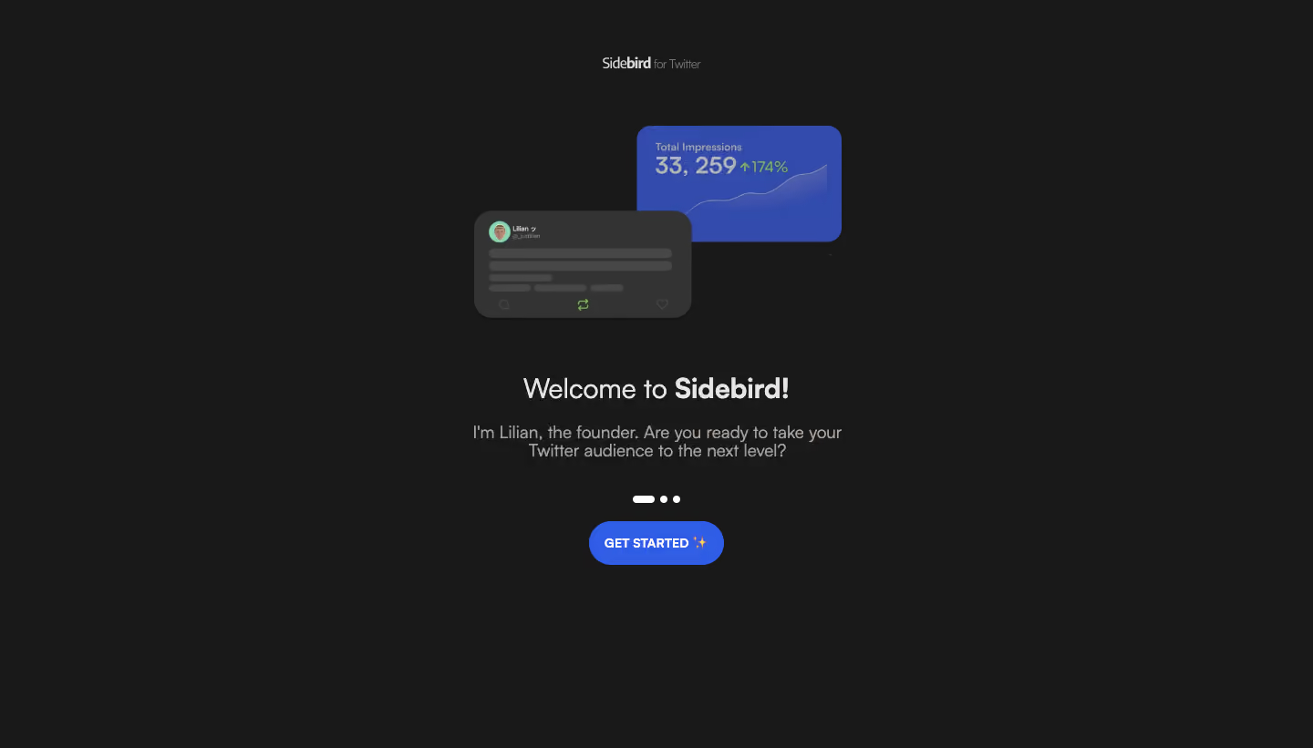
- **Style:** Compact dark onboarding welcome with a product-growth illustration and vivid blue action.
- **Visual character:** Charcoal canvas, centered light text, small brand lockup, and broad empty margins.
- **Illustration:** Overlapping social-post and impressions-chart cards provide the primary visual evidence.
- **Surface treatment:** Cards and action are rounded; the onboarding content sits directly on the page.
### Page composition
- **Screenshot size:** 1440 × 821 image px. Capture-to-CSS scale is unverified.
- **Brand:** Small Sidebird for Twitter lockup centered near the top.
- **Illustration placement:** Overlapping cards span approximately x=520–925 and y=138–350 screenshot px.
- **Text group:** Welcome heading around y=414 px, followed by a short two-line founder introduction.
- **Progress/action:** Three-position indicator below copy, then centered Get Started pill.
- **Content width:** Main text group approximately 460 screenshot px wide.
### Information hierarchy
- **Primary visual:** Bright blue impressions card introduces the growth theme before the welcome message.
- **Primary text:** Welcome to Sidebird uses a lighter first phrase and bold product name.
- **Supporting copy:** Founder introduction and audience-growth question establish context.
- **Progress:** First indicator is elongated; two later positions are small dots.
- **Action:** Blue uppercase Get Started is the only visible main action.
### Typography
- **Family:** Rounded proportional sans serif; exact family unverified.
- **Heading:** Approximately 30 screenshot px, regular-to-bold mixed weight, line-height 38 px.
- **Supporting copy:** Approximately 18 screenshot px with 21–24 px line-height.
- **Action:** Approximately 14 screenshot px, bold uppercase.
- **Brand:** Approximately 16 screenshot px with smaller muted qualifier.
- **Illustration text:** Small chart/post annotations are subordinate to the onboarding copy.
### Colors & surfaces
- **Canvas:** Sampled sRGB #191919.
- **Illustration neutrals:** Sampled #333333 and #474747 form the social-post card and placeholder lines.
- **Chart surface:** Sampled blue #324BAC with nearby #324CAE.
- **Primary action:** Sampled blue #305DE6.
- **Text:** Sampled off-white #E7E5E4 and muted warm gray #A7A29E.
- **Accent detail:** Green metric-change and repost symbols appear within the product illustration; they are local data accents.
### Components
- **Chart card:** Approximately 224 × 128 screenshot px, rounded corners around 16 px, small metric label, large value, and rising thin line plot.
- **Post card:** Approximately 240 × 118 screenshot px with about 20 px corners, small avatar, placeholder text lines, and social-action icons.
- **Layering:** Post card overlaps the lower-left of the blue chart, creating depth with subtle shadow.
- **Progress:** One short white capsule and two small white dots, roughly 7–8 px high.
- **CTA:** Approximately 148 × 48 screenshot px, pill radius around 24 px, white uppercase label, and sparkle emoji.
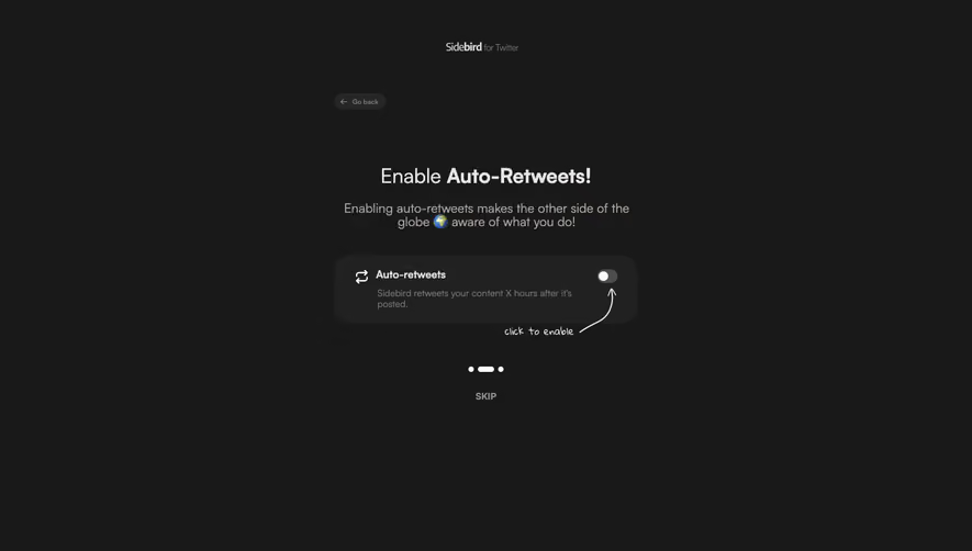
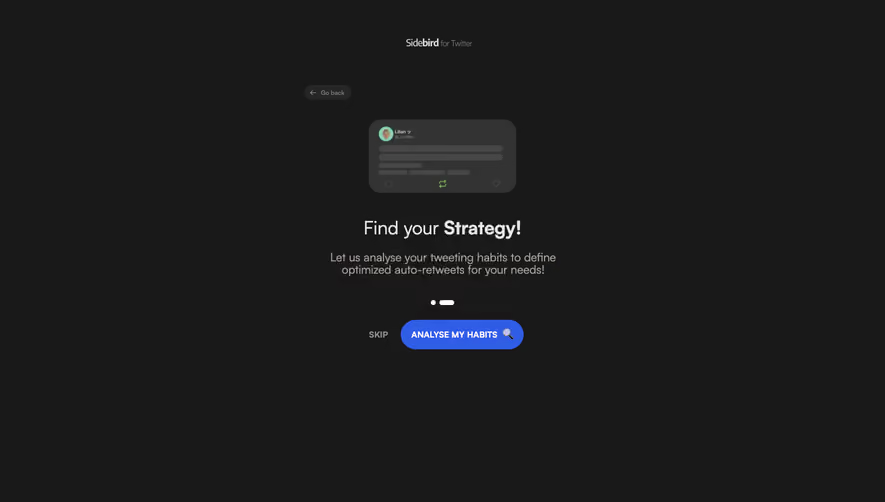
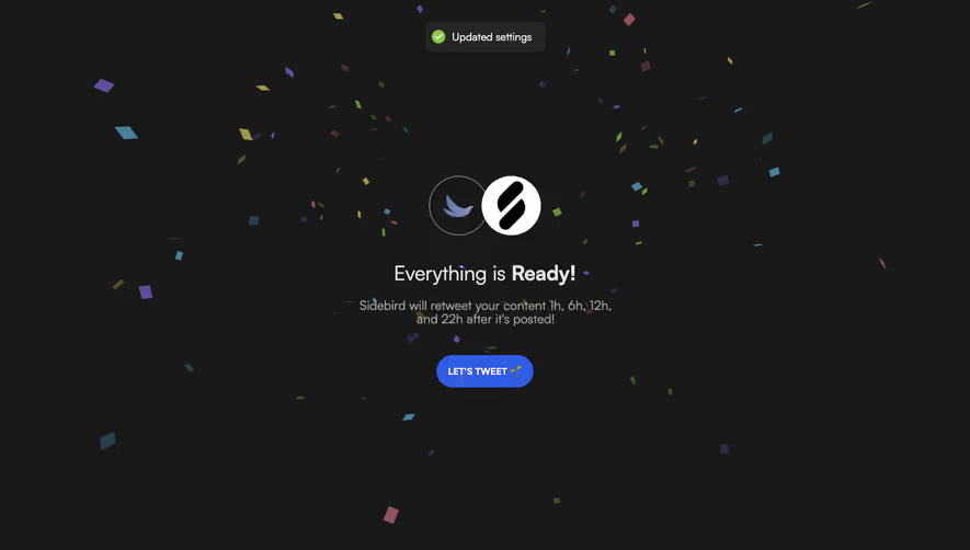
- **Observed state:** Welcome slide only; no later slide contents or transitions are visible.
### Visual rhythm
- **Centered axis:** Brand, illustration, heading, introduction, progress, and action share the page center.
- **Illustration-to-heading gap:** Approximately 60 px.
- **Heading-to-copy gap:** Approximately 20 px.
- **Copy-to-progress gap:** Approximately 40 px; action follows around 20 px below.
- **Outer space:** Large dark margins make the small onboarding group feel focused rather than crowded.
### Responsive
- **Observed version:** Desktop only.
- **Stack recommendation:** Keep the same single-column order.
- **Illustration recommendation:** Scale overlapping cards together so their relative placement remains intact.
- **Type recommendation:** Reduce heading toward 24–28 px if required; retain legible body text.
- **Action recommendation:** Preserve a comfortable pill target and sufficient clearance from progress indicators.
### Adaptation guidance
- **Preserve:** Dark canvas, blue product illustration, centered welcome hierarchy, and one bright action.
- **Brand adaptation:** Replace product lockup, founder introduction, and illustration with supplied identity and actual product evidence.
- **Metric fidelity:** Do not reuse the illustrated impressions total or growth percentage as a target-product claim.
- **Starting values:** Approximately 30 px heading, 18 px body, 48 px action height, and 16–20 px illustration radii.
- **Interaction fidelity:** The dots establish visual progress only; later screens and automatic transitions are unverified.
Use this context to reproduce the reference's visual language: layout, typography, colors, spacing, borders, radii, and distinctive elements. The screenshot takes priority if descriptions conflict.
## Direction
{{preferences.fidelityInstructions}}
## Output
{{output.instructions}}
Deliver a polished, cohesive design with precise alignment, hierarchy, and spacing. Produce the requested visual artifact, not just a description. If unsupported, explain the limitation.