Design with AI
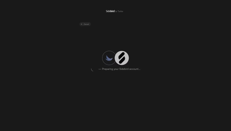
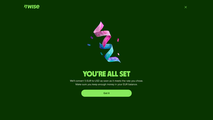
Generate a new design based on this screen using your own content.
# Design from Reference: Sidebird Success
Create an original, high-fidelity visual design inspired by the reference. Prioritize composition, typography, colors, spacing, and component styling over technical implementation.
## Reference
- **Product:** Sidebird
- **Category:** Success
- **Screenshot:** https://cdn.prod.website-files.com/5e9dc792e1210c5325f7ebbc/6acc0c5b3cd54160b13d151c_6acc083eca3783a9b9141a54_cms-384de09ebf03edb65329862a-v3.webp
Analyze the screenshot first. If inaccessible, request it rather than guessing.
## Content
{{content.instructions}}
{{content.data}}
Preserve essential messaging and factual accuracy. Adapt structure and copy length for visual balance; never invent product claims.
## Visual Design
### Overall aesthetic
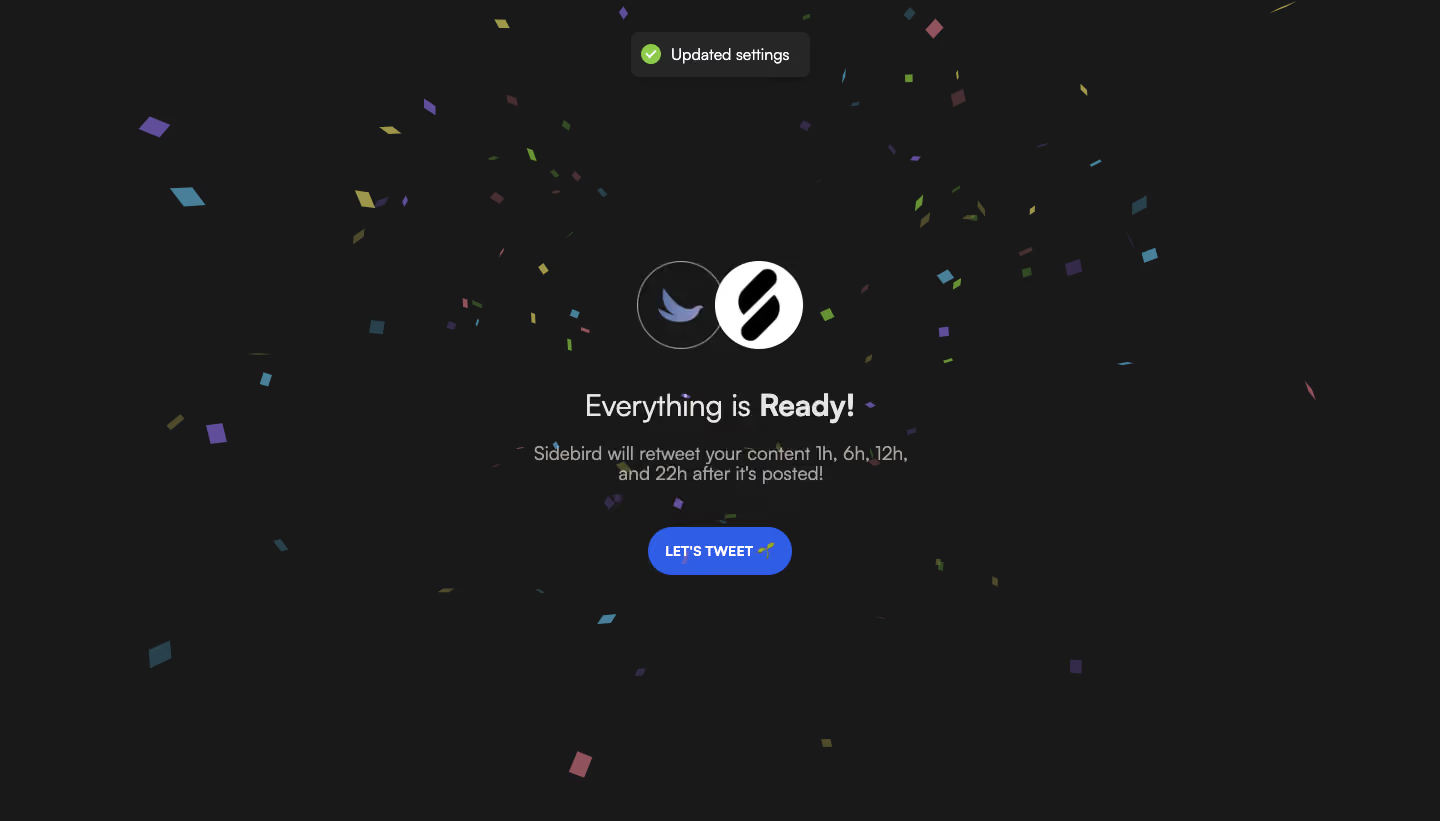
- **Character:** A celebratory completion screen combines a nearly black canvas, colorful confetti and a compact centered success message.
- **Focus:** Two overlapping circular product marks, a readiness heading and one bright blue action form a simple central composition.
### Page composition
- **Capture:** The source measures 1440 × 821 image pixels. Observed dimensions below approximate CSS only under an unverified 1× capture assumption.
- **Central stack:** Overlapping logos sit around y=260, followed by a heading, two-line schedule explanation and a pill action around y=525.
- **Notification:** A small dark toast is centered near the top, containing a green check and a short settings-update message.
- **Background:** Small irregular confetti pieces are scattered across the full canvas. No navigation, sidebar or footer is visible.
### Information hierarchy
- **Success identity:** The overlapping marks visually connect the two services before the text.
- **Heading:** A short readiness sentence uses heavier weight on its final word.
- **Explanation:** A muted two-line sentence summarizes the configured repost timing.
- **Next action:** A blue Let's Tweet pill provides the clear continuation route; the toast serves as secondary confirmation.
### Typography
- **Family:** A neutral sans serif is visible throughout; exact font identity is unverified.
- **Heading:** Approximately 32 px, with mixed regular/bold emphasis and around 38 px line height.
- **Supporting copy:** Approximately 20 px with 23–25 px leading, centered within a roughly 400 px width.
- **Controls:** Button and toast labels are approximately 14–16 px; the action uses bold uppercase text.
### Colors & surfaces
- **Measured foundation:** ICC-aware sRGB sampling yields #191919 for the background and #262626 for the toast.
- **Measured action:** Blue #305DE6 fills the primary pill.
- **Measured highlights:** White #FFFFFF and warm light gray #E7E5E4 appear in logos and prominent text.
- **Confetti:** Sampled accent pieces include purple #604E9A and blue-teal #497F99, alongside muted green, yellow and pink pieces.
- **Status:** A green circular check provides a distinct success cue in the toast.
### Components
- **Logo pair:** Two roughly 90 px circular marks overlap slightly; one has a fine gray outline on dark, while the other is a white disc with a black symbol.
- **Primary button:** A roughly 145 × 48 px blue pill contains a white label and small sprout symbol.
- **Toast:** A compact rounded dark rectangle has horizontal icon/text alignment, moderate padding and a subtle shadow.
- **Confetti layer:** Small rotated rectangles and irregular shapes vary in size, color and opacity, framing rather than enclosing the content.
### Visual rhythm
- **Centered cadence:** Logos, heading, explanation and action share a vertical centerline, with clear gaps between groups.
- **Open space:** Broad dark margins keep the success content readable despite scattered decorative pieces.
- **Emphasis contrast:** The bright action and white logo disc anchor the center; the toast provides a separate small highlight above.
### Responsive
- **Evidence boundary:** Only a desktop state is captured; responsive behaviors are recommendations.
- **Fluid stack:** Keep the message centered within safe mobile gutters and allow the explanation to wrap naturally.
- **Decoration:** Reduce confetti density around text and controls on narrow screens.
- **Motion access:** If confetti is animated, support reduced motion; motion itself is not verified in this still.
### Adaptation guidance
- **Completion pattern:** Reuse explicit confirmation, a short configuration summary and one clear next action.
- **Status accessibility:** Pair success color with a check icon and readable message, and announce transient notifications appropriately.
- **Content separation:** Treat repost schedules and service identities as configurable data rather than fixed design copy.
- **State boundaries:** The screenshot shows completion only; no posting action or subsequent result is verified.
- **Scale calibration:** Confirm observed pixel dimensions against the target CSS viewport before implementation.
Use this context to reproduce the reference's visual language: layout, typography, colors, spacing, borders, radii, and distinctive elements. The screenshot takes priority if descriptions conflict.
## Direction
{{preferences.fidelityInstructions}}
## Output
{{output.instructions}}
Deliver a polished, cohesive design with precise alignment, hierarchy, and spacing. Produce the requested visual artifact, not just a description. If unsupported, explain the limitation.