Overall Style and Aesthetic
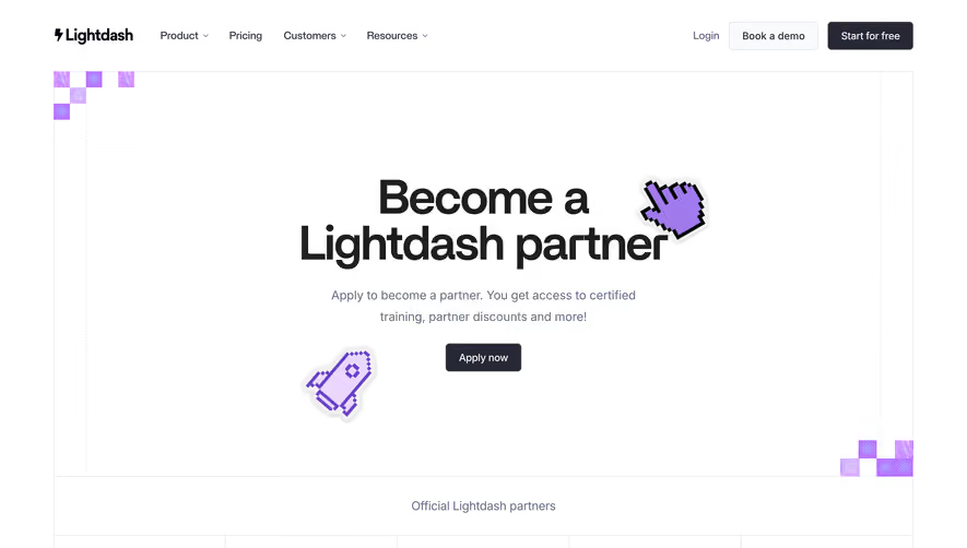
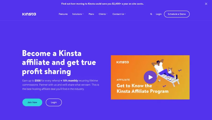
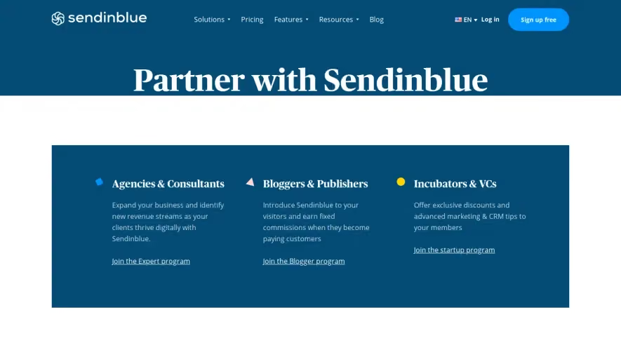
Shogun’s agency partners page exudes a clean, professional, and modern vibe, perfectly tailored for digital agencies and SaaS partners. The design uses ample white space, giving every element room to breathe, while subtle gradients and soft shadowing add depth without overwhelming the content. The site feels sophisticated yet approachable, positioning Shogun as both innovative and reliable. Layout and Structure
The page unfolds with a bold hero section that immediately communicates value and trust, supported by concise copy and a high-contrast call-to-action button. Sequentially, key benefits and partnership features are showcased in a modular grid layout, making information accessible at a glance. Throughout the page, testimonials add social proof, and strategically placed CTAs gently encourage engagement without being intrusive. The footer is comprehensive yet uncluttered, offering navigation, resources, and brand reinforcement. Visual Elements
Custom illustrations and clean iconography reinforce the brand’s modern identity. Subtle hover animations on buttons and cards add interactivity, creating a dynamic user experience. Rather than stock photography, the site uses bespoke graphics that communicate both technical prowess and creativity—enhancing memorability and professionalism. Color Palette and Typography
A restrained palette based on whites, deep blues, and accents of aqua-blue creates a tranquil, trustworthy atmosphere. Bold headlines use a geometric sans-serif font, ensuring clarity and hierarchy, while lighter body text supports readability. The typography maintains a visual rhythm, seamlessly guiding the user through each section. User Experience Patterns and Unique Choices
Persistent top navigation offers simple, intuitive access to all resources, while sticky CTAs invite action as users scroll. The linear flow from headline to CTA is seamless, with concise content blocks preventing cognitive overload. Notably, the balance between illustrations and succinct copy sets Shogun apart, ensuring clarity and visual engagement throughout the journey. The tone is both earnest and forward-thinking, inspiring confidence and curiosity for agency partners.