Design with AI
Generate a new design based on this screen using your own content.
# Design from Reference: Senja Imported From Twitter
Create an original, high-fidelity visual design inspired by the reference. Prioritize composition, typography, colors, spacing, and component styling over technical implementation.
## Reference
- **Product:** Senja
- **Category:** Import & Export
- **Screenshot:** https://cdn.prod.website-files.com/5e9dc792e1210c5325f7ebbc/6acbbbecf023ce865170e173_6acbbb3164a048f355a415a9_cms-072afd691d1a0bc05c5e1a5e.webp
Analyze the screenshot first. If inaccessible, request it rather than guessing.
## Content
{{content.instructions}}
{{content.data}}
Preserve essential messaging and factual accuracy. Adapt structure and copy length for visual balance; never invent product claims.
## Visual Design
### Overall aesthetic
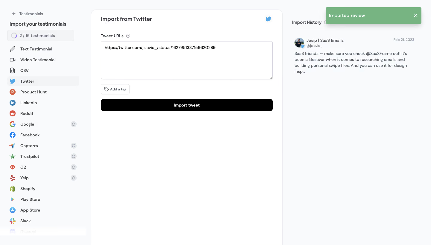
- **Character:** A practical testimonial-import workspace uses pale-gray chrome, a white central form, dark typography, colorful source icons and a green success toast.
- **Evidence:** The screenshot is 1440 × 821 pixels. Approximate CSS dimensions assume an unverified 1× capture density.
### Page composition
- **Source rail:** A roughly 300-pixel left column contains a back link, import title, quota meter and a long source list, with Twitter selected.
- **Import panel:** A white outlined panel about 640 pixels wide begins near x304 and extends to the bottom of the capture.
- **History column:** A narrower right region contains Import History and one imported tweet preview.
- **Notification:** A green Imported review toast overlays the upper-right area.
### Information hierarchy
- **Selected source:** The active Twitter row has a pale rounded background and blue bird mark.
- **Form priority:** Import from Twitter titles the central panel; Tweet URLs labels a large populated text area.
- **Actions:** A small Add a tag control precedes a wide black Import tweet button.
- **Result evidence:** The success toast and history item confirm an imported result in the captured state.
### Typography
- **Panel title:** Approximately 20 pixels semibold; sidebar title is around 16 pixels bold.
- **Labels/navigation:** Mostly 14 pixels semibold, with source labels aligned consistently beside icons.
- **History:** Author text is about 14 pixels bold; date/handle are smaller and muted; review copy is roughly 14 pixels with 20-pixel leading.
- **Identity:** A rounded sans-serif is visible; exact font identity is unverified.
### Colors & surfaces
- **Measured palette:** ICC-to-sRGB sampling identifies #F9FAFB as the canvas/chrome, #FFFFFF as the panel, #000000 as the primary button and #77B481 as the success surface.
- **Measured support:** #F3F4F6 supplies selected areas and #E5E7EB thin outlines.
- **Source icons:** Native platform colors distinguish sources; blue identifies Twitter imagery in the selected row and panel header.
- **Depth:** The central panel is flat and outlined; the green notification has a soft shadow and small radius.
### Components
- **Quota meter:** A small outlined row combines a partial circular indicator and 2 / 15 testimonial count.
- **Source items:** Icon-and-label rows follow about 36-pixel cadence; some show muted refresh-like symbols at the right, while the bottom Discord item appears faded.
- **Text area:** Approximately 574 × 128 pixels with a thin border, small radius and resize grip, containing a tweet URL.
- **Import controls:** Add a tag is a compact outlined button; Import tweet spans the form width at around 40 pixels high.
- **History item:** Avatar, author, handle and date precede a truncated multi-line review; a thin rule separates the history heading.
- **Toast:** Approximately 320 × 56 pixels, with white message and a dismiss x.
### Visual rhythm
- **Three-column structure:** Stable rail, form and history edges divide the workflow into source, input and result.
- **Form spacing:** Roughly 32-pixel padding surrounds the form, with short intervals between label, field and actions.
- **Open space:** The central panel remains mostly blank below the form, while the long sidebar provides vertical density.
### Responsive
- **Observed scope:** Only one desktop successful-import state is visible; menus, tag selection and loading/error behavior are not shown.
- **Recommended layout:** Replace the source rail with a selector and stack history below the import form on phones.
- **Recommended notification:** Keep toast messages within padded viewport bounds and provide accessible status announcements.
### Adaptation guidance
- **Import pattern:** Separate source selection, input and import history, retaining visible quota and result feedback.
- **Content fidelity:** Treat the URL and review as screenshot content; use appropriate sample data in reusable designs.
- **Implementation:** Verify fonts and scale, label the text area programmatically, define duplicate/error states and preserve clear copy for import results.
Use this context to reproduce the reference's visual language: layout, typography, colors, spacing, borders, radii, and distinctive elements. The screenshot takes priority if descriptions conflict.
## Direction
{{preferences.fidelityInstructions}}
## Output
{{output.instructions}}
Deliver a polished, cohesive design with precise alignment, hierarchy, and spacing. Produce the requested visual artifact, not just a description. If unsupported, explain the limitation.