Design with AI
Generate a new design based on this screen using your own content.
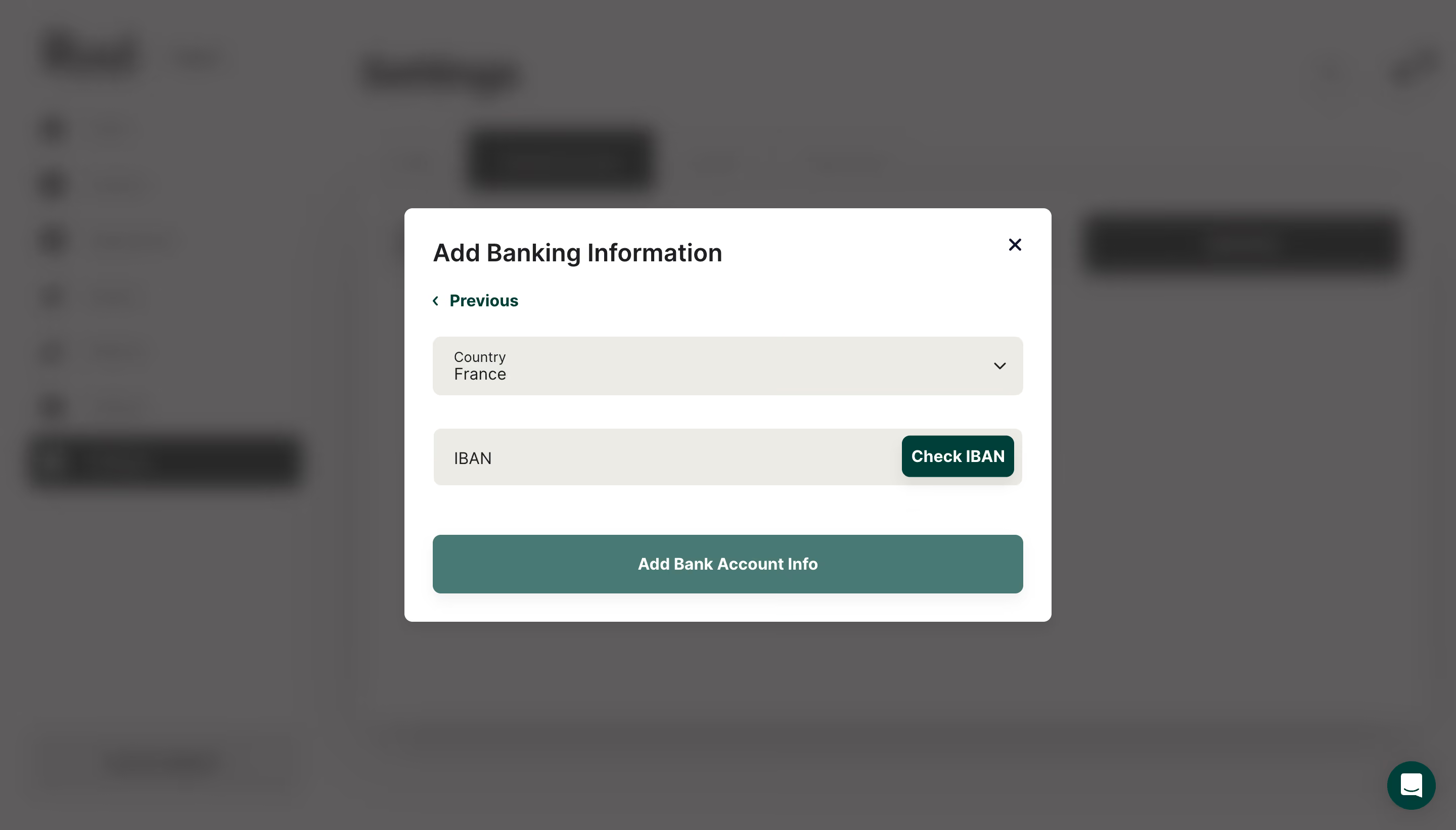
# Design from Reference: Ruul Add Banking Information
Create an original, high-fidelity visual design inspired by the reference. Prioritize composition, typography, colors, spacing, and component styling over technical implementation.
## Reference
- **Product:** Ruul
- **Category:** Add & Edit
- **Screenshot:** https://cdn.prod.website-files.com/5e9dc792e1210c5325f7ebbc/6acb6d83b206c0d3f8f39e23_6acb6b87563b2e222dd3f6ae_cms-03431a11640d3c2f16a0b1ed.webp
Analyze the screenshot first. If inaccessible, request it rather than guessing.
## Content
{{content.instructions}}
{{content.data}}
Preserve essential messaging and factual accuracy. Adapt structure and copy length for visual balance; never invent product claims.
## Visual Design
### Overall aesthetic
- **Style:** Compact bank-details dialog over a blurred, dimmed financial dashboard.
- **Character:** White modal, warm gray fields, deep-teal actions, and minimal decoration.
### Page composition
- **Canvas:** 2880 × 1642 image px; CSS estimates assume an unverified 2× capture.
- **Modal:** Approximately 640 × 410 CSS px, centered.
- **Sequence:** Title and close control, Previous link, country selector, IBAN field with inline check action, then full-width submit.
- **Background:** Dashboard and chat launcher remain visible but heavily blurred.
### Information hierarchy
- **Primary:** Add Banking Information title.
- **Inputs:** Country before bank identifier.
- **Validation:** Check IBAN is embedded at the right of the IBAN row.
- **Completion:** Wide bottom action; back and close provide secondary exits.
### Typography
- **Family:** Neutral sans serif; exact family unverified.
- **Title:** Approximately 24 CSS px, semibold.
- **Field text/actions:** Approximately 16px.
- **Small country label:** Approximately 12px.
- **Precision:** Font values and scale are estimates.
### Colors & surfaces
- **Modal:** #FFFFFF.
- **Field fill:** #ECECE5.
- **Submit fill:** #497974.
- **Dimmed backdrop:** #5E5D5D with nearby #5C5B5B and #5D5C5C.
- **Text:** Dark charcoal; secondary actions deep teal.
- **Precision:** Background colors include overlay and blur; exact dark-teal token unverified.
### Components
- **Modal radius:** Approximately 8 CSS px.
- **Fields:** Approximately 58px high, 8px radius, generous horizontal padding.
- **Inline validation:** Compact dark-teal button.
- **Submit:** Full-width teal button approximately 58px high.
- **Close:** Small unboxed X; Previous uses left chevron.
- **Shadow:** Broad soft elevation under the dialog.
### Visual rhythm
- **Spacing:** Approximately 28px modal padding and generous vertical gaps between fields.
- **Alignment:** Title, links, fields, and submit share left inset.
- **Focus:** Blur removes dashboard detail while preserving context.
### Responsive
- **Observed:** Desktop only.
- **Recommendation:** Fit dialog within viewport margins, stack inline validation if needed, and allow internal scrolling.
- **Inputs:** Preserve labels and readable bank-identifier entry.
### Adaptation guidance
- **Preserve:** Country → identifier → validation → submit hierarchy.
- **Privacy:** Use placeholder bank details; do not reproduce sensitive user data.
- **Behavior:** Validation, account creation, and dismissal outcomes are not demonstrated.
Use this context to reproduce the reference's visual language: layout, typography, colors, spacing, borders, radii, and distinctive elements. The screenshot takes priority if descriptions conflict.
## Direction
{{preferences.fidelityInstructions}}
## Output
{{output.instructions}}
Deliver a polished, cohesive design with precise alignment, hierarchy, and spacing. Produce the requested visual artifact, not just a description. If unsupported, explain the limitation.