Design with AI
Generate a new design based on this screen using your own content.
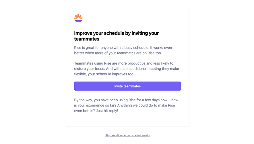
# Design from Reference: Rise Invite Your Team Emails
Create an original, high-fidelity visual design inspired by the reference. Prioritize composition, typography, colors, spacing, and component styling over technical implementation.
## Reference
- **Product:** Rise
- **Category:** Invite Your Team Emails
- **Screenshot:** https://cdn.prod.website-files.com/5e9dc792e1210c5325f7ebbc/6acada10ca6d79c1e0c8a105_6acad9999918fda16bb1d310_cms-36b1b9c48fa5f32ff834da66.webp
Analyze the screenshot first. If inaccessible, request it rather than guessing.
## Content
{{content.instructions}}
{{content.data}}
Preserve essential messaging and factual accuracy. Adapt structure and copy length for visual balance; never invent product claims.
## Visual Design
### Overall aesthetic
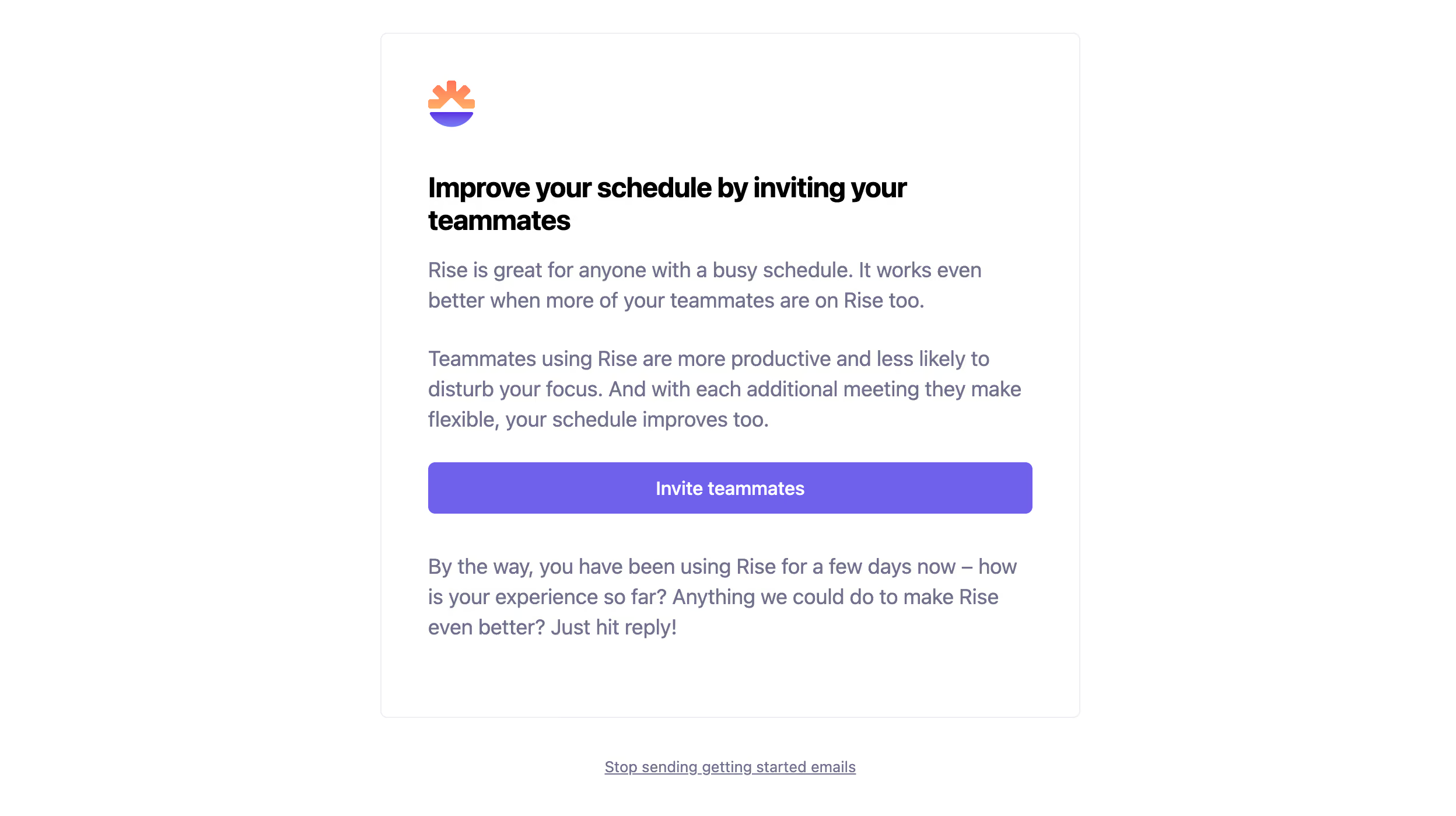
- **Character:** Simple white onboarding email with a fine bordered card, black bold heading, muted lavender-gray prose and purple action.
- **Brand:** A small orange/purple rising-sun symbol adds warmth above the message.
- **Capture:** The source measures 2496 × 1398 image px. Exact email-client/CSS scale is unverified; measurements below use source pixels where stated.
### Page composition
- **Card:** A centered white panel roughly 1200 source px wide has a thin pale border and small corners.
- **Content stack:** Logo, two-line invitation heading, two explanatory paragraphs, full-width purple button and feedback paragraph align left.
- **Footer:** A centered underlined getting-started-email opt-out link sits below the card.
- **Whitespace:** Broad side margins and generous inner padding keep the message calm.
### Information hierarchy
- **Goal:** The heading promotes inviting teammates to improve scheduling.
- **Reasoning:** Two paragraphs explain collaborative value before the action.
- **Action:** Invite teammates is the sole filled destination.
- **Feedback:** A final paragraph invites a reply, visually secondary to the button.
- **State:** No invitations are sent or confirmed in the capture.
### Typography
- **Family:** Neutral sans-serif; exact identity is unverified.
- **Heading:** Approximately 46–50 source px, bold with tight leading.
- **Body:** Around 36–38 source px with roughly 52 px leading, muted.
- **Button:** Approximately 32–34 source px, medium-to-bold white text.
- **Footer:** Smaller underlined text, centered and muted.
### Colors & surfaces
- **Measured base:** ICC-aware sRGB sampling yields #FFFFFF.
- **Measured action:** Purple #7360F4 dominates the button.
- **Measured copy:** #6E728A is the muted body tone; #000000 appears in the heading.
- **Measured rules:** #EDEEF1 defines the fine card boundary.
- **Depth:** The card is flat without a pronounced shadow.
### Components
- **Brand mark:** Small warm orange rays above a purple curved base.
- **CTA:** Wide purple rectangle with roughly 10 source px corners and centered caption.
- **Card outline:** Fine pale border defines the email body without a colored background.
- **Opt-out link:** One underlined line beneath the card provides a separate email preference action.
### Visual rhythm
- **Padding:** Large consistent insets align all content.
- **Paragraph spacing:** Distinct pauses separate explanation, action and feedback.
- **Button width:** The action spans the full inner text measure.
- **Footer gap:** A generous gap separates the preference link from the card.
### Responsive
- **Evidence limit:** Only one rendering is shown; recommendations follow.
- **Width:** Use a fluid email card and reduced mobile padding.
- **Type:** Translate source-pixel sizes to readable email typography rather than treating them as verified CSS.
- **Action:** Preserve a large touch target and natural heading wrapping.
### Adaptation guidance
- **Reusable pattern:** Explain one collaboration benefit, offer one invitation action and invite feedback.
- **Visual discipline:** Keep black/muted text and one purple action, with only a small brand graphic.
- **Accessibility:** Provide meaningful action text, readable contrast and a clear preference link.
- **State truth:** Distinguish an invitation prompt from invitation delivery.
Use this context to reproduce the reference's visual language: layout, typography, colors, spacing, borders, radii, and distinctive elements. The screenshot takes priority if descriptions conflict.
## Direction
{{preferences.fidelityInstructions}}
## Output
{{output.instructions}}
Deliver a polished, cohesive design with precise alignment, hierarchy, and spacing. Produce the requested visual artifact, not just a description. If unsupported, explain the limitation.