Design with AI
Generate a new design based on this screen using your own content.
# Design from Reference: Rise Account Setup
Create an original, high-fidelity visual design inspired by the reference. Prioritize composition, typography, colors, spacing, and component styling over technical implementation.
## Reference
- **Product:** Rise
- **Category:** Account Setup
- **Screenshot:** https://cdn.prod.website-files.com/5e9dc792e1210c5325f7ebbc/6acada1cca6d79c1e0c8a291_6acad9a95f2661b16657cc71_cms-ce291908208b1de17d912547.webp
Analyze the screenshot first. If inaccessible, request it rather than guessing.
## Content
{{content.instructions}}
{{content.data}}
Preserve essential messaging and factual accuracy. Adapt structure and copy length for visual balance; never invent product claims.
## Visual Design
### Overall aesthetic
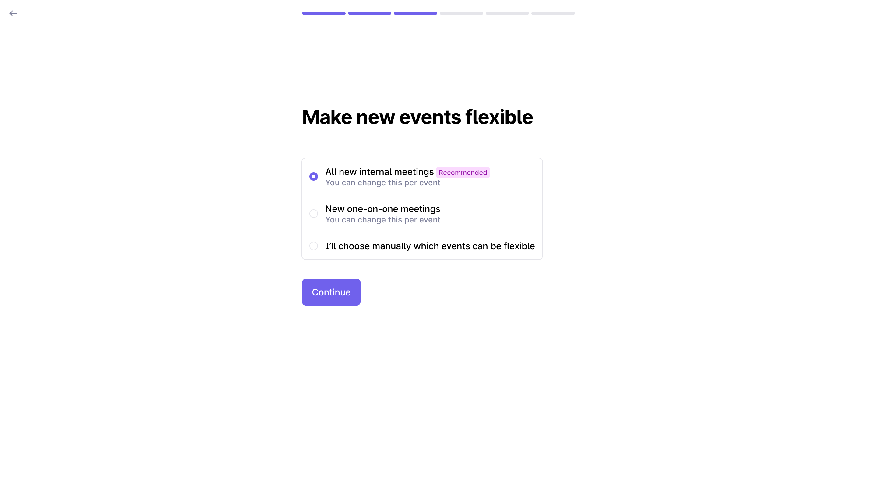
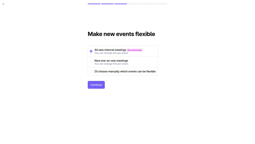
- **Character:** Extremely sparse calendar-preference onboarding with violet progress and radio selection.
### Page composition
- **Canvas:** 2880 × 1630 screenshot px; CSS estimates assume 2× capture.
- **Structure:** Back arrow upper left; six segmented progress bars centered at top; compact left-aligned form in the upper middle with title, three radio rows and Continue.
### Information hierarchy
- **Priority:** Make new events flexible heading leads; selected first option includes a small Recommended tag and secondary per-event explanation.
### Typography
- **Family:** Neutral sans serif, exact font unverified.
- **Scale:** Estimated CSS title 32 px bold, option labels 16 px, helper 14 px and tag 11 px.
### Colors & surfaces
- **Sampled palette:** White #FFFFFF, black #000000, violet #7360F4, borders #E5E5EA, tag pink #FFD9FF and helper #7D819D.
### Components
- **Options:** Single outlined rounded group divided into three rows; small radio circles and secondary text under first two options.
- **Action:** Compact violet rounded rectangle below, aligned to group's left edge; estimated CSS group width 395 px and 8 px radius.
### Visual rhythm
- **Spacing:** Generous empty lower canvas; approximately 48 px title-to-options gap and 30 px before action.
### Responsive
- **Observed:** Desktop only.
- **Adaptation:** Use fluid group width, wrap long labels and keep progress visible without shrinking touch targets.
### Adaptation guidance
- **Preserve:** One preference at a time, clear recommended choice and minimal chrome.
- **Replace:** Use actual calendar behavior and preference defaults; do not infer unseen settings.
Use this context to reproduce the reference's visual language: layout, typography, colors, spacing, borders, radii, and distinctive elements. The screenshot takes priority if descriptions conflict.
## Direction
{{preferences.fidelityInstructions}}
## Output
{{output.instructions}}
Deliver a polished, cohesive design with precise alignment, hierarchy, and spacing. Produce the requested visual artifact, not just a description. If unsupported, explain the limitation.