



1. Header: The page header includes the Reveal Logo, the menu bar, and a prominent heading that reads "Integrations" in a large font. 2. Introduction: The introduction gives a brief summary of what the page is about, highlighting the software's features, functions and the benefits of the integrations. It also provides a button to learn more about the integrations topic. 3. Categories of Integrations: The main content of the page consists of several categories of integrations blocks, neatly arranged below the introductory text. The categories include Customer Relationship and Engagement, Marketing and Automation, Ecommerce, Social Media, and Content Management Systems. 4. Each category includes a heading that indicates the category name and is followed by a carousel of logos representing the different integrations available in the category. Each carousel allows the user to scroll left or right, and the logos include the name and logo of the corresponding integration software. 5. Click-to-Learn-Feature: Beneath each integration category and carousel, there is a CTA button that leads to a separate page containing detailed information on the integration selected. Each integration page includes an overview of how it works, the setup process, and other relevant information. 6. Footer: The webpage's footer contains a brief summary of the Reveal software, including the company logo, social media links and a menu that links to other parts of the website.

Thank you! Your submission has been received!
Oops! Something went wrong while submitting the form.
Get SaaSFrame Pro
Monthly
$18
Quarterly
$48
Yearly
$180
Upgrade to access this feature
Browse all screens & flows
Filter and search screens & flows
Access Figma files
Access mobile versions
Bookmark screens & flows
Join now
Reveal Integrations Page

Reveal
Partnership, Growth, and Sales Ecosystem Solution
Designed by
No items found.

Bookmark
Bookmark
Design with AI
Thank you! Your submission has been received!
Oops! Something went wrong while submitting the form.
# Design from Reference: Reveal Integrations Page
Create an original, high-fidelity visual design inspired by the reference. Prioritize composition, typography, colors, spacing, and component styling over technical implementation.
## Reference
- **Product:** Reveal
- **Category:** Integrations Library
- **Screenshot:** https://cdn.prod.website-files.com/5e9dc792e1210c5325f7ebbc/6acbbe38476aea3982e3fa35_6acbbd62d37e66e942013748_cms-0f213495c2eac9c943bf1c6d.webp
Analyze the screenshot first. If inaccessible, request it rather than guessing.
## Content
{{content.instructions}}
{{content.data}}
Preserve essential messaging and factual accuracy. Adapt structure and copy length for visual balance; never invent product claims.
## Visual Design
### Overall aesthetic
- **Character:** An editorial, atmospheric integration page pairs large cream serif headings with an almost-black blue-green background, mint and violet accents, and grainy surreal illustrations.
- **Evidence scale:** The original screenshot measures 1440 × 8399 pixels. Approximate CSS sizes assume a 1× capture, which remains unverified; all six readable image portions were inspected.
### Page composition
- **Navigation and hero:** A wordmark occupies the upper left, a cream pill navigation bar spans the center, and a small outlined emblem sits right. A large centered three-line headline overlays a globe-and-hands illustration, followed by supporting text and two category buttons.
- **Data sources:** A centered title and explanation introduce nine monochrome source marks arranged in rows of five and four.
- **Integration catalog:** The section begins with a left-column introduction and demo action beside a right-column stack of five cream cards: Salesforce, Slack, HubSpot, Stripe and Reveal API. The left side remains largely empty farther down the captured stack.
- **Proof and conversion:** An arched portrait sits beside a case-study heading and text. A violet gradient security section follows, then a broad cream/mint/violet signup panel and a dark multi-column footer.
### Information hierarchy
- **Primary hierarchy:** Oversized serif headings dominate the hero, source section and signup invitation; sans-serif explanations provide a quieter secondary layer.
- **Catalog structure:** Each card presents a monochrome logo, substantial open space, a large product title, explanatory paragraph and Learn more button.
- **Trust sequence:** The case study supplies human proof before the security message; the final signup invitation precedes practical footer navigation and policies.
### Typography
- **Display headings:** Hero and large centered headings are approximately 80–88 pixels with tight 0.95–1.05 line-height and heavy serif forms. Card titles are about 62–68 pixels, sometimes wrapping to two lines.
- **Supporting roles:** Hero/source descriptions are around 23–24 pixels with 30-pixel leading. Card and feature copy is roughly 20 pixels with 26-pixel leading; nav/button labels are around 18–20 pixels.
- **Footer roles:** Group labels and links use compact sans-serif text around 15–16 pixels; muted legal text occupies a separate row.
- **Family identity:** The serif has pronounced contrast and substantial bracketed shapes, while body copy uses a neutral sans-serif. Exact font families are unverified; display tracking appears slightly tight.
### Colors & surfaces
- **Measured base:** ICC-to-sRGB pixel sampling identifies #0C151B as the principal dark background and #F6F2E8 as the dominant cream surface/text color; #0C151C and #0D151C occur as nearby dark variations.
- **Accent roles:** Mint colors the data-source and signup-related actions; violet colors the integrations action, selected links, social outlines and decorative footer marks.
- **Gradient regions:** The security block transitions through vivid violet and pale lavender into cream. The closing signup band layers mint and violet over cream with a soft, grainy finish.
- **Surface language:** Integration cards are flat cream rectangles with tiny corner rounding and no strong shadow; pill controls contrast with the large rectilinear cards.
### Components
- **Navigation pill:** Approximately 830 × 64 pixels, with a fully rounded outline, evenly spaced inline links and a mint filled signup pill nested at the right.
- **Category actions:** Two approximately 165–180 × 56-pixel pills sit side by side in the hero, each with a short centered caption beneath.
- **Integration cards:** About 500 pixels wide, with roughly 50-pixel side padding, 65–80-pixel top spacing and generous gaps between logo and title. Heights vary with content, approximately 650–780 pixels in the supplied scale.
- **Card actions:** Dark Learn more pills are approximately 160 × 58 pixels; light Book a demo and Read more actions invert the same rounded shape.
- **Trust and utility:** The portrait uses an arch-shaped upper crop. The security illustration combines a glass capsule, plant, stepped mint wall and eye. Footer utilities include circular social outlines, a rounded Back to top control and a circular chat launcher.
### Visual rhythm
- **Main grid:** Catalog and case-study content sit in a centered region with approximately 150–170-pixel outside margins; the card stack starts near the horizontal midpoint, creating deliberate asymmetry.
- **Vertical spacing:** Source logos have ample row spacing; integration cards are separated by roughly 100 pixels, and major sections receive larger pauses.
- **Internal cadence:** Each card repeats logo, open space, title, paragraph and button. Paragraphs use restrained line lengths, while oversized headlines wrap assertively.
- **Footer rhythm:** Four link columns align at the top, followed by a widely separated policy row, thin divider and decorative brand/address strip.
### Responsive
- **Observed scope:** The screenshot documents one desktop width; sticky navigation or sticky section behavior cannot be established from the static image.
- **Recommended catalog:** Stack the introduction above full-width cards on smaller screens and reduce the unused left-column space. Keep card padding proportionate and reduce display text to avoid narrow word columns.
- **Recommended navigation and imagery:** Collapse the long navigation, wrap source logos into a smaller grid, stack case-study/security columns and keep decorative images from competing with copy.
- **Recommended footer:** Stack or accordion link groups, wrap legal links and retain accessible tap targets for pills, chat and social controls.
### Adaptation guidance
- **Transferable system:** Combine a dark editorial canvas, contrasting serif display type, neutral body text and cream integration cards with consistent internal sequencing.
- **Content structure:** Separate incoming data-source compatibility from outgoing integration capabilities, then support the offer with a concrete customer story and security explanation.
- **Production translation:** Verify font identities and capture density before implementing size tokens. Keep grain and surreal artwork decorative, provide meaningful text alternatives where needed, and preserve legible contrast across gradients.
- **Interaction specification:** Define clear focus/hover states and real destinations for category links, demo actions and integration cards; the screenshot supplies their resting appearance only.
Use this context to reproduce the reference's visual language: layout, typography, colors, spacing, borders, radii, and distinctive elements. The screenshot takes priority if descriptions conflict.
## Direction
{{preferences.fidelityInstructions}}
## Output
{{output.instructions}}
Deliver a polished, cohesive design with precise alignment, hierarchy, and spacing. Produce the requested visual artifact, not just a description. If unsupported, explain the limitation.
Category
Patterns
No items found.
Tech Stack
Added on
February 11, 2023
Similar screens
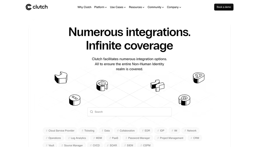


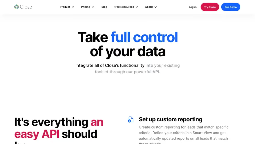

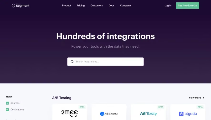

Upgrade to SaaSFrame Pro now to see similar examples.
Monthly
$18 /month
Billed $18 monthly
Browse all screens & flows
Filter and search screens & flows
Search text in screenshots
Access Figma files
Access mobile versions
Join now
Quarterly
$16 /month
Billed $48 quarterly
Browse all screens & flows
Filter and search screens & flows
Search text in screenshots
Access Figma files
Access mobile versions
Join now
Yearly
$15 /month
Billed $180 yearly
Browse all screens & flows
Filter and search screens & flows
Search text in screenshots
Access Figma files
Access mobile versions
Join now