Design with AI
Generate a new design based on this screen using your own content.
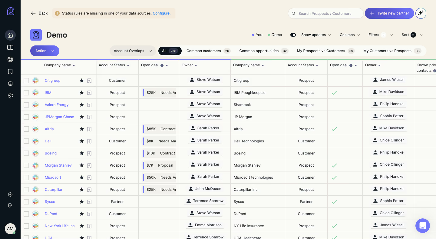
# Design from Reference: Reveal Dashboard
Create an original, high-fidelity visual design inspired by the reference. Prioritize composition, typography, colors, spacing, and component styling over technical implementation.
## Reference
- **Product:** Reveal
- **Category:** Table
- **Screenshot:** https://cdn.prod.website-files.com/5e9dc792e1210c5325f7ebbc/6acbc569681d3a08a1edff80_6acbbd689ffd93ab51c237b1_cms-33c698995aeeb506263cac16.webp
Analyze the screenshot first. If inaccessible, request it rather than guessing.
## Content
{{content.instructions}}
{{content.data}}
Preserve essential messaging and factual accuracy. Adapt structure and copy length for visual balance; never invent product claims.
## Visual Design
### Overall aesthetic
- **Character:** A partner-account matching dashboard combines a cream canvas, dark icon rail, violet controls and a dense spreadsheet-style table.
- **Evidence:** The screenshot is 1440 × 789 pixels. Approximate CSS dimensions assume an unverified 1× capture density.
### Page composition
- **Rail:** A roughly 68-pixel dark strip holds brand/navigation icons and avatar.
- **Header:** Back navigation, a warning notice, search, partner-invite action and utility icon sit above the Demo title.
- **Table tools:** Action, overlap selector, category/count pills, update toggle and column/filter/sort controls occupy two horizontal bands.
- **Grid:** A wide table compares two account datasets side by side, extending beyond the right edge and below the viewport.
### Information hierarchy
- **Context:** Demo is the largest text; a small color legend distinguishes the two datasets.
- **Comparison categories:** All is selected as a dark pill, with other overlap categories and counts on a light rounded strip.
- **Grid detail:** Repeated company/status/deal/owner column groups structure the comparison.
- **State cues:** Blue company links, owner chips, green checks and violet deal markers differentiate content types.
### Typography
- **Title:** Approximately 26 pixels semibold.
- **Tools:** Mostly 12–14 pixels; category counts use smaller bold text.
- **Grid:** Headers and values are around 12–13 pixels with compact row height. Exact sans-serif identity is unverified.
### Colors & surfaces
- **Measured palette:** ICC-to-sRGB sampling identifies #FAFAF6 as principal canvas/table surface, #F6F2E8 as cream chrome and #0C151B as the dark rail/selected pill.
- **Measured support:** #F8F8F8, #E1DEDA and #F3F1EB occur in cells, outlines and neutral layers.
- **Accents:** Violet marks actions/links and deal strips; mint-green checks indicate matches/status.
- **Borders:** Fine beige-gray rules divide rows and columns; the grid is flat with little shadow.
### Components
- **Warning notice:** A pale compact banner includes an amber information symbol and blue Configure link.
- **Search/invite:** A rounded search field precedes a violet pill with plus icon.
- **Category strip:** Rounded tabs combine labels and count chips; selected All inverts to dark fill.
- **Rows:** Approximately 40 pixels tall, with selection boxes, app icons, company links, star/bookmark tools and compact owner badges.
- **Deal cells:** Small pale chips contain currency/status text with a violet leading rule.
### Visual rhythm
- **Dense alignment:** Repeated headers and row rules make cross-company comparisons scannable.
- **Chrome contrast:** Rounded controls above the grid contrast with rectangular cells.
- **Viewport clipping:** Partial rightmost columns and lower rows establish a larger workspace without showing scrolling behavior directly.
### Responsive
- **Observed scope:** One desktop comparison state is shown; menus and narrow layouts are not visible.
- **Recommended layout:** Preserve horizontal grid scrolling, collapse the rail/tools and keep company identifiers available while scrolling.
- **Recommended access:** Provide semantic headers and keyboard support for selection, sorting and row tools.
### Adaptation guidance
- **Comparison pattern:** Group related columns by dataset and expose overlap categories before the dense grid.
- **State clarity:** Use text labels alongside checks/colors and keep filter/sort counts explicit.
- **Implementation:** Confirm fonts/density and accessible table behavior; use sample company/owner data when creating reusable examples.
Use this context to reproduce the reference's visual language: layout, typography, colors, spacing, borders, radii, and distinctive elements. The screenshot takes priority if descriptions conflict.
## Direction
{{preferences.fidelityInstructions}}
## Output
{{output.instructions}}
Deliver a polished, cohesive design with precise alignment, hierarchy, and spacing. Produce the requested visual artifact, not just a description. If unsupported, explain the limitation.