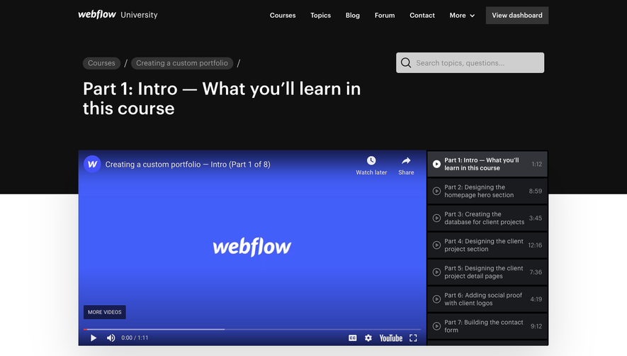
Generate a new design based on this screen using your own content.
Thank you! Your submission has been received!
Oops! Something went wrong while submitting the form.
# Design from Reference: Reveal Academy
Create an original, high-fidelity visual design inspired by the reference. Prioritize composition, typography, colors, spacing, and component styling over technical implementation.
## Reference
- **Product:** Reveal
- **Category:** Academy
- **Screenshot:** https://cdn.prod.website-files.com/5e9dc792e1210c5325f7ebbc/6acbbe38476aea3982e3fa38_6acbbd61d37e66e942013709_cms-ecc9f38d328f8178ad6d01eb.webp
Analyze the screenshot first. If inaccessible, request it rather than guessing.
## Content
{{content.instructions}}
{{content.data}}
Preserve essential messaging and factual accuracy. Adapt structure and copy length for visual balance; never invent product claims.
## Visual Design
Use this context to reproduce the reference's visual language: layout, typography, colors, spacing, borders, radii, and distinctive elements. The screenshot takes priority if descriptions conflict.
## Direction
{{preferences.fidelityInstructions}}
## Output
{{output.instructions}}
Deliver a polished, cohesive design with precise alignment, hierarchy, and spacing. Produce the requested visual artifact, not just a description. If unsupported, explain the limitation.
Reveal Academy’s page embodies a crisp, modern minimalism paired with vivid color accents. The abundant white space creates an airy, uncluttered environment, allowing playful branded illustrations and bold graphics to shine. This fusion of professional clarity and energetic visuals signals innovation while ensuring approachability.
Layout and Structure
The structure follows a classic SaaS educational microsite format: a vibrant hero section introduces the Academy’s value proposition and invites sign-ups with a pronounced CTA. Scrolling reveals a brief curriculum overview, dynamic course cards, and highlights of learning formats, all neatly chained by logical flow. Lateral or sticky navigation is absent, focusing attention on linear discovery rather than overwhelming users with options.
Visual Elements
Custom vector illustrations, such as stylized avatars and learning icons, infuse personality and visual hierarchy without clutter. Occasional animated elements or subtle hover effects bring interactivity, keeping engagement high. Screenshots and branded badges highlight achievements and real course content, adding authenticity and breaking up textual density.
Color Palette and Typography
Reveal’s signature palette blends a confident deep blue with eye-catching gradients—purples, teals, and oranges—that spotlight interactive elements and CTAs. Typography is clear and current: generous headlines in a approachable sans-serif, balanced by tidy body copy and microcopy, creating clear vertical rhythm and information hierarchy.
User Experience Patterns and Unique Choices
Navigation is frictionless: a sticky top bar anchors the “Academy,” while primary CTAs use contrasting colors for instant visibility. The succinct email capture form is up front, reducing friction and nudging sign-up. Breakout boxes, scroll-triggered transitions, and the absence of clutter keep the experience focused and trustworthy—a testament to expertly balanced UX and visual harmony.