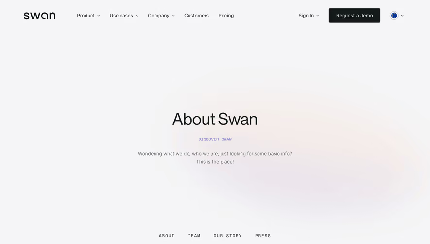
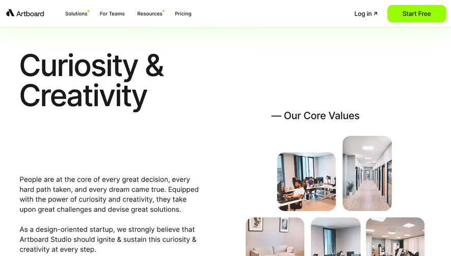
Overall Style and Aesthetic
Reveal’s About page projects a distinctly modern and professional vibe, nuanced with playful elements that keep the experience fresh and approachable. The design is intentional and uncluttered—ample white space, crisp outlines, and bursts of subtle animation give it a contemporary sophistication. Layout and Structure
The page kicks off with a compact hero section, cleanly centered with a concise value proposition and energetic subhead. Below, a modular vertical layout guides visitors seamlessly through the company story, rationale, team introductions, and a direct CTA, all separated by gentle visual breaks that maintain momentum and clarity. Visual Elements
Custom illustrations—in vivid, slightly abstract style—add personality without distracting from the content. Photos of the team are candid yet polished, positioned alongside friendly bio blurbs. Animated transitions and gentle motion cues bring the static elements to life as users scroll. Subtle iconography punctuates key points, aiding comprehension. Color Palette and Typography
A restrained palette mixes pristine whites and cool grays with vibrant accents of indigo, turquoise, and coral. The sans-serif typography is decisive and accessible, using distinct weight variation for clear hierarchy. Headlines command attention, while body text remains highly legible and open. User Experience Patterns
Navigation is sticky and minimalist, ensuring ease of access throughout. CTAs are bold yet unintrusive, employing dynamic color shifts on hover. Scroll-based animations offer visual delight without delaying content delivery. The absence of heavy forms or frictional obstacles streamlines user flow. Unique or Notable Design Choices
Reveal stands out by weaving playful yet professional illustrations with authentic team photography, establishing both authority and approachability. Microinteractions and subtle parallax effects contribute to an engaging, memorable browsing experience. Tone and Feel
Overall, the tone balances trustworthy professionalism with energy and innovative spirit—channeling optimism and expertise, making visitors feel both impressed and welcome.