Design with AI
Generate a new design based on this screen using your own content.
# Design from Reference: Resend Verification
Create an original, high-fidelity visual design inspired by the reference. Prioritize composition, typography, colors, spacing, and component styling over technical implementation.
## Reference
- **Product:** Resend
- **Category:** Verification
- **Screenshot:** https://cdn.prod.website-files.com/5e9dc792e1210c5325f7ebbc/6acb6ae3bf2e69a0c03b6b3e_6acb6a28adcf005a3c5f770d_cms-2af899902bd4c2988fcc9f48.webp
Analyze the screenshot first. If inaccessible, request it rather than guessing.
## Content
{{content.instructions}}
{{content.data}}
Preserve essential messaging and factual accuracy. Adapt structure and copy length for visual balance; never invent product claims.
## Visual Design
### Overall aesthetic
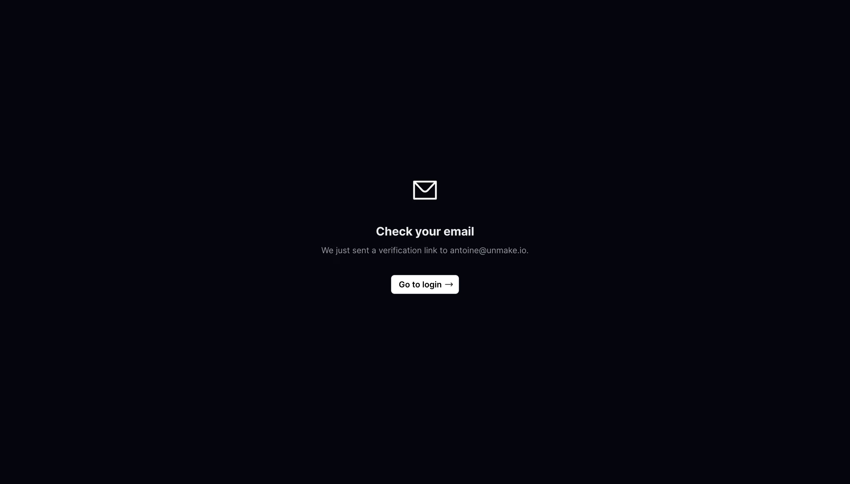
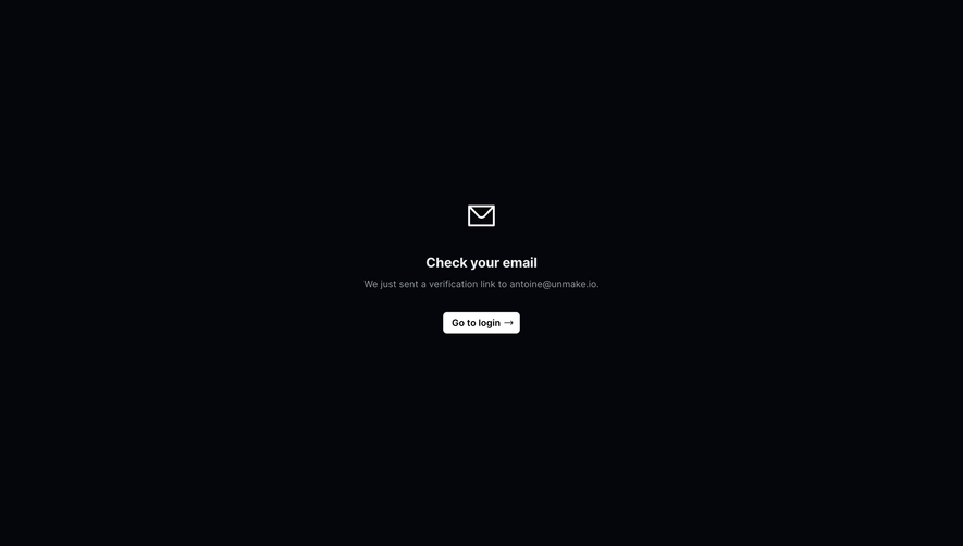
- **Style:** Extremely minimal email-verification confirmation, with a nearly black navy canvas and a small centered white/gray message stack.
- **Scale:** Source image 2880 × 1642px. Sizes below estimate a 1440 × 821 CSS viewport at 2× capture scale.
### Page composition
- **Centered module:** The content is centered horizontally near x720 and spans approximately y305–500, slightly above the page's vertical midpoint.
- **Sequence:** An outlined envelope sits above a bold heading, one muted confirmation sentence and a compact white navigation button.
- **Whitespace:** The rest of the viewport is uninterrupted dark background; no header, footer, form field or enclosing card is visible.
### Information hierarchy
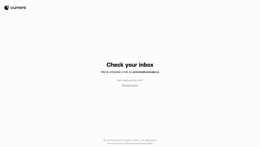
- **Status:** Check your email is the primary heading, reinforced by the envelope symbol.
- **Explanation:** A single sentence confirms that a verification link was sent and names the recipient address.
- **Next action:** Go to login, with a right arrow, is the only visible interactive action. No resend or countdown control is shown.
### Typography
- **Family:** Neutral sans-serif; exact font identity is unverified.
- **Roles:** Estimated heading 20px/26px bold, confirmation text 14px/20px regular, button label 14px medium.
- **Alignment:** All content is center aligned; the address remains in the same text style as the surrounding sentence.
### Colors & surfaces
- **Sampled palette:** ICC-aware sRGB samples include background #05050C, white #FFFFFF, light gray #EAEBED, muted gray #949AA1 and pale #E3E7EB.
- **Contrast:** Heading and envelope are bright; the explanatory line is subdued. A white button with dark text supplies the strongest solid shape.
- **Surface restraint:** There are no visible shadows, gradients, decorative backgrounds or card outlines.
### Components
- **Envelope:** Approximately 40 × 32px simple white outline icon, centered above the heading with ample separation.
- **Button:** Approximately 114 × 32px white rectangle with 5–6px corners and an inline right arrow.
- **Message:** One compact heading and one sentence, without additional badges or alerts.
### Visual rhythm
- **Spacing:** Approximately 42px separates the icon from the heading, around 8px separates heading and sentence, and about 32px precedes the button.
- **Balance:** The small message module relies on broad negative space rather than a large container or illustration.
### Responsive
- **Recommended adaptation:** Only desktop is observed. Keep the module centered with 24px side padding and allow long recipient addresses to wrap.
- **Usability:** Increase the action's touch height where needed while preserving its compact visual weight.
### Adaptation guidance
- **Preserve:** Keep an unmistakable confirmation icon, concise status heading, explicit destination address and one next action.
- **Adapt:** Use the actual recipient and authentication destination. Add resend or support controls only if the product supports them.
Use this context to reproduce the reference's visual language: layout, typography, colors, spacing, borders, radii, and distinctive elements. The screenshot takes priority if descriptions conflict.
## Direction
{{preferences.fidelityInstructions}}
## Output
{{output.instructions}}
Deliver a polished, cohesive design with precise alignment, hierarchy, and spacing. Produce the requested visual artifact, not just a description. If unsupported, explain the limitation.