Design with AI
Generate a new design based on this screen using your own content.
# Design from Reference: Resend Signup
Create an original, high-fidelity visual design inspired by the reference. Prioritize composition, typography, colors, spacing, and component styling over technical implementation.
## Reference
- **Product:** Resend
- **Category:** Signup
- **Screenshot:** https://cdn.prod.website-files.com/5e9dc792e1210c5325f7ebbc/6acb6ae3bf2e69a0c03b6b3b_6acb6a29b8517e813b436ac6_cms-2e07c946a2cc799b71cf4123.webp
Analyze the screenshot first. If inaccessible, request it rather than guessing.
## Content
{{content.instructions}}
{{content.data}}
Preserve essential messaging and factual accuracy. Adapt structure and copy length for visual balance; never invent product claims.
## Visual Design
### Overall aesthetic
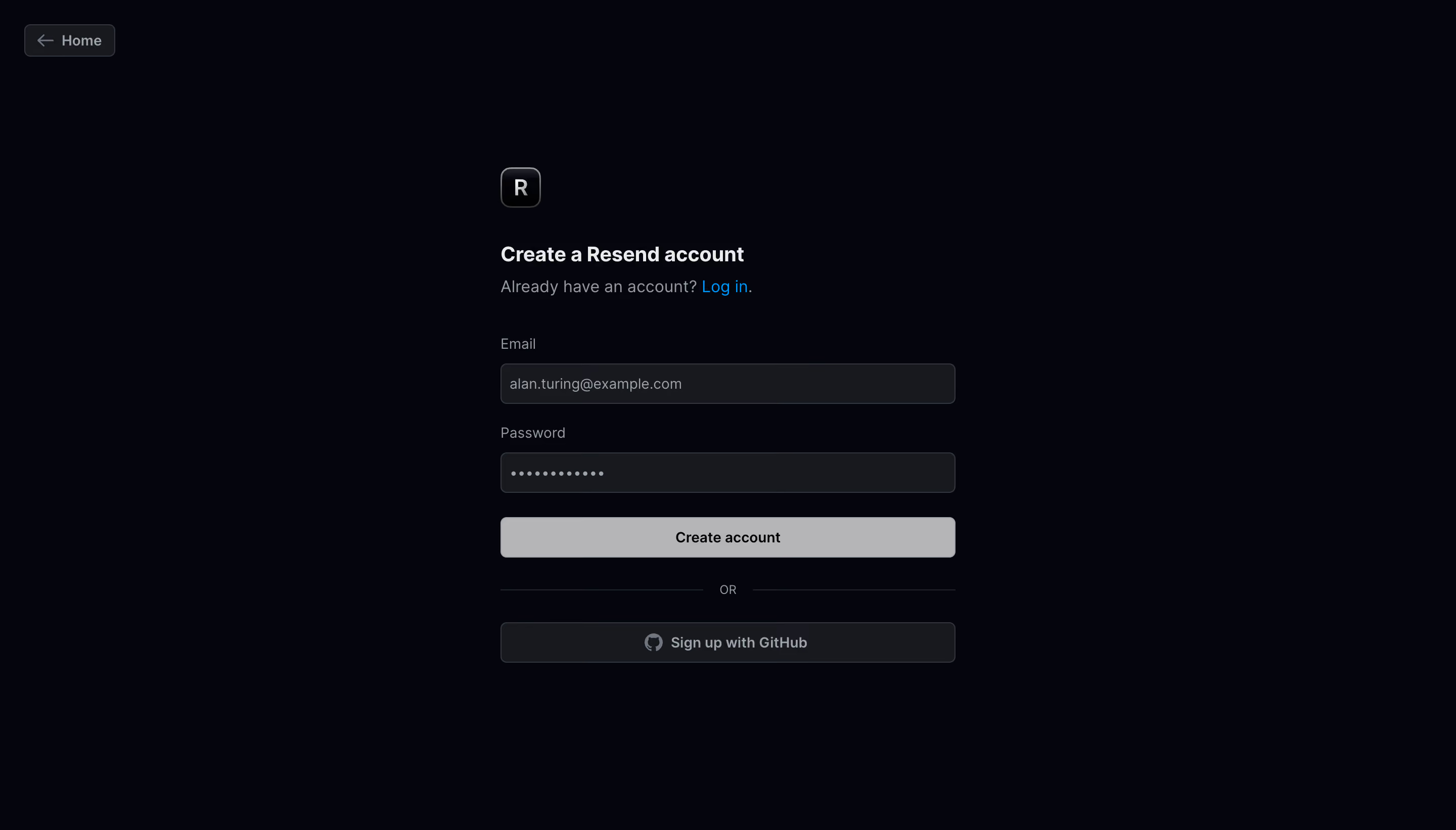
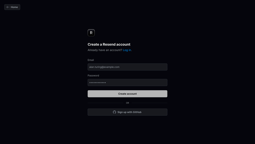
- **Character:** A minimal dark signup page uses a nearly black canvas, charcoal fields and a pale gray primary action.
- **Restraint:** A small outlined brand tile and blue login link provide identity and color without a surrounding form card.
### Page composition
- **Capture scale:** The source measures 2880 × 1642 image pixels. CSS estimates below assume a 2× capture; device-pixel ratio is unverified.
- **Main column:** A roughly 450 px CSS form stack is centered horizontally, beginning with a small brand tile around y=165.
- **Sequence:** Account heading/login route, email and password fields, Create account button, OR divider and GitHub signup control form one column.
- **Peripheral navigation:** A compact Home back-button sits at the upper-left edge.
### Information hierarchy
- **Account task:** A bold heading leads the form, with a quieter existing-account sentence directly below.
- **Fields:** Persistent labels sit above the email and masked-password inputs.
- **Primary action:** The light Create account button contrasts most strongly with the dark background.
- **Alternative route:** GitHub signup follows a ruled OR separator and uses a darker outlined treatment.
### Typography
- **Family:** A neutral sans serif is visible; exact identity is unverified.
- **Heading:** Approximately 20–22 px CSS, semibold.
- **Supporting line:** Approximately 16 px, with a blue inline login link.
- **Labels and controls:** Approximately 14 px, regular/medium, with compact 20 px leading.
- **Divider:** A small uppercase OR label sits between thin horizontal rules.
### Colors & surfaces
- **Measured base:** ICC-aware sRGB sampling yields #05050C for the canvas.
- **Measured fields:** Charcoal #18191E fills inputs and the provider control; #31363F supports borders.
- **Measured action:** Light gray #B5B5B6 fills the primary button.
- **Measured text:** #EAEBED marks prominent text, while #A0A4A8 and #9BA2A9 support quieter copy.
- **Accent:** A bright blue login link is the only saturated text color.
### Components
- **Brand tile:** A roughly 40 px CSS rounded square contains a white R, with a fine metallic-looking outline.
- **Inputs:** Full-width controls are approximately 40 px high, with thin gray borders and 6 px corners.
- **Password masking:** The second field displays dot characters; no reveal control is visible.
- **Primary button:** A pale full-width rectangle uses dark centered text and small rounded corners.
- **Provider button:** A charcoal outlined control combines the GitHub mark and centered label.
- **Home control:** A small bordered dark button combines a left arrow and text.
### Visual rhythm
- **Field cadence:** Labels sit close to inputs, while larger gaps separate fields and action groups.
- **Alignment:** Brand tile, heading, labels and controls share a consistent left edge.
- **Whitespace:** Broad dark margins isolate the form and keep the entry task focused.
- **Alternative separation:** The ruled divider creates a clear pause before provider authentication.
### Responsive
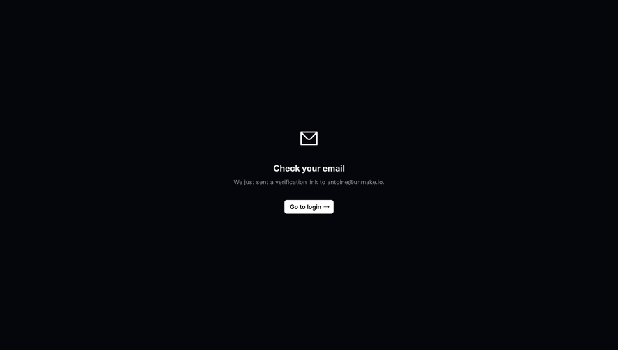
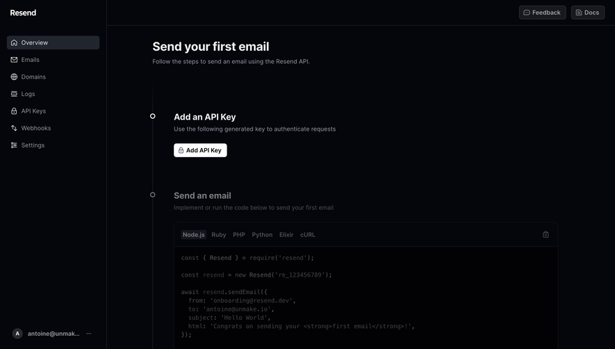
- **Evidence boundary:** Only a desktop state is shown; responsive behaviors are recommendations.
- **Fluid width:** Fit the form within mobile gutters while preserving full-width controls.
- **Keyboard handling:** Allow vertical scrolling so fields and actions remain reachable.
- **Home access:** Keep the back control separate from the form heading on narrow layouts.
### Adaptation guidance
- **Authentication pattern:** Reuse explicit email/password entry with a clear provider alternative and login route.
- **State clarity:** Define validation, submission and focus states; the static capture does not establish button enabled/disabled behavior.
- **Data handling:** Use replaceable example values and preserve password masking.
- **Accessibility:** Associate labels with fields and provide meaningful provider-button text.
- **Scale calibration:** Validate the assumed 2× scale before implementing CSS dimensions.
Use this context to reproduce the reference's visual language: layout, typography, colors, spacing, borders, radii, and distinctive elements. The screenshot takes priority if descriptions conflict.
## Direction
{{preferences.fidelityInstructions}}
## Output
{{output.instructions}}
Deliver a polished, cohesive design with precise alignment, hierarchy, and spacing. Produce the requested visual artifact, not just a description. If unsupported, explain the limitation.