
Thank you! Your submission has been received!
Oops! Something went wrong while submitting the form.
Get SaaSFrame Pro
Monthly
$18
Quarterly
$48
Yearly
$180
Upgrade to access this feature
Browse all screens & flows
Filter and search screens & flows
Access Figma files
Access mobile versions
Bookmark screens & flows
Join now
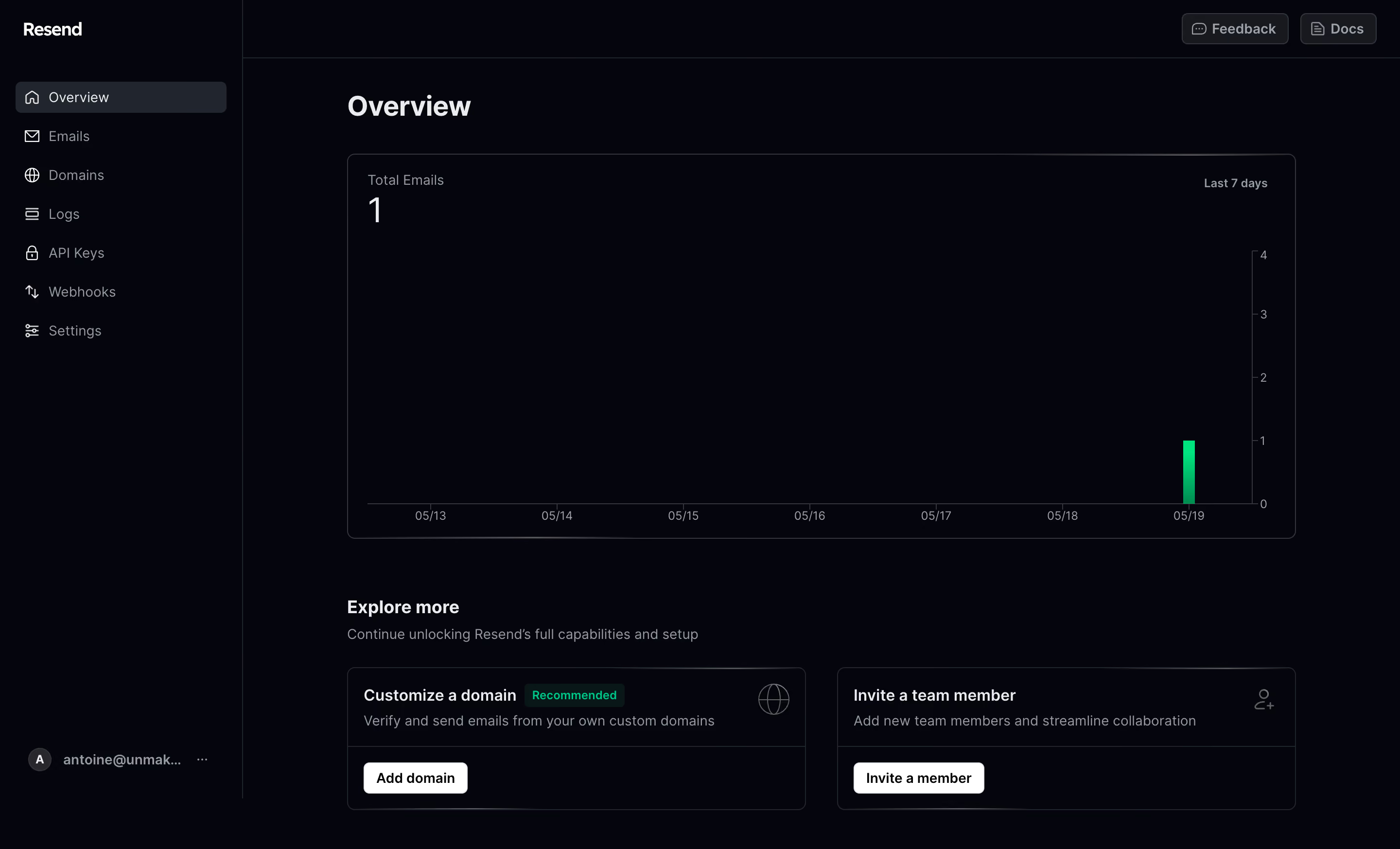
Resend Dashboard

Resend
The email API for developers
Designed by
No items found.

Bookmark
Bookmark

Design with AI
Thank you! Your submission has been received!
Oops! Something went wrong while submitting the form.
# Design from Reference: Resend Dashboard
Create an original, high-fidelity visual design inspired by the reference. Prioritize composition, typography, colors, spacing, and component styling over technical implementation.
## Reference
- **Product:** Resend
- **Category:** Dashboard
- **Screenshot:** https://cdn.prod.website-files.com/5e9dc792e1210c5325f7ebbc/6acb6c095391d62536b67091_6acb6a9fecc5bd4d930a54cc_cms-d736ebabf5d22022d4c5b685.webp
Analyze the screenshot first. If inaccessible, request it rather than guessing.
## Content
{{content.instructions}}
{{content.data}}
Preserve essential messaging and factual accuracy. Adapt structure and copy length for visual balance; never invent product claims.
## Visual Design
### Overall aesthetic
- **Character:** A restrained dark developer dashboard, using near-black surfaces, fine gray borders and a single green data accent.
- **Evidence scale:** Original screenshot 2880 × 1746 pixels. Estimated CSS dimensions assume an unverified 2× capture scale; sampled colors are converted sRGB pixels.
### Page composition
- **Sidebar:** A fixed-looking roughly 250 px navigation rail occupies the left, with the Resend wordmark at top, seven icon-led links and an account control near the bottom.
- **Top bar:** A thin horizontal divider separates an approximately 60 px utility header; Feedback and Docs buttons sit at the far right.
- **Content:** A roughly 976 px wide column starts around 358 px from the left. Overview precedes a large chart card and a two-card setup section.
- **Bottom region:** Explore more and a muted introductory line sit above equal-width domain and team invitation cards.
### Information hierarchy
- **Primary heading:** Overview is large and bold, establishing the current section, which is also highlighted in the sidebar.
- **Metric:** Total Emails appears above a large value of 1; Last 7 days is positioned in the opposite corner of the chart.
- **Supporting tasks:** Two setup cards use medium-weight titles, muted descriptions and small white action buttons.
- **Recommendation:** A green Recommended badge emphasizes the domain setup card without overpowering the main chart.
### Typography
- **Page title:** Unverified sans-serif, approximately 30 px bold with 36 px line height and slightly tight tracking.
- **Metric:** Approximately 36 px regular; its label is about 14 px muted.
- **Section and card titles:** Approximately 18 px semibold for the section and 16 px medium for card headings.
- **Navigation and body:** Approximately 14 px regular with 20 px line height; compact axis labels and badges are around 12 px.
### Colors & surfaces
- **Base:** Measured #05050C fills almost the entire dashboard.
- **Selection:** Dark gray #21252E marks the active navigation row; controls use neighboring dark #18191E surfaces.
- **Borders:** Sampled #343439 appears in structural edges; subtler separators keep the shell quiet.
- **Text:** White #FFFFFF and pale #EBECED emphasize headings; muted #949AA1 supports labels and descriptions.
- **Data:** A narrow saturated green bar and the green recommendation badge supply focused chromatic contrast.
### Components
- **Navigation item:** Approximately 216 × 32 px active rectangle, 6 px radius, leading line icon and 14 px label; other links have generous vertical separation.
- **Chart card:** Roughly 976 × 396 px, 8 px radius, thin gray border and approximately 20 px inset.
- **Plot:** Date labels run across the bottom; a right-side numeric axis ranges from zero to four, and one green bar reaches one near the final date.
- **Setup cards:** Approximately 472 × 146 px each, 8 px radii and fine borders, with a horizontal divider above the action footer.
- **Card actions:** Compact white buttons with black medium-weight text and 6 px radii; small outline illustrations sit near each card's upper-right edge.
- **Utilities:** Feedback and Docs are bordered dark buttons with leading line icons. The bottom account control combines an initial avatar, truncated address and ellipsis.
### Visual rhythm
- **Content spacing:** Roughly 32 px separates the title from the chart, and approximately 60 px separates the chart from the setup heading.
- **Card grid:** Two equal cards use a roughly 32 px gap; their headings, descriptions and action bars align.
- **Restraint:** Large areas of empty plot space make the single observed activity bar easy to locate.
### Responsive
- **Observed limit:** Desktop only; collapsed navigation and mobile chart behavior are unverified.
- **Recommendation:** Collapse the rail, reduce content side padding and stack setup cards when their descriptions cannot fit comfortably.
- **Chart handling:** Keep the metric and date range visible above a fluid chart, reducing tick density as needed.
### Adaptation guidance
- **Retain:** Combine a simple usage metric with clear next-step setup cards.
- **Implement:** Reserve bright color for actual data or recommendation emphasis; rely on subtle borders and typography for the rest.
- **Verify:** Confirm fonts, scale and actual button behavior independently. The screenshot shows a dashboard state, not completed setup actions.
Use this context to reproduce the reference's visual language: layout, typography, colors, spacing, borders, radii, and distinctive elements. The screenshot takes priority if descriptions conflict.
## Direction
{{preferences.fidelityInstructions}}
## Output
{{output.instructions}}
Deliver a polished, cohesive design with precise alignment, hierarchy, and spacing. Produce the requested visual artifact, not just a description. If unsupported, explain the limitation.


Category
Patterns


Added on
May 19, 2023
Similar screens
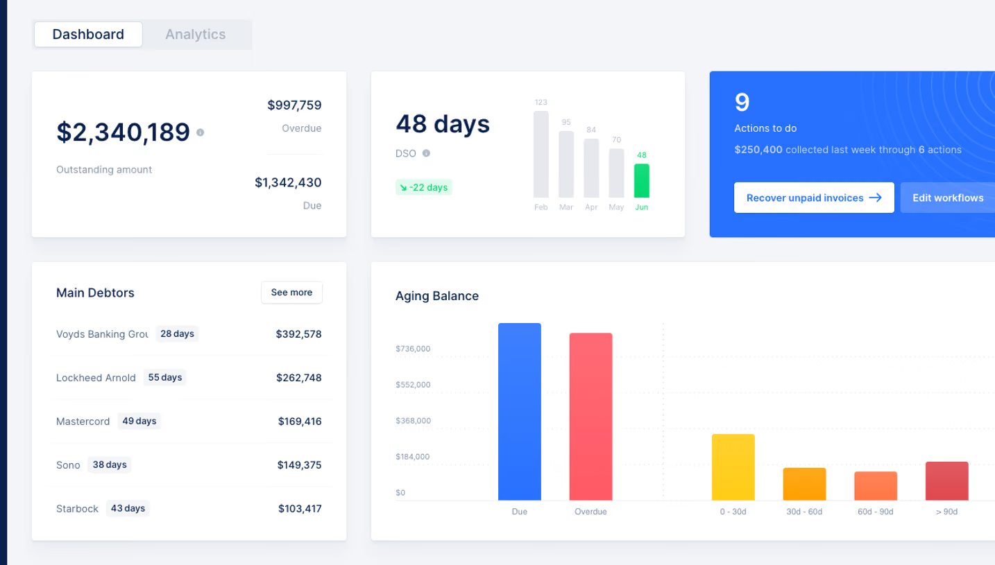






Upgrade to SaaSFrame Pro now to see similar examples.
Monthly
$18 /month
Billed $18 monthly
Browse all screens & flows
Filter and search screens & flows
Search text in screenshots
Access Figma files
Access mobile versions
Join now
Quarterly
$16 /month
Billed $48 quarterly
Browse all screens & flows
Filter and search screens & flows
Search text in screenshots
Access Figma files
Access mobile versions
Join now
Yearly
$15 /month
Billed $180 yearly
Browse all screens & flows
Filter and search screens & flows
Search text in screenshots
Access Figma files
Access mobile versions
Join now