Overall Style and Aesthetic
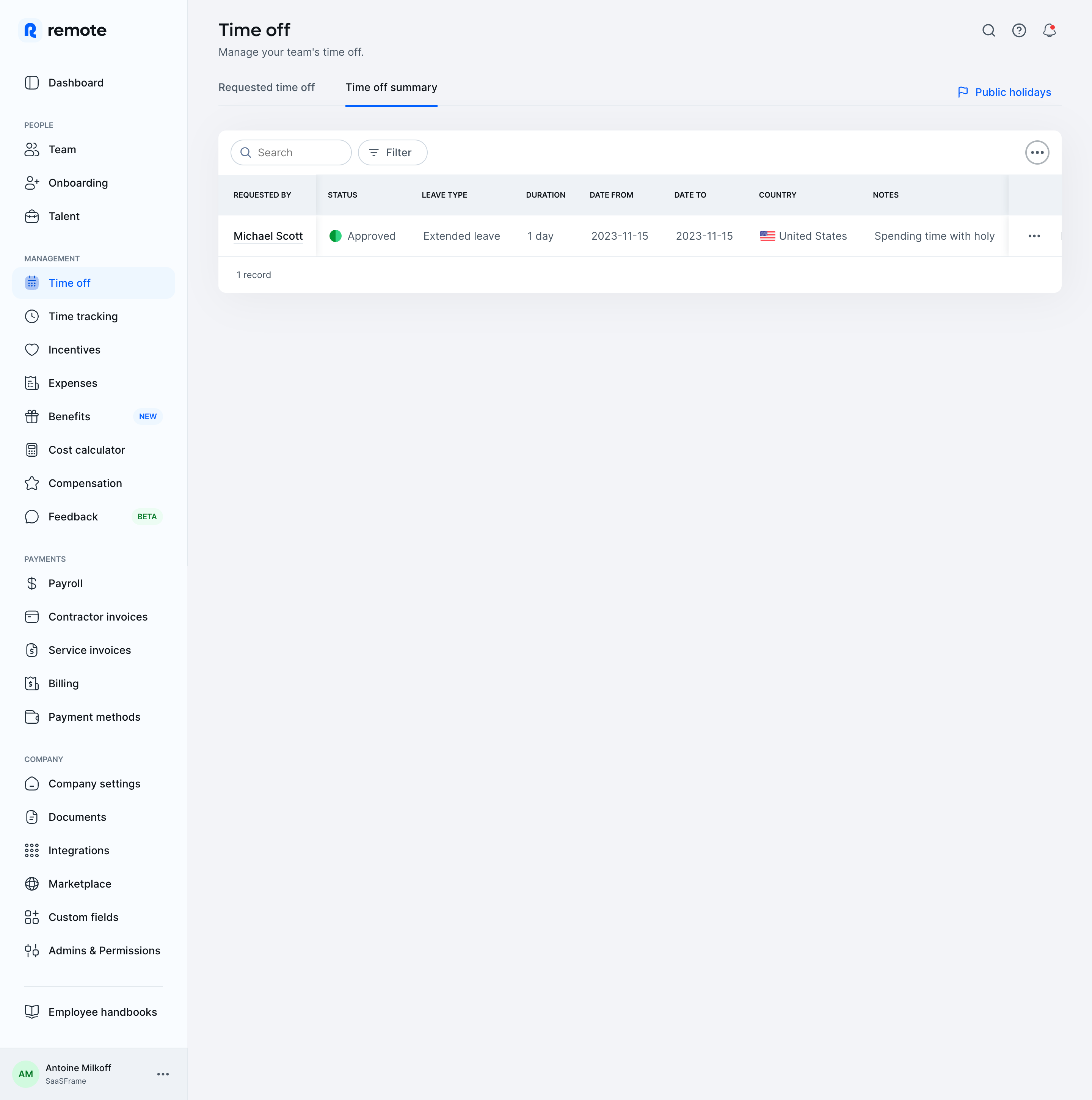
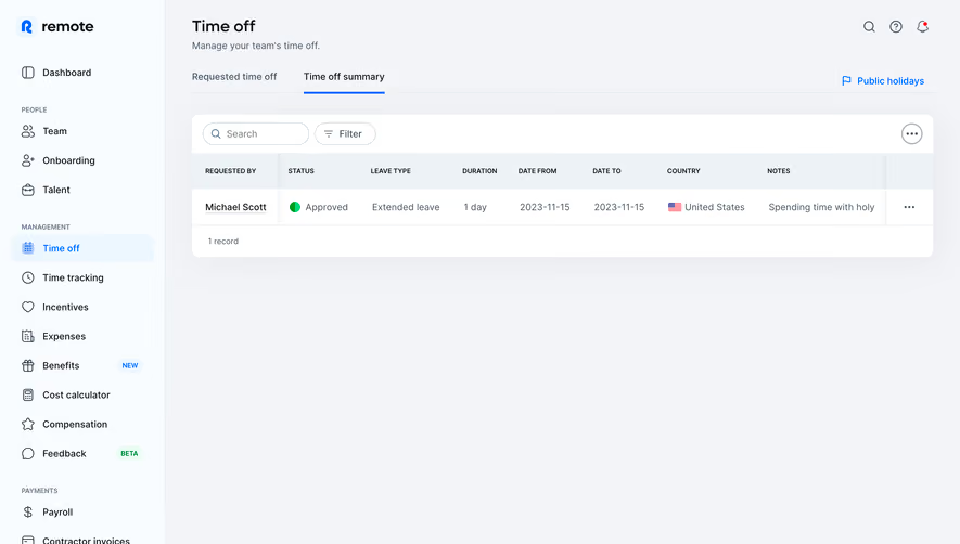
Employ Remote’s Time Off dashboard exemplifies a refined, modern SaaS aesthetic, balancing functionality with a clean, approachable interface. Its minimalist ethos eliminates clutter, directing attention to essential information while infusing the space with a sense of calm professionalism. Light backgrounds paired with vibrant accent colors channel a friendly confidence—striking a balance between warmth and corporate reliability. Layout and Structure
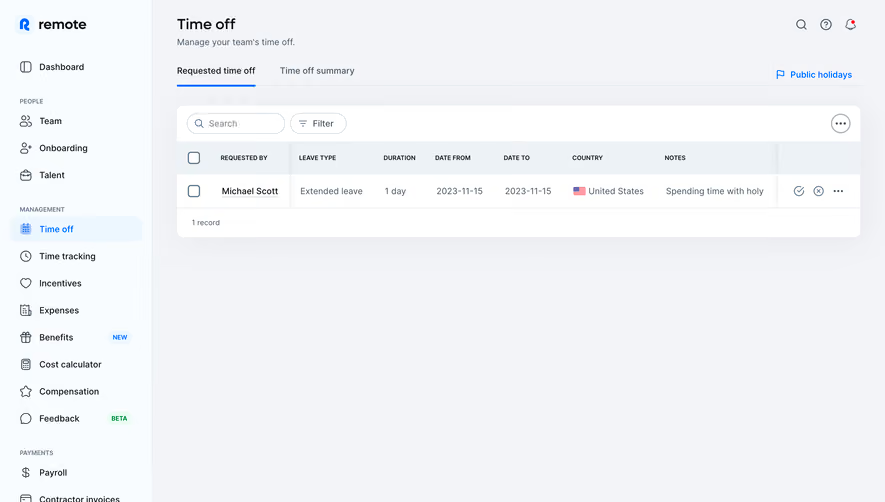
This dashboard abandons flashy hero banners or testimonials, favoring a focused, utility-driven structure. The key navigational areas—left sidebar menu, horizontal sub-tabs (e.g. “Summary,” “Requests”)—prioritize scannability. Critical stats and filters appear “above the fold,” while segmented content cards manage data density. The entire layout guides the user naturally from high-level overviews to actionable details, reducing cognitive load. Visual Elements
Neutral spaces are punctuated with crisp icons and subtle, on-brand illustrations that reinforce concepts like vacation days and PTO policies. Micro-interactions—such as hover highlights and checkmark feedback—inject subtle dynamism without distraction. Icons are line-based and contemporary, lending continuity throughout the interface. Color Palette and Typography
Dominated by whites and cool grays, the color palette makes strategic use of Remote’s bold blue and electric teal for highlights, states, and CTAs. Headings employ a geometric sans-serif with high legibility, applying weight and size contrast to enforce hierarchy. Informational tags and status chips use color-coded backgrounds for instant visual parsing. User Experience Patterns
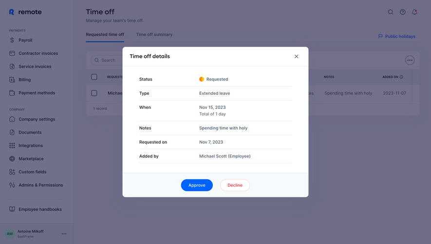
Left-aligned navigation, sticky headers, intuitive search, and filter options embody SaaS best practices. The main CTA (“Request Time Off”) stands out with color and position, while concise form modals reduce friction. Responsive layouts adapt seamlessly to smaller screens, ensuring accessibility and usability. Unique or Notable Design Choices
Noteworthy is the dashboard’s restraint: it eschews unnecessary ornamentation in favor of clarity, maintaining visual engagement through color and micro-interactions. The “summary” cards with graphical leave balances present data visually, creating a dashboard that feels both analytical and welcoming. Tone and Feel
The overall impression is trustworthy yet inviting—perfectly calibrated for global teams managing sensitive HR processes. The experience instills user confidence, blending modernity with a calm, approachable tone that makes PTO management almost enjoyable.