Overall Style and Aesthetic
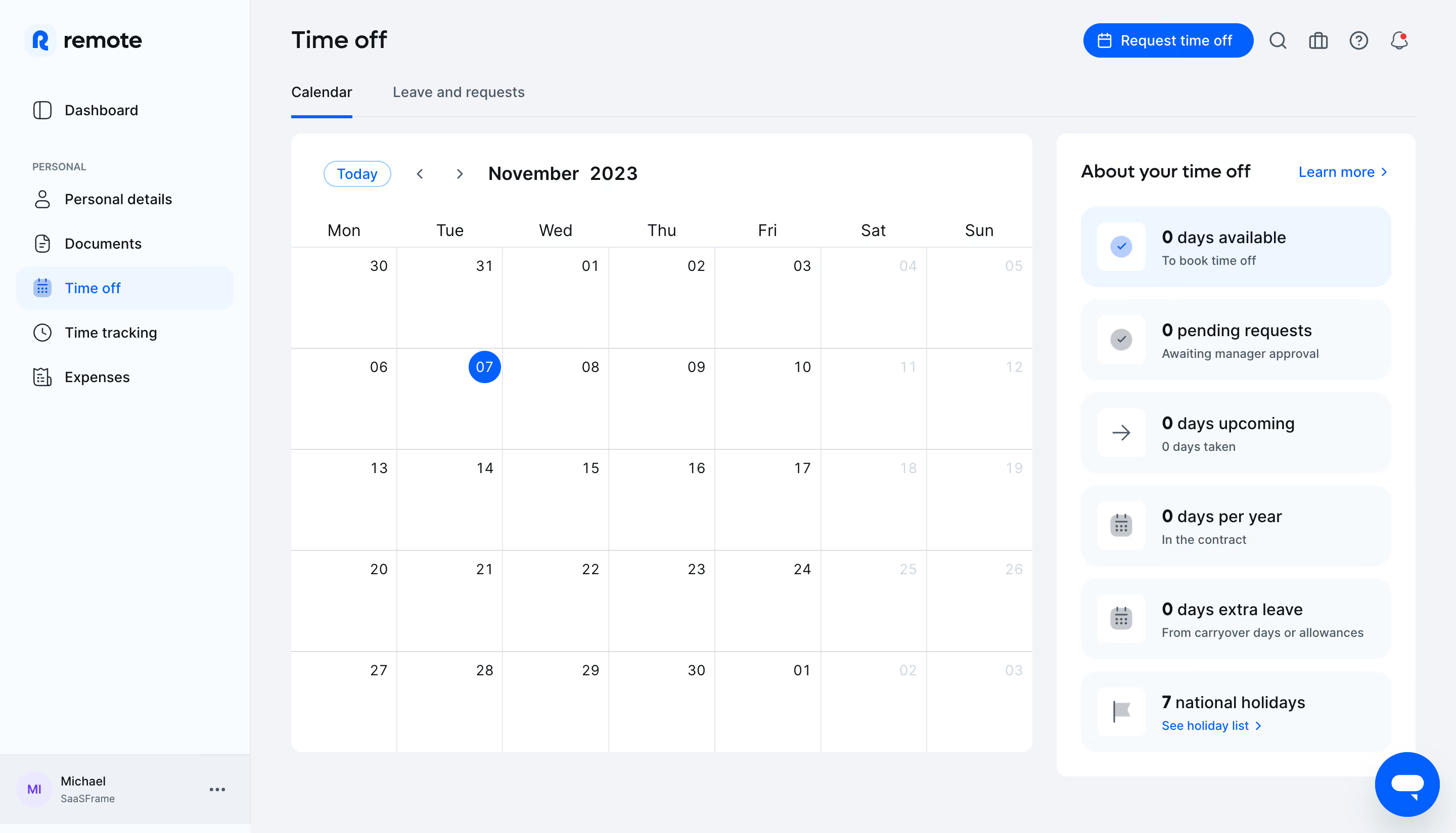
Remote’s time-off dashboard exemplifies modern minimalism with a crisp, professional vibe. The interface feels fresh and welcoming, using white space to create an uncluttered environment that invites focus and calm. Subtle accent colors reinforce the brand without overwhelming the senses, emphasizing usability and clarity over decoration. Layout and Structure
Content is structured for immediate utility. A clean top navigation bar provides quick access to essential modules, while the page is split into easy-to-scan sections: a concise header with user context and actionable controls, a calendar-based visualization of leave, and a clear summary of balances. The primary dashboard area keeps everything above the fold, minimizing the need for vertical scrolling and surfacing the most relevant actions immediately. Visual Elements
Functional icons and lightweight illustrations guide attention without distracting. Icons in tooltips, cards, and action buttons offer instant visual cues, and the custom calendar integrates status indicators for different leave types. No gratuitous motion—animations and transitions are subtle, lending a polished slickness to UI feedback. Color Palette and Typography
Dominant use of whites and light grays provides breathing room, punctuated by signature blues and purples that accentuate key actions and data points. Typography is sans-serif and approachable, with distinct hierarchy through weight, size, and spacing—headers command attention, while supporting copy remains quietly legible. User Experience Patterns
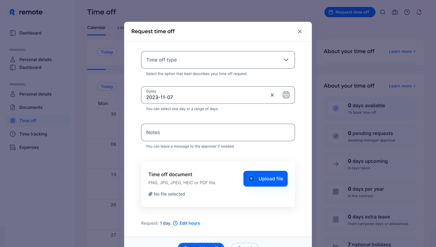
Navigation is frictionless, with sticky menus, intuitive CTAs, and quick-action modals for submitting requests. Helpful microcopy ensures users always understand the next step. Data visualization (like the leave calendar) is interactive, turning summary data into immediately usable insights. Notable Design Choices and Tone
The page’s standout feature is its balance of function and empathy: the design ensures that requesting time off feels easy and transparent, fostering trust. The tone is quietly confident, emphasizing clarity and control for users while remaining aesthetically refined—spot-on for a global, people-focused SaaS.