Overall Style and Aesthetic
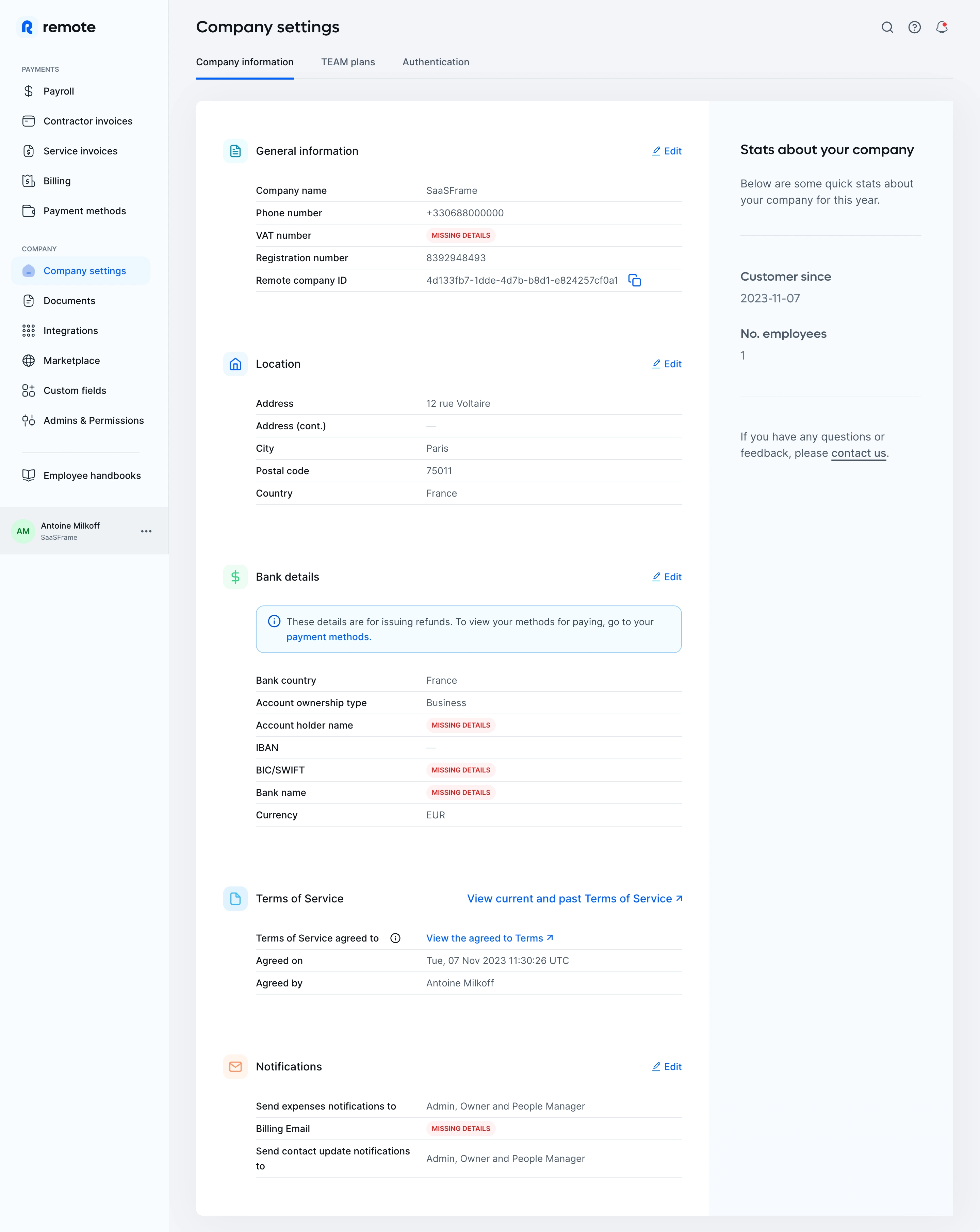
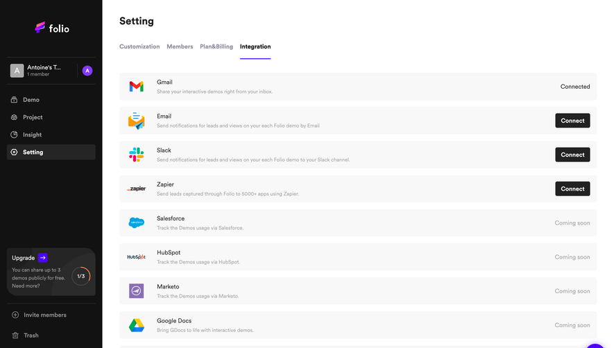
Employ Remote’s dashboard page exemplifies a sophisticated, minimalist SaaS aesthetic. Clean lines, generous white space, and restrained pops of brand color evoke professionalism and approachability. The uncluttered interface feels intentionally simplified, empowering users to focus on core backend tasks without distraction. Layout and Structure
The structure is highly functional, with a sidebar navigation anchoring the experience. Content is modular, displaying primary company information in a broad, single-column layout that’s easy to scan. Tabs enable contextual navigation (“Company Information,” “People,” etc.), eschewing overwhelming multi-section pages and guiding users step by step. The header’s compact layout and fixed position aid orientation. Visual Elements
SVG icons and subtle accent graphics lend visual interest without detracting from the data. Avatar placeholders and status badges offer at-a-glance clarity and reinforce the brand’s tech-savvy character. Visual hierarchy is clear, using shaded info cards and crisp divider lines for separation. Color Palette and Typography
A modern, accessible palette dominates: neutral backgrounds contrast with deep navy, teal, and soft blues, while accent highlights (such as buttons or status dots) are reserved for points of action. Typography is crisp and readable—likely sans-serif, with bold variants for headings and a harmonious rhythm between label text and actionable elements. User Experience Patterns & Unique Choices
Navigation is frictionless, utilizing a persistent sidebar and clearly marked CTAs (“Edit,” “Add new,” etc.). Form fields are cleanly presented, benefiting from ample spacing and inline validation cues. The use of cloud-inspired, abstract icons throughout conveys reliability and innovation. Overall, the dashboard’s tone feels confident and trustworthy—perfect for organizations managing sensitive global employment data.