Generate a new design based on this screen using your own content.
Thank you! Your submission has been received!
Oops! Something went wrong while submitting the form.
# Design from Reference: Reducto Blog Feed
Create an original, high-fidelity visual design inspired by the reference. Prioritize composition, typography, colors, spacing, and component styling over technical implementation.
## Reference
- **Product:** Reducto
- **Category:** Blog Feed
- **Screenshot:** https://cdn.prod.website-files.com/5e9dc792e1210c5325f7ebbc/6acad40ec910b3adf9e48d72_6acad1a5c2028efdec712489_cms-8682712fc66bcb11947533b2.webp
Analyze the screenshot first. If inaccessible, request it rather than guessing.
## Content
{{content.instructions}}
{{content.data}}
Preserve essential messaging and factual accuracy. Adapt structure and copy length for visual balance; never invent product claims.
## Visual Design
Use this context to reproduce the reference's visual language: layout, typography, colors, spacing, borders, radii, and distinctive elements. The screenshot takes priority if descriptions conflict.
## Direction
{{preferences.fidelityInstructions}}
## Output
{{output.instructions}}
Deliver a polished, cohesive design with precise alignment, hierarchy, and spacing. Produce the requested visual artifact, not just a description. If unsupported, explain the limitation.
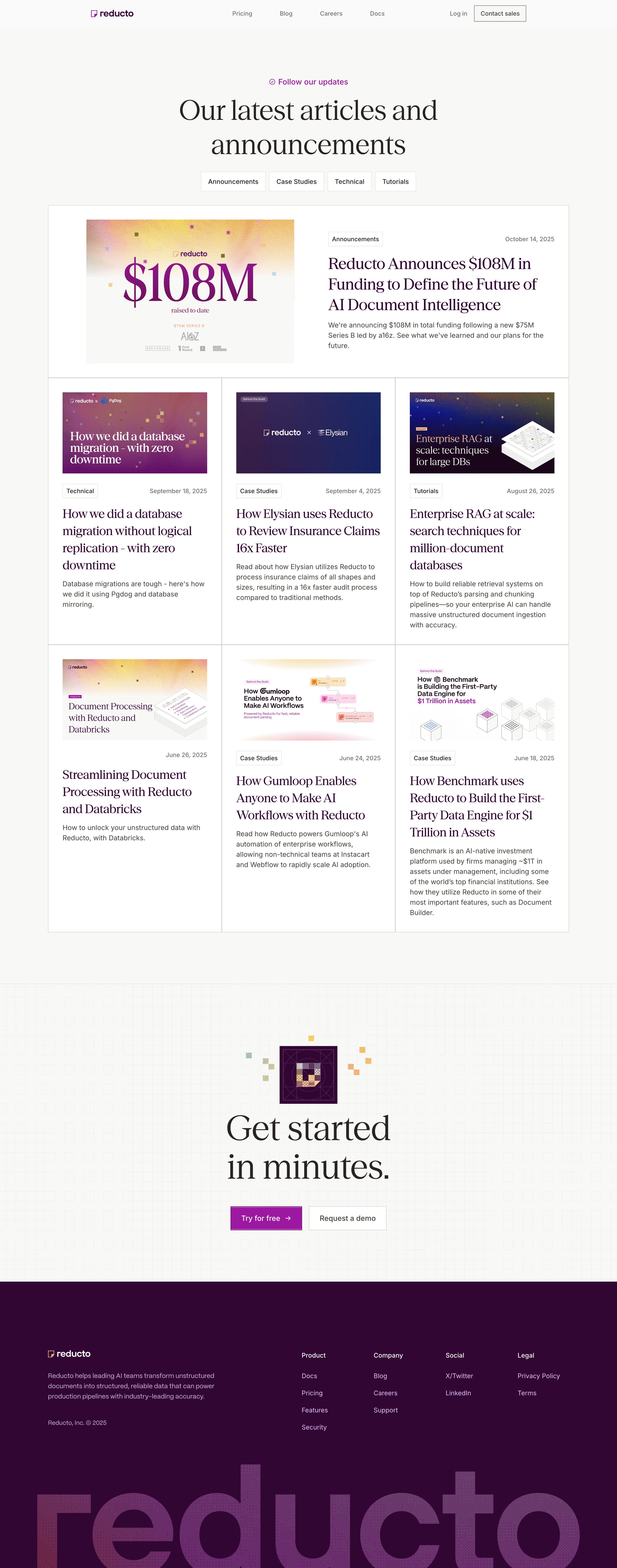
Reducto.ai’s blog exemplifies a modern, minimalist SaaS aesthetic—clean lines, ample whitespace, and restrained use of color create a highly professional yet approachable atmosphere. The style is unfussy, focusing attention on content while radiating tech-savvy sophistication.
Layout and Structure
The page adopts a streamlined column layout: a compact header with branding and navigation sits above a hero section featuring a concise page title and subheading, anchoring users immediately. Blog posts are arranged in an ordered grid with clear separation and generous margins. There are no distractions—features like sidebars or pop-ups are pleasingly absent, supporting laser-focused reading.
Visual Elements
Visuals are purposeful and minimal, letting content take center stage. Each blog post features a custom illustration or bold graphic thumbnail, adding vibrancy and thematic cues without clutter. Visual hierarchy is maintained through well-proportioned images and space rather than ornate iconography or animation.
Color Palette and Typography
The color palette is restrained—dominated by cool whites and grays, punctuated with a signature blue for highlights and interactive elements, lending both clarity and brand recognition. Typography is modern and readable, using sans-serif fonts with distinct hierarchy: large, bold headings guide the eye, while smaller body text invites deep engagement.
User Experience Patterns
Navigation is frictionless: a sticky header keeps key links accessible. Calls-to-action are subtle and context-driven—a gentle encouragement to explore further rather than shout for attention. Pagination is understated, ensuring readers focus on content. Smooth scroll interactions and consistent spacing amplify comfort and usability.
Unique Design Choices and Tone
Standout design choices include the highly readable blog grid, unique post artwork, and an unwavering commitment to visual simplicity. The overall tone is trustworthy and innovative, suggesting cutting-edge technology delivered with reassuring calm and expertise—an ideal model for SaaS teams seeking to project both authority and accessibility.