Overall Style and Aesthetic
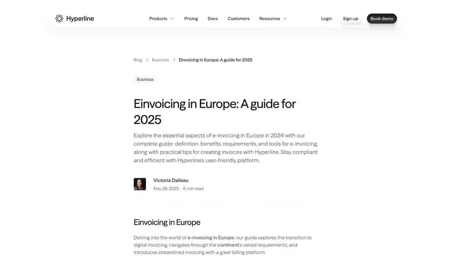
RallyOn’s blog page exudes a clean, modern professionalism with a dash of vibrancy. The minimalist layout is enhanced with generous white space, streamlined content blocks, and fresh, playful accents. Decorative geometric shapes and a crisp interface establish a trustworthy yet approachable tone, perfect for SaaS audiences. Layout and Structure
The page opens with a compelling hero section featuring a concise headline and subheading, complemented by an eye-catching banner image. Content is organized into clear sections: an introductory summary, featured checkouts, and supporting insights. There’s a sticky navigation bar atop, while intuitive sidebars surface related articles and recommended reads, sustaining user engagement. Visual Elements
Instead of heavy visuals or stock photography, RallyOn leans into subtle illustrations and branded icons. Screenshots are embedded thoughtfully within the text, showcasing real-world checkout examples without clutter. Subtle hover effects animate links and buttons for interactive feedback, promoting a dynamic user experience without visual overload. Color Palette and Typography
A limited palette—primarily deep navy, crisp white, and electric blue accents—anchors the design, with occasional coral and mint highlights drawing attention to CTAs and key examples. Clear sans-serif fonts execute both headlines and body copy, employing bold weights for headers and generous line height for effortless readability. User Experience Patterns
Navigation is straightforward: sticky elements keep the top menu accessible, and related content in sidebars provides ample exploration cues. Prominent, non-intrusive CTAs invite newsletter signup or deeper dives into content. Smooth scrolling and logical information hierarchy make longer reads feel digestible and inviting. Unique or Notable Design Choices
Distinctive touches—like geometric patterns in the hero, well-curated checkout screenshots, and understated micro-interactions—create an innovative yet user-friendly browsing atmosphere. The cohesive tone and carefully tuned visuals inspire confidence, making this a standout reference for SaaS blog design inspiration.