Generate a new design based on this screen using your own content.
Thank you! Your submission has been received!
Oops! Something went wrong while submitting the form.
# Design from Reference: Qatalog Templates Library
Create an original, high-fidelity visual design inspired by the reference. Prioritize composition, typography, colors, spacing, and component styling over technical implementation.
## Reference
- **Product:** Qatalog
- **Category:** Templates Library
- **Screenshot:** https://cdn.prod.website-files.com/5e9dc792e1210c5325f7ebbc/6acb6ea22837b9f3168fb5d7_6acb6c7e3f1023ca3771d847_cms-06c0dc908f91c4d09a888202.webp
Analyze the screenshot first. If inaccessible, request it rather than guessing.
## Content
{{content.instructions}}
{{content.data}}
Preserve essential messaging and factual accuracy. Adapt structure and copy length for visual balance; never invent product claims.
## Visual Design
Use this context to reproduce the reference's visual language: layout, typography, colors, spacing, borders, radii, and distinctive elements. The screenshot takes priority if descriptions conflict.
## Direction
{{preferences.fidelityInstructions}}
## Output
{{output.instructions}}
Deliver a polished, cohesive design with precise alignment, hierarchy, and spacing. Produce the requested visual artifact, not just a description. If unsupported, explain the limitation.
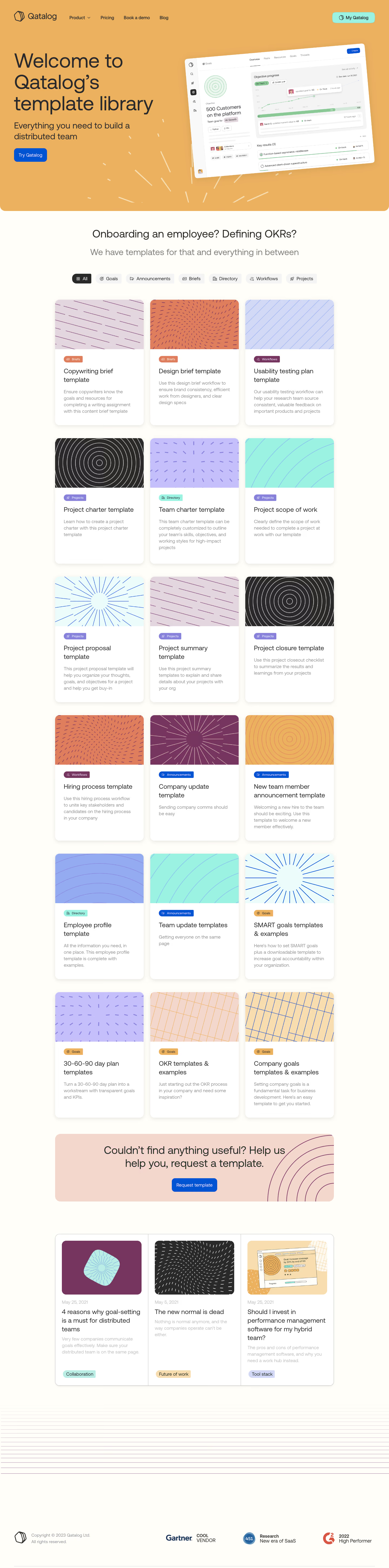
Qatalog’s templates page embodies a refined minimalism with a distinctly modern and professional aura. Clean white backgrounds set a calm, uncluttered tone, punctuated by subtle gradients and softly rounded cards that project approachability. Generous spacing and restrained color use create breathing room, reflecting a focus on clarity and ease rather than visual noise.
Layout and Structure
The page flows logically from a prominent hero section—with a crisp headline and succinct supporting text—directly into a dynamic grid of template cards. Each card acts as an entry point, drawing users further with concise summaries and inviting visuals. The page is divided into digestible sections, foregoing unnecessary clutter (like testimonials or pricing blocks) to spotlight its template library. A concise footer anchors the experience, reiterating brand trust and providing navigational support.
Visual Elements
Vivid yet understated illustrations soften the tech-forward feel, and lightweight icons communicate functionality at a glance. Gentle micro-interactions—like subtle hover effects or animated transitions—guide attention and reinforce interactivity, making browsing both intuitive and visually engaging.
Color Palette and Typography
A contemporary palette of deep charcoals, cool grays, and select accent colors (such as teal and indigo) ensures important actions and sections pop. The sleek sans-serif font family delivers clear hierarchy: bold headings lead the eye, while light, well-spaced body text maximizes readability on every device.
User Experience Patterns
Intuitive navigation stays ever-accessible via a fixed header. Prominent CTAs guide users from discovery to template selection seamlessly, with cards acting as large, clickable targets. Smooth scrolling, filter options, and simple forms streamline exploration, prioritizing utility and delight in equal measure.
Unique or Notable Design Choices
Noteworthy is the dynamic, interactive grid—responsive layouts fluidly adapt to any screen, and playful accent animations inject energy without distraction. The overall tone is trustworthy yet innovative, perfectly capturing the spirit of a forward-thinking SaaS brand focused on user empowerment and clarity.