
Thank you! Your submission has been received!
Oops! Something went wrong while submitting the form.
Get SaaSFrame Pro
Monthly
$18
Quarterly
$48
Yearly
$180
Upgrade to access this feature
Browse all screens & flows
Filter and search screens & flows
Access Figma files
Access mobile versions
Bookmark screens & flows
Join now
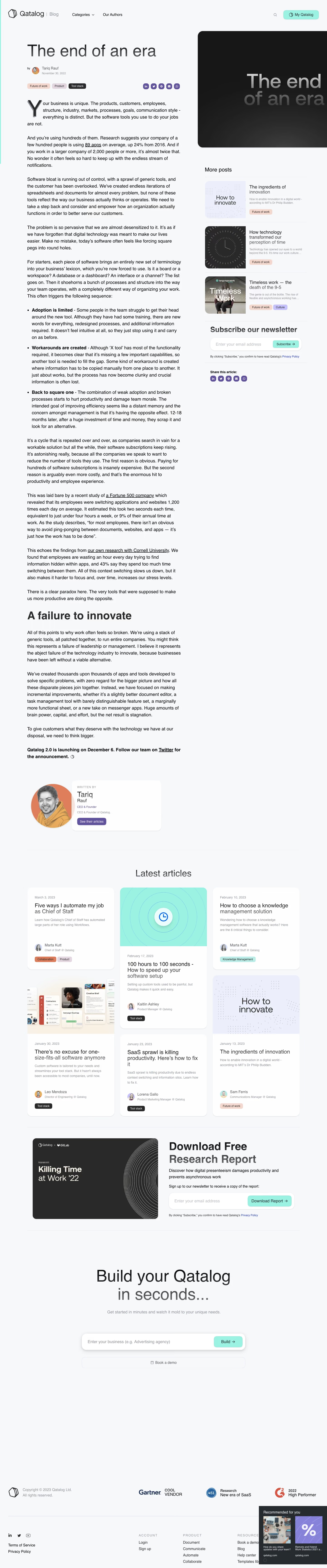

Qatalog Blog Post

Qatalog
Your Bespoke Operating System for Work
Designed by
No items found.

Bookmark
Bookmark

Design with AI
Thank you! Your submission has been received!
Oops! Something went wrong while submitting the form.
# Design from Reference: Qatalog Blog Post
Create an original, high-fidelity visual design inspired by the reference. Prioritize composition, typography, colors, spacing, and component styling over technical implementation.
## Reference
- **Product:** Qatalog
- **Category:** Blog Post
- **Screenshot:** https://cdn.prod.website-files.com/5e9dc792e1210c5325f7ebbc/6acb6ea42837b9f3168fb605_6acb6c87994832179b573700_cms-682bcfb43bc133ed8662251c.webp
Analyze the screenshot first. If inaccessible, request it rather than guessing.
## Content
{{content.instructions}}
{{content.data}}
Preserve essential messaging and factual accuracy. Adapt structure and copy length for visual balance; never invent product claims.
## Visual Design
### Overall aesthetic
- **Style:** Spacious editorial blog page on a cool near-white background, combining large regular-weight headings, long-form black text, mint actions and rounded article cards.
- **Scale:** Source image 1440 × 6904 screenshot pixels. Dimensions below describe screenshot pixels; CSS scale is unverified.
### Page composition
- **Header:** Qatalog | Blog branding, Categories and Our Authors align left; search and a mint My Qatalog button sit right.
- **Article and sidebar:** The main layout uses a roughly 680px article column at x120 and a roughly 450px right sidebar with about 80px separation. A large dark title graphic occupies the sidebar's upper region.
- **Article conclusion:** The long text ends with a bold announcement and an author module combining a circular portrait with a white rounded biography card.
- **Lower regions:** Six latest-article cards form a staggered three-column grid. A two-column research-report signup follows, then a large centered product-builder form and a spacious footer with awards, social/legal links and navigation groups.
### Information hierarchy
- **Article opening:** A large title precedes author/avatar/date metadata, three category pills and purple sharing icons. The opening paragraph begins with an oversized decorative Y drop cap.
- **Reading structure:** Body paragraphs, underlined inline links, a three-item bold-led bullet list and a large A failure to innovate subheading structure the argument.
- **Sidebar:** More posts contains three thumbnail/text items, followed by a newsletter form and repeated sharing controls. This sidebar ends well before the long article.
- **Conversion sequence:** Related content gives way to a report download form, then a business-description builder and secondary Book a demo action.
### Typography
- **Family:** Neutral sans-serif; exact font identity is unverified.
- **Article roles:** Title approximately 70px regular; article body around 20px/30px; major subheading about 48px bold. Metadata is roughly 14–16px, with smaller date text.
- **Lower roles:** Latest articles heading around 40px regular; card titles about 24px, descriptions 14–15px/22px. Report title around 48px bold; final builder headline approximately 70px with a two-line treatment.
### Colors & surfaces
- **Sampled palette:** ICC-aware sRGB samples include background #F6F8FA, near-white card #FDFEFE, charcoal #292929 and #171717, pale lavender #ECEFFB and mint #9BF2E2.
- **Accent roles:** Mint fills key buttons; purple fills share circles and the author action. Category pills use soft peach, lavender, mint or charcoal according to topic.
- **Treatment:** Cards use very subtle shadows and large soft corners. Fine light-gray rules divide sidebar items and major lower sections.
### Components
- **Article artwork:** A large rounded dark graphic repeats the article title in oversized gray lettering, with a subtle tonal gradient.
- **Sharing and tags:** Small circular purple social buttons align horizontally; category pills are short, softly rounded labels with compact text.
- **Related cards:** Approximately 380px-wide white cards with around 20px corners, varied optional images, publication date, title, summary, author/avatar and topic pills.
- **Forms:** Newsletter and report forms place a mint action inside a white rounded input container. The main builder input is about 720px wide with a deeper soft shadow, followed by a matching-width outlined demo control.
- **Footer overlay:** A dark Recommended for you widget with two thumbnails overlaps the lower-right footer in the capture; it is an overlay rather than part of the footer columns.
### Visual rhythm
- **Article cadence:** Paragraphs use generous 30–40px gaps, with a narrow consistent measure and substantial space around the major subheading and author module.
- **Grid rhythm:** Related cards vary in height across three columns, creating staggered lower edges. The report and builder regions add large breathing spaces after the dense reading content.
- **Alignment:** Article, related grid and report boundaries share left/right guides; the final builder deliberately recenters content within them.
### Responsive
- **Recommended adaptation:** Desktop only is shown. Move related posts, newsletter and sharing below the article on narrow screens; use a single reading column and reduce large headings.
- **Forms and cards:** Stack report image and form, collapse article cards to one column and let embedded buttons move below inputs when necessary. Prevent recommendation overlays from covering legal links.
### Adaptation guidance
- **Preserve:** Retain the strong editorial measure, drop cap, clear article metadata, supporting sidebar and progressively stronger lower conversion areas.
- **Adapt:** Use genuine article content, author identity and related resources. Keep category colors consistent, and avoid carrying historical announcement or report claims into unrelated content.
Use this context to reproduce the reference's visual language: layout, typography, colors, spacing, borders, radii, and distinctive elements. The screenshot takes priority if descriptions conflict.
## Direction
{{preferences.fidelityInstructions}}
## Output
{{output.instructions}}
Deliver a polished, cohesive design with precise alignment, hierarchy, and spacing. Produce the requested visual artifact, not just a description. If unsupported, explain the limitation.


Category
Tech Stack
No items found.
Added on
March 15, 2023
Similar screens





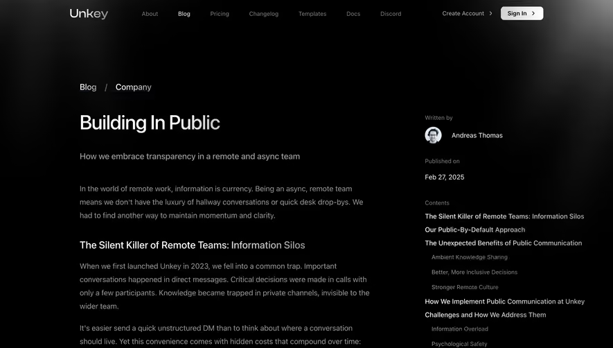

Upgrade to SaaSFrame Pro now to see similar examples.
Monthly
$18 /month
Billed $18 monthly
Browse all screens & flows
Filter and search screens & flows
Search text in screenshots
Access Figma files
Access mobile versions
Join now
Quarterly
$16 /month
Billed $48 quarterly
Browse all screens & flows
Filter and search screens & flows
Search text in screenshots
Access Figma files
Access mobile versions
Join now
Yearly
$15 /month
Billed $180 yearly
Browse all screens & flows
Filter and search screens & flows
Search text in screenshots
Access Figma files
Access mobile versions
Join now