Generate a new design based on this screen using your own content.
Thank you! Your submission has been received!
Oops! Something went wrong while submitting the form.
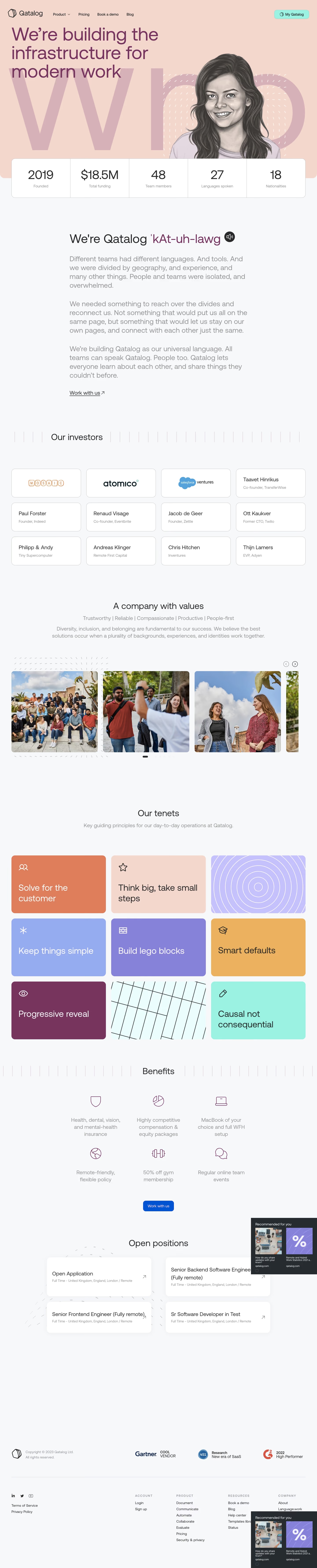
# Design from Reference: Qatalog About Page
Create an original, high-fidelity visual design inspired by the reference. Prioritize composition, typography, colors, spacing, and component styling over technical implementation.
## Reference
- **Product:** Qatalog
- **Category:** About Page
- **Screenshot:** https://cdn.prod.website-files.com/5e9dc792e1210c5325f7ebbc/6acb6ea32837b9f3168fb5f3_6acb6c7edf214d356eeabfde_cms-86741384afd02f05c6d5e3b6.webp
Analyze the screenshot first. If inaccessible, request it rather than guessing.
## Content
{{content.instructions}}
{{content.data}}
Preserve essential messaging and factual accuracy. Adapt structure and copy length for visual balance; never invent product claims.
## Visual Design
Use this context to reproduce the reference's visual language: layout, typography, colors, spacing, borders, radii, and distinctive elements. The screenshot takes priority if descriptions conflict.
## Direction
{{preferences.fidelityInstructions}}
## Output
{{output.instructions}}
Deliver a polished, cohesive design with precise alignment, hierarchy, and spacing. Produce the requested visual artifact, not just a description. If unsupported, explain the limitation.
Qatalog's About page exemplifies sleek minimalism blended with a modern, innovative edge. The site emphasizes clarity with abundant white space, precise alignment, and unobtrusive UI elements. Subtle color pops and a restrained visual language lend a professional yet approachable tone, favoring trustworthiness and transparency—key for SaaS brands.
Layout and Structure
The page begins with a bold, statement-driven hero section featuring a clean headline and a succinct description. Scrolling downward, content is structured into digestible segments: company story, team visuals, core values, and mission. Instead of cramming information, sections breathe with ample padding, allowing each story or value to stand out. Team photos and narratives are used in lieu of testimonials or pricing, underscoring a people-centric brand.
Visual Elements
Crisp, high-resolution photography humanizes the organization, giving faces to the brand. Custom illustrations and minimalistic iconography add unique flourishes without cluttering the experience. Subtle animations and on-scroll transitions bring dynamism to the presentation while maintaining overall calm.
Color Palette and Typography
Dominant use of white and cool grays is skillfully accented by muted blues and occasional highlight colors. Headings employ a modern sans-serif that scales for impact, while paragraph text is smaller, clean, and highly readable. Clear visual hierarchy guides the visitor’s eye through headlines, subtexts, and calls-to-action.
User Experience Patterns
Sticky top navigation provides quick access and orientation throughout the site. CTAs are discreet—encouraging exploration rather than aggressive conversion. Large touch targets and simple forms create a seamless mobile experience. On-scroll reveals and microinteractions energize engagement without distraction.
Unique or Notable Design Choices
Qatalog’s About page resists SaaS clichés by showcasing authentic photography and candid team intros instead of stock icons or overloaded feature grids. The overall tone is quietly confident and future-focused, signaling innovation while remaining human at the core—a sophisticated reference for SaaS teams seeking inspiration.