Overall Style and Aesthetic
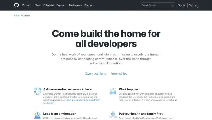
Proof’s careers page embodies a refined, modern aesthetic with minimalist sensibilities. Clean whitespace frames each section, creating a sense of openness and clarity. Pops of vibrant accent colors bring energy and warmth, but are sparingly used, keeping the tone polished and professional with subtle touches of playfulness that hint at a creative and dynamic culture. Layout and Structure
The structure unfolds thoughtfully: a bold hero section immediately captures attention with a headline and crisp copy that sets a welcoming tone. Down the page, content is intuitively segmented—an “About Us” pitch, team member highlights, open positions, and friendly calls to action guide prospects seamlessly. The absence of visual clutter or overwhelming information supports an easy reading flow. Visual Elements
Custom illustrations and lively photography humanize the company, amplifying its approachable vibe. Iconography is fresh but restrained, used purposefully to reinforce points rather than just decorate. Animated hover effects throughout add interactivity and polish, delighting users as they browse. Color Palette and Typography
Proof blends a soft, neutral background with bold blues, rich purples, and warm coral accents. Ample contrast ensures headers stand out, while body text remains highly legible. Fonts are modern, sans-serif, and feature a well-defined hierarchy—large, welcoming headings paired with comfortably sized supporting text. User Experience Patterns
Sticky navigation ensures users stay oriented, with “Open Roles” and “Culture” sections easy to reach. CTAs are clear and compelling, using bright color blocks and generous spacing to invite engagement. Scroll-triggered content reveals and micro-interactions give the site an engaging, tactile rhythm. Unique or Notable Design Choices
Proof’s careers page distinguishes itself via authentic team photos, candid messaging (“We’re a people-first company”), and playful, informal touches that project both trustworthiness and genuine human energy. This is SaaS recruiting design that feels alive, inclusive, and distinctly un-corporate—making it standout inspiration for anyone seeking to showcase company culture online.