Design with AI
Generate a new design based on this screen using your own content.
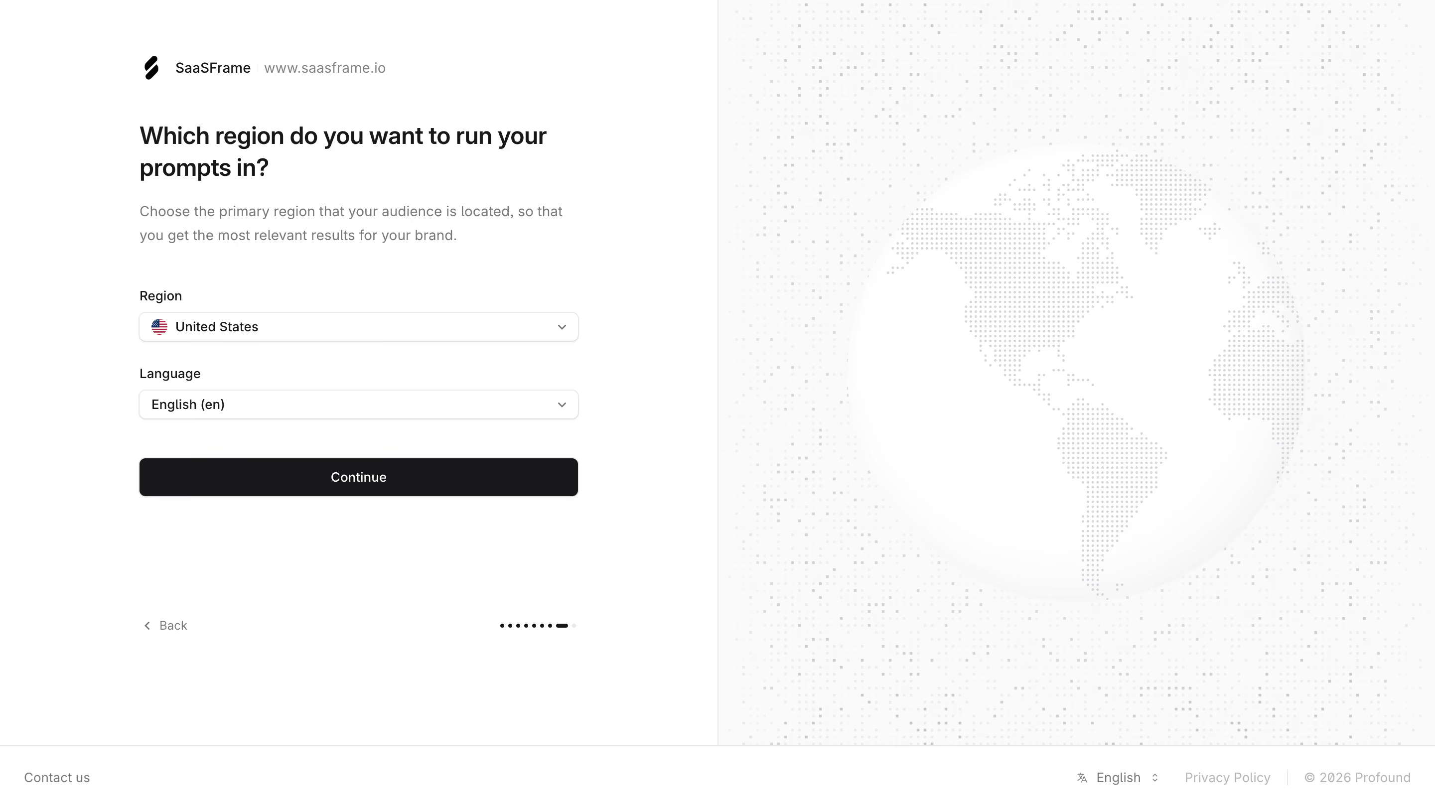
# Design from Reference: Profound Select Region
Create an original, high-fidelity visual design inspired by the reference. Prioritize composition, typography, colors, spacing, and component styling over technical implementation.
## Reference
- **Product:** Profound
- **Category:** Account Setup
- **Screenshot:** https://cdn.prod.website-files.com/5e9dc792e1210c5325f7ebbc/6acc0f645d6cd572f289cb58_6acc0e4e5706a500e65d7618_cms-da4c20a6368d624720d1108d-v3.webp
Analyze the screenshot first. If inaccessible, request it rather than guessing.
## Content
{{content.instructions}}
{{content.data}}
Preserve essential messaging and factual accuracy. Adapt structure and copy length for visual balance; never invent product claims.
## Visual Design
### Overall aesthetic
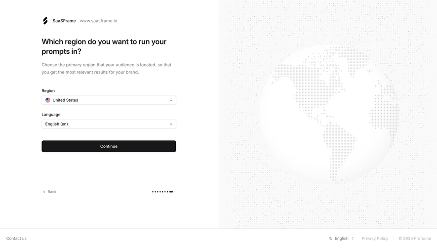
- **Character:** A minimal onboarding step pairs a white region/language form with a large pale dotted globe illustration.
- **Capture scale:** The screenshot measures 2880 × 1624 pixels. Approximate CSS dimensions assume a 1440 × 812 viewport at 2× density; this is unverified.
- **Tone:** Monochrome controls and subdued geographic artwork keep the task focused and calm.
### Page composition
- **Split layout:** The main area is divided equally into a left form region and right illustration region.
- **Brand context:** A workspace mark/name and website text sit at the upper left of the form column.
- **Question:** A two-line heading and short explanation introduce the regional choice.
- **Fields:** Region and Language dropdowns stack above a full-width dark Continue action.
- **Lower navigation:** Back sits left of a small dot-based step indicator near the form bottom.
- **Footer:** A full-width thin-bordered strip contains contact, language, privacy and copyright details.
### Information hierarchy
- **Question:** The bold heading asks where prompts should run.
- **Explanation:** Muted copy connects region selection to audience relevance.
- **Choices:** Region is shown with a country flag and selected value; language has a separate selected value.
- **Primary action:** Continue is the only dark filled control.
- **Progress:** A compact sequence of dots and an elongated dark marker indicates a late onboarding stage, without explicit step numbers.
- **Illustration:** A faint globe reinforces geography without adding selectable controls.
### Typography
- **Family:** A neutral sans-serif is visible; exact identity is unverified.
- **Heading:** Approximately 24px CSS semibold with 32px line-height.
- **Explanation:** Approximately 14px with 24px line-height.
- **Labels/values:** Approximately 14px regular.
- **Action:** Approximately 14px medium white text.
- **Footer/back:** Approximately 12–13px muted text.
### Colors & surfaces
- **Base:** Sampled #FFFFFF supplies the form and globe surface.
- **Illustration region:** Sampled #FAFAFA supplies the pale right background.
- **Dotted details:** Sampled #F7F7F7, #F9F9F9 and #F8F8F8 contribute to the low-contrast map pattern.
- **Primary action:** Sampled #18181A supplies the Continue button.
- **Secondary text:** Medium gray distinguishes instructions, domain and footer content.
- **Borders:** Fine pale-gray outlines separate fields, split regions and footer.
### Components
- **Dropdowns:** Approximately 440 × 30px CSS, white with thin gray outline, 6px radii and right chevrons.
- **Region icon:** A small flag precedes the selected country.
- **Continue:** Matching-width dark rectangle around 40px high with small radii and subtle shadow.
- **Back control:** A small left chevron precedes muted text.
- **Step indicator:** Tiny dark circles lead into a short rounded bar and pale final dot.
- **Globe art:** A large softly shaded white sphere uses gray dot continents over a broader dotted background.
- **Footer language:** A small translation icon and language label sit beside policy/copyright text.
### Visual rhythm
- **Form width:** A roughly 440px column sits centered within the left half.
- **Opening spacing:** Around 40px separates brand context from the question.
- **Field cadence:** Roughly 24px separates the two labeled selectors.
- **Action separation:** Around 40px sits between language selector and Continue.
- **Lower gap:** Large whitespace separates the action from Back/progress.
### Responsive
- **Evidence limit:** Only desktop is observed; selector behavior and mobile transitions are unverified.
- **Layout recommendation:** Prioritize the form and reduce or omit the globe on narrow screens.
- **Control recommendation:** Keep selectors full width and maintain persistent labels.
- **Progress recommendation:** Provide a textual step description in addition to dots.
- **Footer recommendation:** Allow utilities to wrap without colliding with navigation.
### Adaptation guidance
- **Onboarding model:** Keep region and language distinct and explain their effects clearly.
- **Data consistency:** Populate valid region/language combinations from maintained options.
- **Artwork:** Treat the dotted globe as decoration rather than an interactive map.
- **Accessibility:** Label selectors, expose current values and provide visible keyboard focus.
- **Scope:** The capture shows a selection step only; it does not verify prompt execution or regional service availability.
Use this context to reproduce the reference's visual language: layout, typography, colors, spacing, borders, radii, and distinctive elements. The screenshot takes priority if descriptions conflict.
## Direction
{{preferences.fidelityInstructions}}
## Output
{{output.instructions}}
Deliver a polished, cohesive design with precise alignment, hierarchy, and spacing. Produce the requested visual artifact, not just a description. If unsupported, explain the limitation.