Design with AI
Generate a new design based on this screen using your own content.
# Design from Reference: Profound Content Dashboard
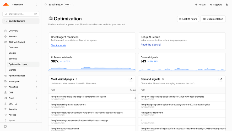
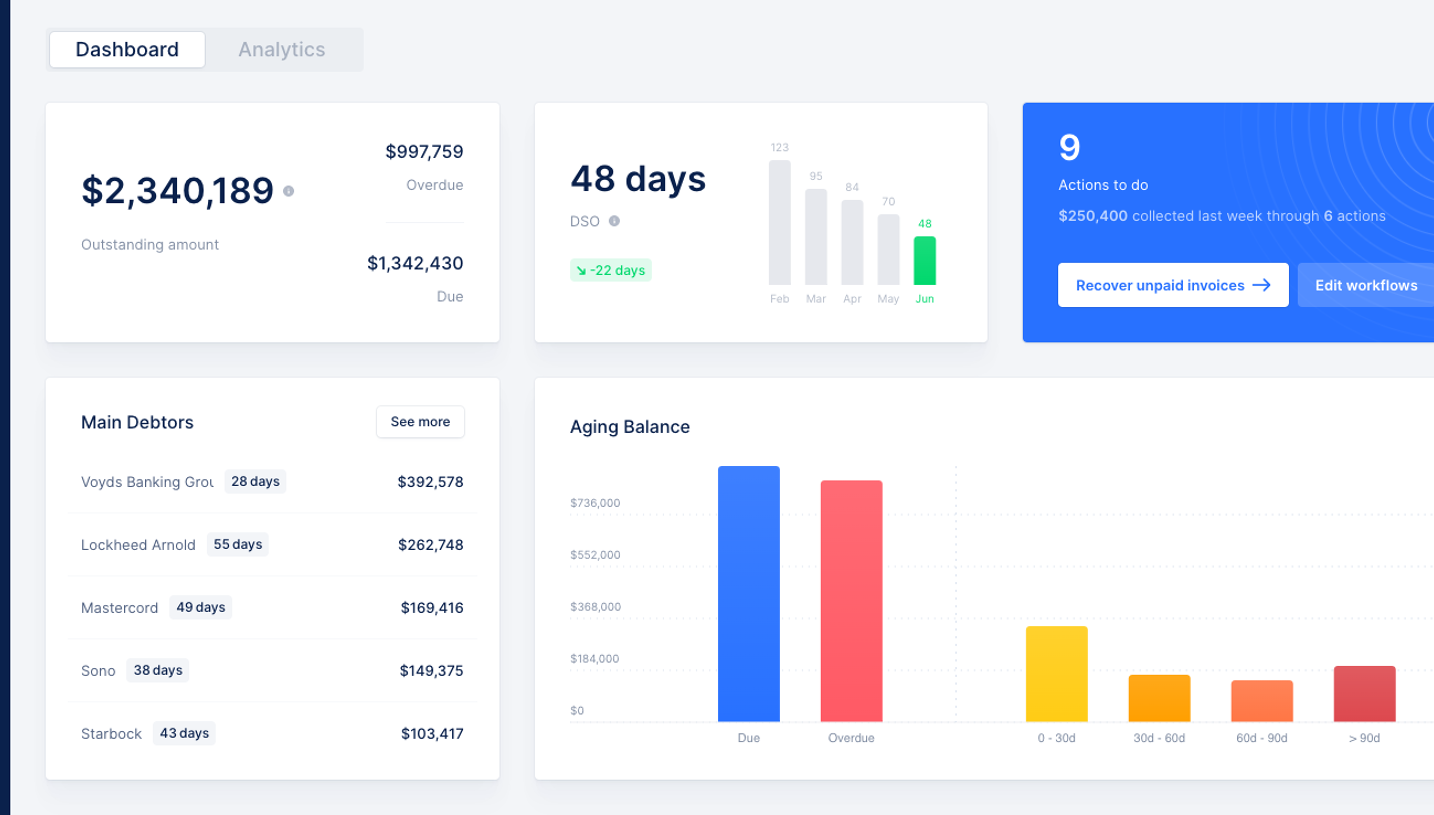
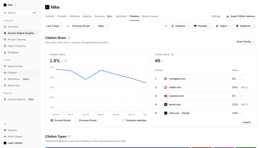
Create an original, high-fidelity visual design inspired by the reference. Prioritize composition, typography, colors, spacing, and component styling over technical implementation.
## Reference
- **Product:** Profound
- **Category:** Dashboard
- **Screenshot:** https://cdn.prod.website-files.com/5e9dc792e1210c5325f7ebbc/6acad5c3d05a3f53c0a6e342_6acad54ebf4db4ed6805475b_cms-e542081b88ef065e71a54d0a.webp
Analyze the screenshot first. If inaccessible, request it rather than guessing.
## Content
{{content.instructions}}
{{content.data}}
Preserve essential messaging and factual accuracy. Adapt structure and copy length for visual balance; never invent product claims.
## Visual Design
### Overall aesthetic
- **Character:** Restrained content-production dashboard with monochrome actions and subtle status color.
### Page composition
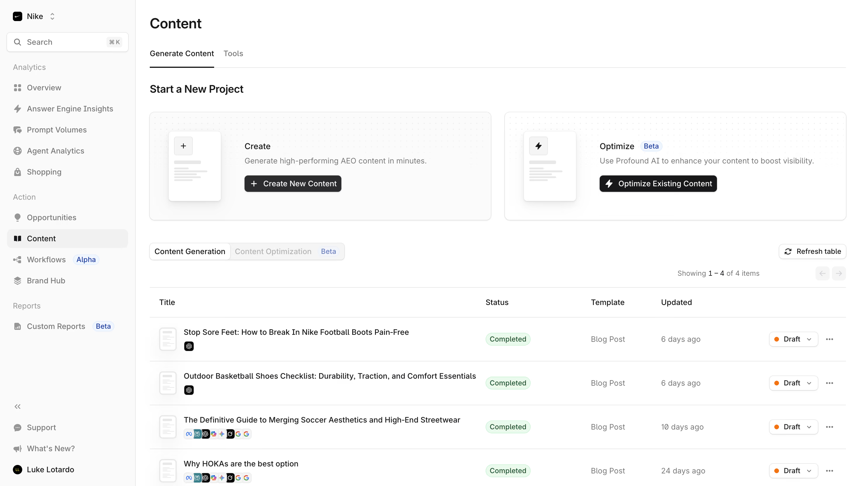
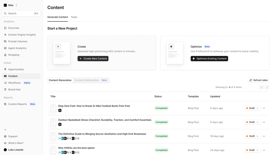
- **Canvas:** 2940 × 1662 screenshot px. Left navigation, Content heading/tabs, two side-by-side project cards, generation selector, refresh/pagination controls, and four-row project table.
### Information hierarchy
- **Priority:** Create and Optimize cards introduce primary paths; table titles lead each row, followed by completion status, template, update time, draft selector, and overflow.
### Typography
- **Scale:** Estimated CSS at assumed 2× capture: title 24 px, section 18 px, body 14 px, metadata 12 px. Sans serif family unverified.
### Colors & surfaces
- **Palette:** Sampled sRGB #FFFFFF, #FAFAFA, #FBFBFB, border #E8E8E8, and near-black #18181A. Pale green completion pills, blue Beta badges, and orange draft dots signal state.
### Components
- **Details:** Rounded project cards with faint dotted backgrounds and document thumbnails; black action buttons, segmented tabs, thin row dividers, small channel icons, and compact status dropdowns.
### Visual rhythm
- **Spacing:** Estimated sidebar 230 CSS px, main padding 24 px, project-card gap 24 px, and table rows about 76 px high.
### Responsive
- **Adaptation:** Mobile is not shown. Stack project cards and turn table rows into compact summaries with secondary details below titles.
### Adaptation guidance
- **Transfer:** Preserve distinct creation/optimization paths and separate generation status from publishing status. Use actual project names and workflow states.
Use this context to reproduce the reference's visual language: layout, typography, colors, spacing, borders, radii, and distinctive elements. The screenshot takes priority if descriptions conflict.
## Direction
{{preferences.fidelityInstructions}}
## Output
{{output.instructions}}
Deliver a polished, cohesive design with precise alignment, hierarchy, and spacing. Produce the requested visual artifact, not just a description. If unsupported, explain the limitation.