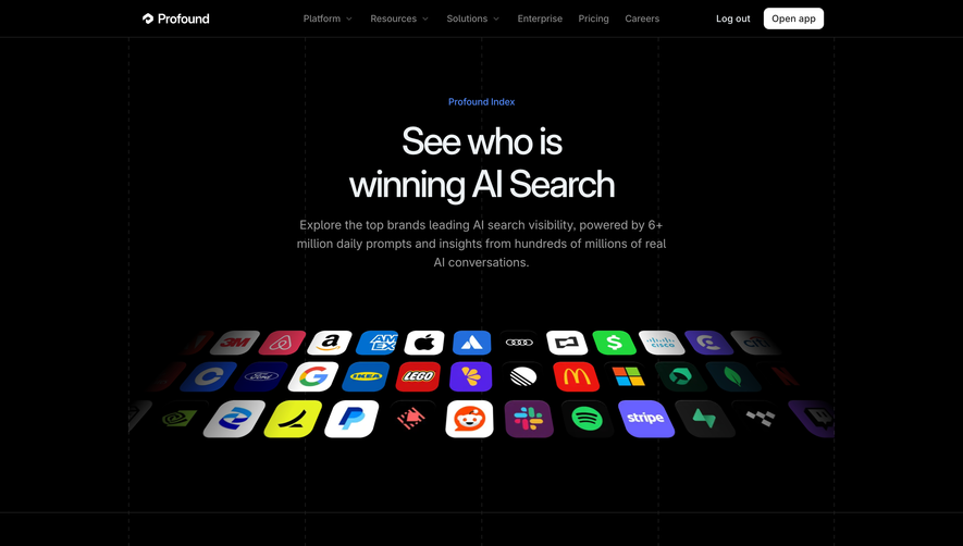
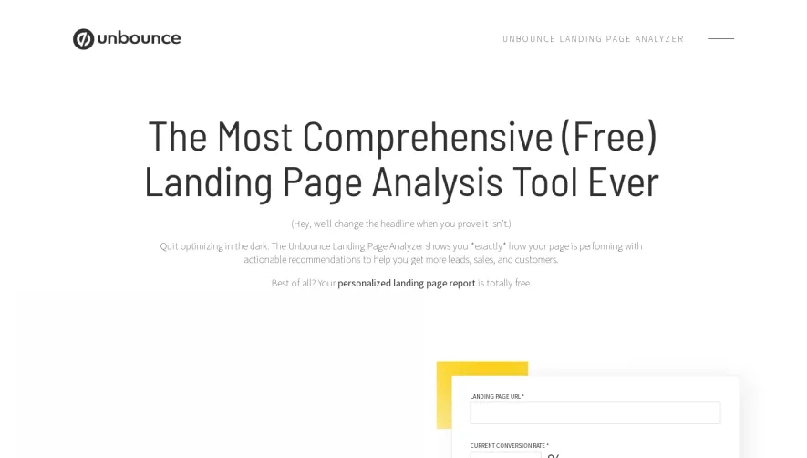
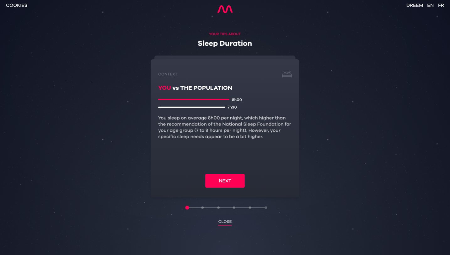
Generate a new design based on this screen using your own content.
Thank you! Your submission has been received!
Oops! Something went wrong while submitting the form.
# Design from Reference: Profound AEO Report
Create an original, high-fidelity visual design inspired by the reference. Prioritize composition, typography, colors, spacing, and component styling over technical implementation.
## Reference
- **Product:** Profound
- **Category:** Free Side Product
- **Screenshot:** https://cdn.prod.website-files.com/5e9dc792e1210c5325f7ebbc/6acad33bd5603a17eba5b62b_6acad0c65a5fdf4c302f7177_cms-88c20028471edc8cda67a6a8.webp
Analyze the screenshot first. If inaccessible, request it rather than guessing.
## Content
{{content.instructions}}
{{content.data}}
Preserve essential messaging and factual accuracy. Adapt structure and copy length for visual balance; never invent product claims.
## Visual Design
Use this context to reproduce the reference's visual language: layout, typography, colors, spacing, borders, radii, and distinctive elements. The screenshot takes priority if descriptions conflict.
## Direction
{{preferences.fidelityInstructions}}
## Output
{{output.instructions}}
Deliver a polished, cohesive design with precise alignment, hierarchy, and spacing. Produce the requested visual artifact, not just a description. If unsupported, explain the limitation.
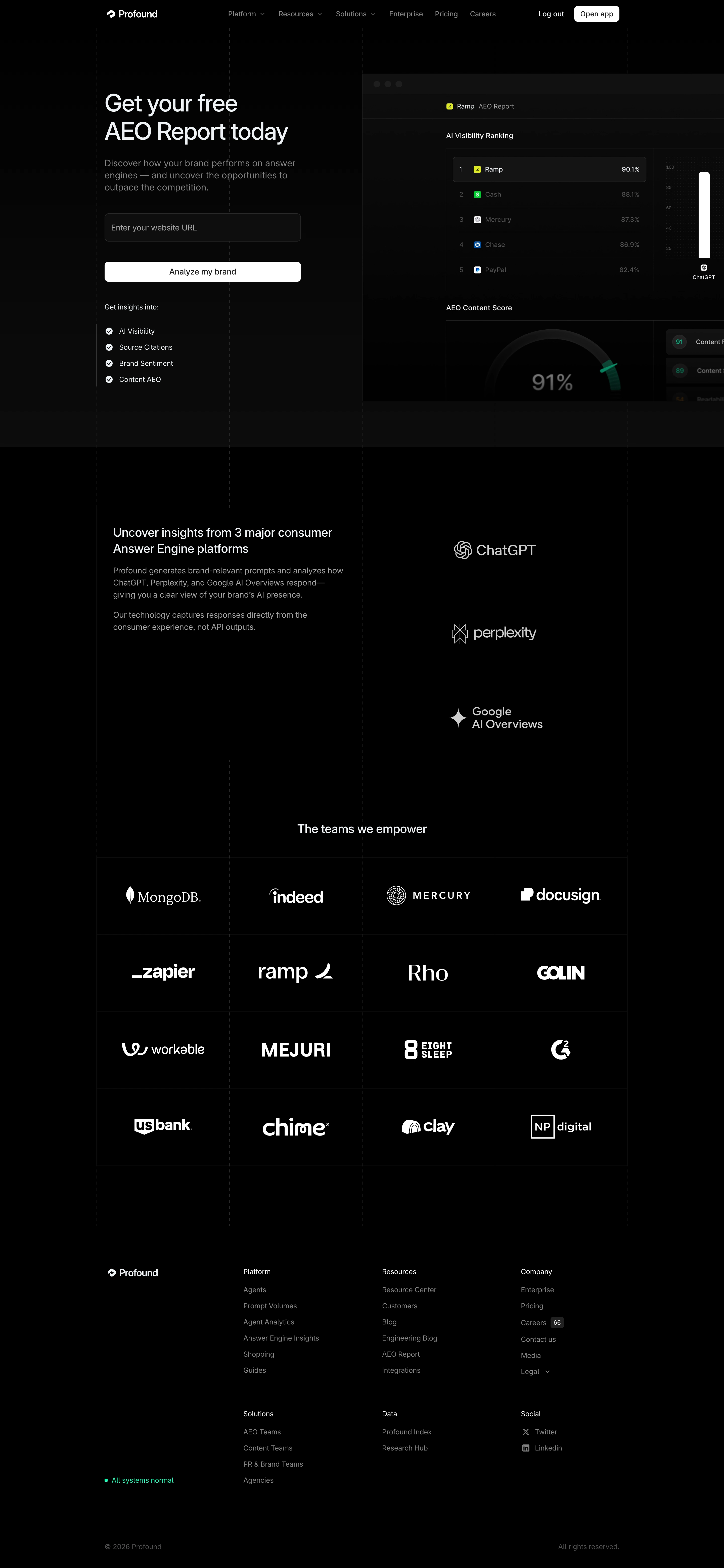
The deep black background makes everything pop here. That green accent color carries a lot of weight, showing up in the gauge chart, checkmarks, and the "All systems normal" status indicator at the bottom. It's consistent without being overwhelming. The hero section pulls you in with a clear value prop on the left and a mock AEO Report dashboard on the right. Smart move showing the actual product UI instead of some generic illustration.
Trust Wall That Actually Works
The logo grid at the bottom is stacked four across and four deep. MongoDB, Indeed, Ramp, US Bank. Heavy hitters. They didn't just sprinkle in a few logos and call it a day. The sheer density of it builds credibility fast. Each row feels intentional with the spacing kept tight and uniform.
Typography and Flow
Big bold sans-serif headlines paired with smaller body text create a clean hierarchy. The CTA is dead simple. One input field, one button. No friction. The three platform logos for ChatGPT, Perplexity, and Google AI Overviews are stacked vertically with generous whitespace, letting each one breathe. It reads like a story from top to bottom.