Overall Style and Aesthetic
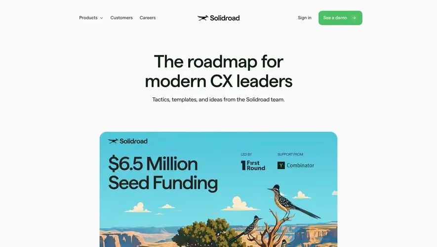
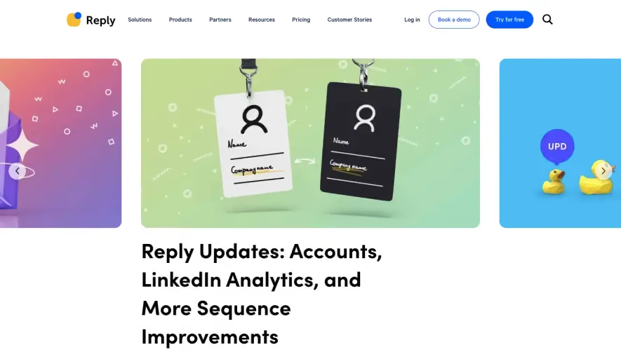
Producter’s blog page embraces a crisp, minimalist aesthetic, blending modern professionalism with a touch of playfulness. The ample white space creates room for breathing, while subtle color pops infuse energy without overwhelming. Clean lines and consistent margins reinforce a sense of clarity and order. Layout and Structure
The layout is user-centric, opening with a simple branded header and no clutter. Blog articles are presented in a masonry grid, allowing visitors to quickly scan content. Each entry uses card-based layouts, featuring clear thumbnails, concise titles, and author metadata for easy navigation. The footer is compact, offering helpful resource links and product navigation, ensuring a seamless exploration experience. Visual Elements
Custom illustrations and distinctive icons add personality, differentiating the interface from generic template-driven blogs. Thumbnails are sharp and uniform, delivering immediate visual cues about article topics. There’s an understated playfulness in the iconography, which complements the otherwise clean and functional design. Color Palette and Typography
A cool, modern palette dominates—primarily blue and white—invoking trust and freshness. Strategic uses of accent colors (like orange and green) draw attention to labels and CTAs. Typography is clean and geometric, with bold headings establishing visual hierarchy and smaller, easily readable text for summaries. User Experience Patterns
Navigation is streamlined: the sticky left sidebar elegantly houses sections for categories and popular posts, aiding discoverability without distraction. CTAs—like newsletter sign-ups—are gentle, never intrusive. The infinite scroll pattern keeps users engaged, loading new content as you browse. Notable Design Choices & Tone
Producter’s blog stands out with its disciplined grid system and visually harmonious cards, showcasing how to remain professional yet lively. Confident, trustworthy, and subtly innovative, this page provides a blueprint for SaaS blogs wanting to inspire and inform while prioritizing usability.