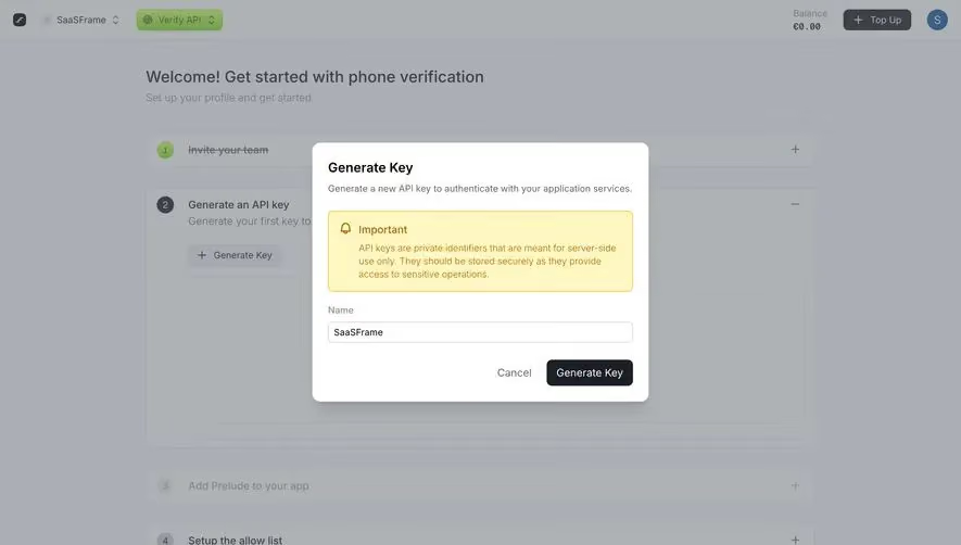
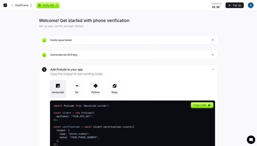
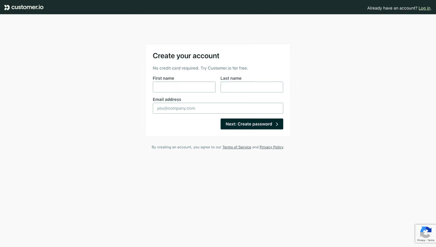
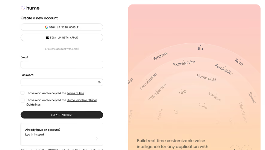
Generate a new design based on this screen using your own content.
Thank you! Your submission has been received!
Oops! Something went wrong while submitting the form.
# Design from Reference: Prelude Signup
Create an original, high-fidelity visual design inspired by the reference. Prioritize composition, typography, colors, spacing, and component styling over technical implementation.
## Reference
- **Product:** Prelude
- **Category:** Signup
- **Screenshot:** https://cdn.prod.website-files.com/5e9dc792e1210c5325f7ebbc/697b7629a3175b576c8a8e22_hrVIIWoeh__-JPbuQP_HHmMujCHq7_K1qzB5hMuubME.avif
Analyze the screenshot first. If inaccessible, request it rather than guessing.
## Content
{{content.instructions}}
{{content.data}}
Preserve essential messaging and factual accuracy. Adapt structure and copy length for visual balance; never invent product claims.
## Visual Design
Use this context to reproduce the reference's visual language: layout, typography, colors, spacing, borders, radii, and distinctive elements. The screenshot takes priority if descriptions conflict.
## Direction
{{preferences.fidelityInstructions}}
## Output
{{output.instructions}}
Deliver a polished, cohesive design with precise alignment, hierarchy, and spacing. Produce the requested visual artifact, not just a description. If unsupported, explain the limitation.
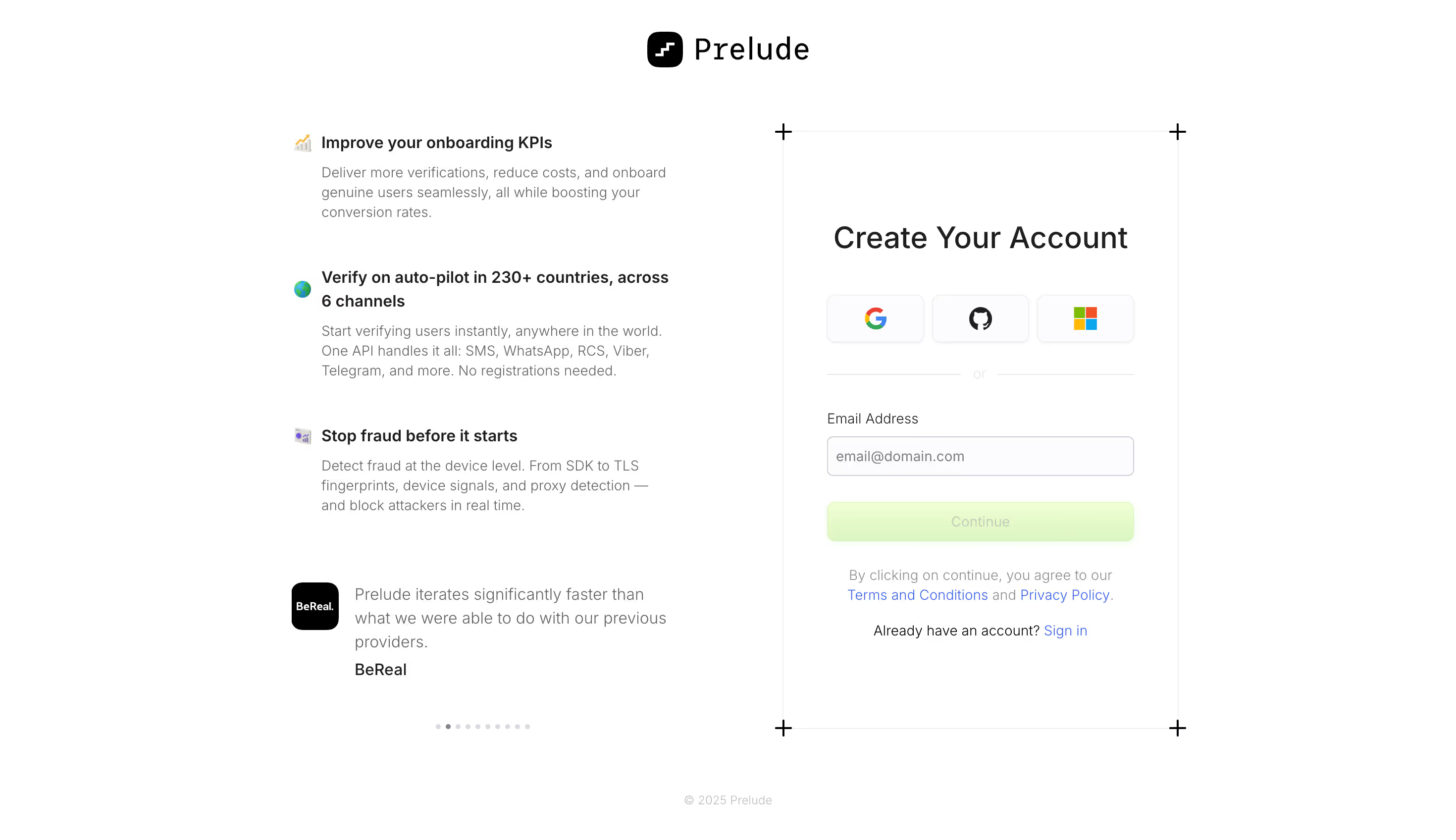
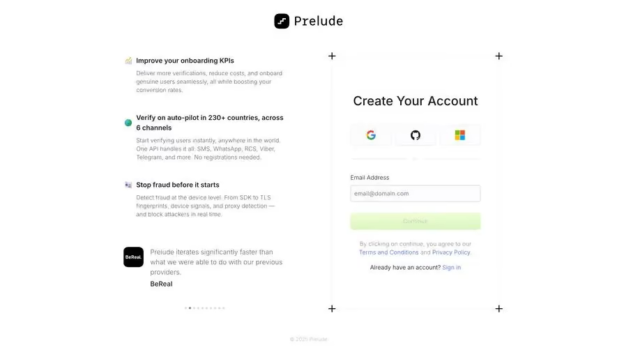
The two-column structure here is doing a lot of heavy lifting. Left side sells you on the product with benefit-driven copy. Right side gets you signed up. No confusion about what to do next. The breathing room between sections feels generous without being wasteful.
Restrained Color, Big Impact
Almost everything is black and white, which makes that soft lime green Continue button impossible to miss. It's subtle but it pulls your eye right where it needs to go. The social login icons (Google, GitHub, Microsoft) sit in neat bordered boxes that feel tappable and organized. Typography is a clean sans-serif, probably Inter or something close, with solid hierarchy between headings and body text.
The Left Column Does the Convincing
Love the emoji-style icons next to each value prop. They add personality without clutter. The BeReal testimonial at the bottom with the dark logo mark adds real credibility. And those tiny dot indicators suggest a carousel of quotes, which is a smart way to pack in social proof without overwhelming the page. Whole thing feels confident and unhurried.